2025/12/01
Similar-Day Naive Method
Like the Chronos-2 technical report, Uniejewski and Weron compare the approaches implemented in their aforementioned paper against a naive baseline. Unlike the technical report which uses seasonal naive for all data sets, Uniejewski and Weron, to their credit, employ a baseline that, while naive, is tuned to their use case of electricity price forecasting and employs as much knowledge as possible:
The first benchmark, the so-called naive method, belongs to the class of similar-day techniques. It is defined by \(\hat{P}_{d,h} = \hat{P}_{d-7,h}\) for Monday, Saturday and Sunday, and \(\hat{P}_{d,h} = \hat{P}_{d-1,h}\) otherwise. As Contreras et al. argued, forecasting procedures that are not calibrated carefully fail to outperform this extremely simple method surprisingly often.
So given the different human patterns in electricity usage on workdays and on weekends, they use the naive method for workdays and seasonal naive for the weekend and Monday (because Sunday can’t be used to predict Monday).
Reminds me of this footnote.
2025/11/30
Scaling Time Series Using the Inverse Hyperbolic Sine
This one’s new to me: The Chronos-2 tokenization pipeline follows up an initial standardization of input time series with a variance stabilizing transformation in the inverse hyperbolic sine function, \(\sinh^{-1}\), as described in the model’s technical report.
The inverse hyperbolic sine function is defined as:
\[ \sinh^{-1}(x) = \ln(x + \sqrt{x^2+1}). \]
As such it is an alternative to the \(\ln(x+1)\) transform with the added benefit of being applicable to negative values.
While news to me, the technical report points out that the inverse hyperbolic sine is no news to the electricity price forecasting literature, citing “Efficient Forecasting of Electricity Spot Prices with Expert and LASSO Models” by Bartosz Uniejewski and Rafał Weron, which describes the inverse hyperbolic sine and other variance stabilizing transformations in more detail.
2025/11/23
Stacking Simple Forecasts by Classification
This paper got me thinking about stacking and ensembling of forecasts again.
Different from what the paper proposes but in the stacking models-sense, consider some multi-class classification model used to predict which base model forecasts a given observation from a set of many time series best. Something more akin to the FFORMA approach.
But use simple forecast methods to keep the overhead of first creating base forecasts at a minimum. Use the seasonal lag, the seasonal average, the most recent observation, zero, year-to-date average, etc. as base forecasts. Anything, really, that makes for a strong baseline for part of your dataset and can be calculated “without training”. If nothing else, this avoids the need for expensive cross-validation loads (as those described in the aforementioned paper).
Then, for each observation of your time series data, derive a label based on the base forecast that comes closest to the observation.1
Finally, train the classifer model to predict the labels, using the base models as features, but also any other kind of feature. Now well and truly spitballing: Have some features summarize base predictions relative to one another, and relative to recent observations (“The seasonal lag is 190% of the year-to-date average”) to help the model distinguish patters.
Given that the classifier model would only pick between simple forecast methods to arrive at the final prediction, the overall forecast accuracy will always be limited. I can imagine scenarios, however, where the prediction ends up being more stable and at the right level compared to models trained to predict the time series directly. Constrained by the quality of the base forecasts, this stacking approach could pay off handsomely if the optimal base learner differs across the set of time series, or frequently changes within the same series. That is, when there is no dominant baseline.
For example, it could work well in scenarios where time series have multi-modal distributions due to zeroes, or frequently exhibit structural breaks.
In a way, the classifier would learn the sort of “item routing” described here. Instead of assigning time series to different forecast models based on rules, the classifier will split the data into subsets and assign the model.
One more nice side effect: There is no need for target scaling when base forecasts are non-trained methods and when the meta learner only needs to classify.
The overall approach is also fairly explainable if not interpretable. Especially if one picks the features for additional context wisely.
Finally, while the base forecasts will limit the overall forecast quality that can be achieved, we can measure the best possible forecast quality the stacking approach can reach in the hypothetical case of a perfect classification of every observation. So before putting any effort into training a good classifier, we will know whether the effort could hypothetically be worth it.
Though there is a limit to the number of base forecasts you should use to derive the labels for the classifier. Dare to use the range of real numbers and you’ll end up back with a (discretized) regression problem.
-
Why not throw in an additional label category indicating that none of the methods came even close to the actual observation? To predict that a data point is not predictable by the base forecasts. ↩︎
2025/05/10
‘Data Engineers Should Be Held to the Same Standards as Bakers’
∞
Over at Hermit Tech, Jordan Andersen laments over embarrassingly low project delivery expectations within the software and data industry when compared to other professions such as the one of a baker. His concern, however, is not only with the customers of the project, but with the developers:
The latter consequence of low expectations is the more serious one. It’s something that some people may never recover from. […] The trajectory of a data or software engineer seems to be a bit different: they burn out from the mental stress of working in dishonest and fraudulent cultures that produce unsatisfying work, but the engineer stays in the profession. Only they’re a shell of a human.
2025/05/10
Patrick Collison Interviews Jony Ive at Stripe Sessions
∞
Having browsed my thesaurus, I’m settling on thoughtful as the one word I’d choose to describe Jony Ive, as he is both deliberate in his words and stories and attentive to those who use his tools. Tools, not products, because Ive describes himself as a toolmaker.
Ive’s description of his profession and work could come across as pretentious if Ive was less self-conscious and at times self-deprecating. Instead, presented in his thoughtful manner, Ive’s attitude is the kind of stuff that gets you out of bed in the morning. Impart meaning to your work by caring to the extent that humans who interact with your work sense that someone cared.
This conversation is like a Happy Meal, full of little golden nuggets.
2025/03/16
Inherently Coherent Forecasts
Suppose you offer a single API endpoint that takes historical observations of one time series at a time (not unlike Nixtla’s TimeGPT). Suppose further that everyone at your company uses this endpoint to generate any business forecast they need. What behaviors should the API’s forecast exhibit?
An obvious one would be forecast coherence across aggregation levels. Say your company sells three products. You have the historical revenue for the three products, \(Y_1\), \(Y_2\), \(Y_3\), as well as the historical revenue for the company as a whole, \(Y\), where \(Y=Y_1+Y_2+Y_3\). When you feed \(Y_1\) into the API, the API returns forecast \(\text{API}(Y_1)=\hat{Y}_1\). It returns \(\hat{Y}_2\) given \(Y_2\), \(\hat{Y}_3\) given \(Y_3\), and given \(Y\) it returns \(\hat{Y}\). If we want to see a forecast at company-level that “makes sense” given product-level forecasts, we want the forecasts to be coherent: \(\hat{Y}=\hat{Y}_1 + \hat{Y}_2 + \hat{Y}_3\). But given that the API only ever sees one time series at a time, what model could be used to provide coherent forecasts?
Again, keep in mind that the API doesn’t have access to more information than its current input. For example, when you feed it \(Y_2\), it doesn’t know that \(Y_1\) and \(Y_3\) exist. It also doesn’t know whether \(Y_2\) is at the hierarchy’s bottom- or top-level. The API does not have access to all possible time series that exist at the company. Consequently, the API does not have the information required to apply the methods from the vast literature on coherent forecasts. What modeling approach will return coherent forecasts nevertheless?
The seasonal naive method would. As would the naive method, of course. The mean forecast, too. And any other linear combination of the past observations with a pre-determined context length and coefficients.1 Any pre-trained—the coefficients must not change depending on the input provided to the API—linear autoregressive model of order p will do.
That’s a fairly flexible model family. It also includes the Non-Parametric Time Series Forecaster and threedx. Thus, the API could do an OK job for most series passed to it. It would have an obvious weakness in new or recently discontinued time series, though. The API could not, for example, override its usual forecast for a recently discontinued product and forecast zero instead. The same holds for any other kind of structural break as well as anomalies. That would make it tough to rely exclusively on such an API for operational decisions happening at the low hierarchy level ridden with discontinuities.
The above combined with recent evidence make me inclined to offer the seasonal naive method as Zero-Shot Foundation Model with Inherently Coherent Forecasts available as API.
For example, the mean forecast must not be the mean of the provided observations, but the mean of \(k\) observations resulting in coefficients \(1/k\). A time series with \(n<k\) observations needs to be padded with zeros. A time series with \(n>k\) observations is shortened to the \(k\) most recent observations.↩︎
2025/03/01
FF&P Store Report for 2025-02
In “Forecasting for Fun and Profit” I described how I would simulate the process of running the inventory replenishment decisions of a store for the remainder of a year. Every month I would publish a report on the preceding month’s results.
I just published the report summarizing the month of February.
A few quick thoughts:
- To properly reflect fixed order costs in cost-of-goods-sold, I updated the
shoprpackage I use for the simulation. The derivation of cost-of-goods-sold now attributes part of an order’s fixed cost to each unit of product sold based on how many units were ordered. - Simulating realistic data is hard. While the real world has a way of keeping only those combinations of purchase prices, delivery times, order and holding costs that fit to the demand for a product, picking these parameters at random for each product while keeping the overall business reasonably profitable is hard. To avoid a simulation that implies an unprofitable business model, I adjusted the upfront simulation of the products’ attributes.
- The previous two bullets imply that the simulation for February would be nothing like the one I had previously reported for January. In fact, I needed to re-simulate January as basis for February. So I also published a new version of the January report.
- The reports now feature additional product-level information (private-brand products, new products, discontinued products) and a revised out-of-stock impact.
- While the shop is not yet unprofitable, February shows an increase in holding costs and out-of-stock periods, and thus first signs that the (still) default forecast and replenishment optimization are not good enough and will lead the shop into an untenable downward spiral.
2025/02/23
‘Performance of Zero-Shot Time Series Foundation Models on Cloud Data’
∞
Toner et al. compare time series foundation models such as Chronos, Mamba4Cast, and TimesFM on data from Huawei data centers (data is available on Github!):
To examine the behaviour of (zero-shot) FMs on cloud time series, we perform experiments on function demand data drawn from real-world usage. Our results show that FMs perform poorly, being outperformed by the simple baselines of a linear model and a naive seasonal forecaster.
If you think about it, the seasonal naive method is the original zero-shot foundation model.
For example, the naive seasonal forecaster performs better than all the FMs across all datasets and forecast horizons. Moreover, the performance difference is often large; for example, the naive seasonal forecaster incurs a MASE typically half that of TimesFM.
Alas, the authors make little attempt to explain why the foundation models are outperformed by the seasonal naive method beyond the data’s spikiness. But perhaps that’s just it. Chronos, for example, is known to fail on spiky data due to its mean scaling and quantization (see figure 16 in the corresponding paper).
We also present evidence of pathological behaviours of FMs, demonstrating they can produce chaotic (as in Figure 1) or illogical (as in Figure 2) forecasts.
Check out the mentioned plots in figures 1, 2, 4 and 5. They’re why I don’t trust any paper that doesn’t visualize its method’s predictions.
2025/02/01
Forecasting for Fun and Profit 🤑
For the remainder of the year, I will simulate the process of running the inventory replenishment decisions of a store. If work has taught me anything, it’s that you look differently at your forecast model when it decides day after day how money is spent—and doesn’t just fill cells in Excel. Unfortunately, that’s not often the topic of academic research. But I have a bunch of loosely connected ideas about business forecasting that I’d like to bring to paper, and the worked example of a store and its replenishment decisions will serve as the connective tissue.
To make replenishment decisions, I will first of all need to simulate a store that sells products and replenishes them to keep them on stock. With shopr, I have written a small package that models a simple world in which every day a store faces demand, sells products from inventory, and decides how many products to replenish. More on that below.
While you can run simulations with shopr as fast as your computer let’s you, I will simulate the replenishment decisions in real time: The iterations of the simulated world will be daily, from January 1 through December 31 of 2015. On the first day of every month I will publish a report that summarizes the profit and loss and cash flow achieved by the store in the previous month.1
Compared to simulating the entire year at once, proceeding in this step wise fashion will give me opportunity to make changes to the forecast method and inventory optimization and observe the changes’ impact. The step wise approach is also closer to the real-world where performance is observed over time and period-over-period changes raise questions. That should spark some discussions.
I have published the first report earlier today, summarizing the month of January.
In it you’ll find financials of a store called “FF&P Store”. It sells 1,906 different emojis (some to be released in the future). Reading tables of top sellers and out-of-stock products becomes just so much easier when it comes with product imagery.2
| Private Label | Sales Price | Purchase Price | Holding Cost | Delivery Days | |
|---|---|---|---|---|---|
| 🔞 no one under eighteen | no | $2.4 | $0.5 | $0.1 | 7 |
| 🦠 microbe | yes | $1.1 | $0.1 | $0.0 | 33 |
| 🇦🇶 flag Antarctica | no | $6.9 | $3.9 | $0.1 | 3 |
| 🙈 see-no-evil monkey | no | $2.5 | $0.7 | $0.1 | 7 |
| 🤑 money-mouth face | no | $1.7 | $0.5 | $0.0 | 9 |
The store’s financials are an aggregation of products’ observed sales, products’ prices, and the costs for purchasing products and holding them on inventory. The prices, costs, and the demand underlying the sales are the input data to the simulation and can either be generated in shopr or passed to it from existing tables.
For this simulation, I use some of the daily sales time series released in the M5 competition as historical sales and future demand, and the accompanying prices as sales prices. That’s a useful set of data to demonstrate fairly common real-world scenarios. I extend the demand and sales prices by purchase prices and holding costs. Additionally, I generate starting levels of inventory and delivery lead times for each material.
With that data as input, the simulation proceeds as follows:
For each day from January 1 through January 31:
    - Receive previously ordered shipments
    - Update inventory
    - Observe sales by comparing demand against inventory

    - User: Derive forecasts from historical sales
    - User: Optimize replenishment given forecasts and inventory

    - Open orders given replenishment decisions
A nice feature of shopr is that it stores the daily state of inventory, orders, and sales in partitioned parquet files. Using arrow in the background, it’s efficient to analyze the resulting data both during the iterations (e.g. when comparing forecasts and inventory) as well as at the end when preparing the monthly report.
While forecasts and replenishment decisions motivate this whole exercise, the key determinant of the financial results is the store’s business model: How frequently can we order products? Do we need to buy different products at once? Are there minimum order quantities? What delivery lead times do we have with suppliers? For data scientists these tend to be fixed constraints provided by others, but when simulating we need to choose each one.
The current version of shopr does take delivery lead times into account and the emoji store will replenish some products at shorter lead times and others, the private brands, at longer lead times. But shopr does not yet constrain the frequency, size, and cost of orders in any way. That’s unrealistic and I will adjust it in future iterations to make the optimization problem more interesting.
This then is also the final message: The work has only begun. Consider this a conversation starter and expect more to come soon.3
Edit (2025-03-01): Here’s a list of all reports published to-date:
- January 2025, published on 2025-02-01
- January 2025, published on 2025-03-01
- February 2025, published on 2025-03-01
Like those Mastodon accounts posting what happened on the same day during World War II.↩︎
Credit where credit is due: The unicode-emoji-json project has come in handy as tabular overview of all emojis with basic metadata.↩︎
A blogger’s famous last words.↩︎
2025/01/12
R-squared as Forecast Evaluation Metric
When Jane Street’s $120,000 “Real-Time Market Data Forecasting” Kaggle competition closes tomorrow, submitted forecasts will be evaluated using \(R^2\):
Submissions are evaluated on a scoring function defined as the sample weighted zero-mean R-squared score (\(R^2\)) of
responder_6. The formula is give by: \(R^2 = 1 - \frac{\sum w_i(y_i - \hat{y}_i)^2}{\sum w_i y_i^2}\) where \(y\) and \(\hat{y}\) are the ground-truth and predicted value vectors ofresponder_6, respectively; \(w\) is the sample weight vector.
Stats 101 courses have left \(R^2\) with a bad rep as gameable regression metric. But I’ve come to appreciate it as a metric in forecasting—when calculated on the test set with the total-sum-of-squares denominator based on the test period’s empirical mean, \(\bar{y}_{T,h} = \sum_{t = T+1}^{T+h}y_t\), where \(T\) is the training set’s last observation and \(h\) the number of observations in the test set. Then:
\[ R^2 = 1 - \frac{\sum_{t = T+1}^{T+h}(y_t - \hat{y}_t)^2}{\sum_{t = T+1}^{T+h}(y_t - \bar{y}_{T,h})^2} \]
Above definition gives the total-sum-of-squares the advantage of future knowledge included in \(\bar{y}_{T,h}\) that the predictions \(\hat{y}_t\) used for the residual-sum-of-squares do not have. In comparison to its linear regression origin, this test set-focused definition is not going to improve as parameters are added to the forecast model. But it does keep its interpretability:
- A value of 1 indicates a perfect model
- A value of 0 indicates a model as good as the test mean (the latter being a forecast that is both perfectly unbiased and perfectly predicts the total sum over the forecast horizon)
- Any negative value indicates a model that isn’t even as good as the simple test mean (but then again, the test mean uses future knowledge)
For example, when predicting the final twelve months of AirPassengers data, the obviously poor prediction given by the training set mean results in an \(R^2\) of -8.24 whereas a seasonal naive prediction achieves an \(R^2\) of 0.54.
This shouldn’t come as a suprise. Interpreting \(R^2\) as the fraction of (test) variance explained, the seasonal naive prediction can explain more than half of the variance that the test mean left unexplained. The model captures a large part of the signal hidden in the data’s variation.
Just like Jane Street replaced the test set empirical mean in their definition of \(R^2\) by zero, which in their application of predicting expected financial returns is a hard to beat expected value, one could replace the total sum of squares denominator by the squared errors of a different benchmark such as seasonal naive predictions when it is known that due to the data’s seasonality the seasonal naive prediction will consistently outperform the test set mean despite its future knowledge. Thus, \(R^2\) is not so different from the more common relative measures such as the Relative Mean Squared Error described in section 6.1.4 of Hewamalage et al. (2022), or Skill Scores employed in weather prediction described by Murphy (1988).
Then again, when a time series’ variance is not dominated by its seasonal component, \(R^2\) and its interpretation as fraction of variance explained can leave a damning picture of a model’s forecasts not actually being all that skillful. It casts doubt by asking how much signal your model has picked up to meaningfully predict future variation. Suddenly any value larger than zero will feel like an enormous success.
2024/10/06
Explosion Back to Its Roots
∞
In 2016, Matthew Honnibal presented at the first PyData Berlin meetup that I attended. He had already started spaCy and was training models on Reddit comments, whereas I wasn’t really into NLP and heard about spaCy for the first time that evening. And while I’m still not really into NLP, I never stopped keeping tabs on what he and Ines Montani were building at Explosion.
Honnibal recounts Explosion’s history in view of recent changes:
For most of Explosion’s life we’ve been a very small company, running off revenues. In 2021 that changed, and we became a slightly less small company running off venture capital. We’ve been unable to make that configuration work, so we’re back to running Explosion as an independent-minded self-sufficient company. We’re going to stay small and not look for any more venture capital. spaCy and Prodigy will continue.
With a focus on “industrial-strength”, Explosion has built opinionated data science tooling with beautiful documentation. SpaCy is beloved open-source software (with the community coming together for spaCy IRL—a real treat of a conference) that convinces data scientists to spend company budget on Prodigy. This combination of spaCy and Prodigy is the ingredient to Explosion’s unique success as small, self-sufficient company in a venture-funded AI environment. Already familiar with spaCy, data scientists are comfortable with purchasing Prodigy licenses to ease their annotation workflows common to NLP. And being technical expert users, they also are capable of hosting the software themselves. Explosion doesn’t have to handle customers' data.
License revenues, no hosting, no data: Enablers of a profitable business run by a small team. I wish they continue to thrive!
In his post, Honnibal shares realities of maintaining software that companies and developers rarely admit to, yet which are determinants of a team’s success:
Engineering for spaCy and our other projects was also very challenging to hand over. spaCy is implemented in Cython, and big chunks of the project are essentially C code with funny syntax. We pass around pointers to arrays of structs, and if you access them out of bounds, well, hopefully it crashes. You have to just not do that. And then in addition to this memory-managed code, there’s all the GPU-specific considerations, all the numpy minutiae, and maintaining compatibility with a big matrix of Python versions, operating systems and hardware. It’s a lot.
The infrastructure required for machine learning doesn’t make it any easier:
I’ve been finding the transition back to the way things were quite difficult. I still know our codebases well, but the associated infrastructure isn’t easy to wrangle. Overall I haven’t been very productive over the last few months, but it’s getting better now.
On top come unexpected team dynamics as the previous architect shifts his focus:
As I became less involved in the hands-on work, I struggled to be effective as a decision-maker. A lot of the bigger questions got deferred, and we had an increasing bias towards whichever approach was least committal.
On a different note, I am fascinated that Hugging Face has the funds to provide a quarter-million grant for open-source developers. How many of these funds do they provide?1
We considered selling the company, but we weren’t able to find a good fit. Instead, we’re back at the same sort of size we had before the investment. We’re very grateful to Hugging Face for a $250,000 grant to support our open-source work as our funding ran out, and we’ve applied successfully for a German R&D reimbursement grant that will give us up to €1.5m in unconditional funding.
To me, Explosion is one of the coolest exports that Berlin and Germany have to offer. Great to see them receive such grant.
-
At roughly 0.1% of their Series D funding round, there might be a few. ↩︎
2024/10/06
The New Internet
∞
Avery Pennarun, CEO of Tailscale, in a company all-hands meeting:
In modern computing, we tolerate long builds, and then docker builds, and uploading to container stores, and multi-minute deploy times before the program runs, and even longer times before the log output gets uploaded to somewhere you can see it, all because we’ve been tricked into this idea that everything has to scale. People get excited about deploying to the latest upstart container hosting service because it only takes tens of seconds to roll out, instead of minutes. But on my slow computer in the 1990s, I could run a perl or python program that started in milliseconds and served way more than 0.2 requests per second, and printed logs to stderr right away so I could edit-run-debug over and over again, multiple times per minute.
2024/10/05
Measurement of Discernible Differences
Wind is like pornography: I know it when I see it. I recognize wind on my face as a “Light Breeze”, I understand a “Moderate Breeze” passes by when loose paper is lifted in the air, and I know a “Moderate Gale” when it inconveniences me in my walk.
Likewise, tell me that I will have a hard time using an umbrella and I’ll think twice about leaving my apartment. But tell me that the wind’s speed is 45km/h and I’ll think twice about what that means.
The human experience of wind imparts the Beaufort wind force scale its clarity. By relating to shared observations, Beaufort made something as intangible as wind tangible. The resulting Beaufort scale classifies wind speeds into categories from 0 to 12. Each category corresponds to an observable wind condition, from 0 (wind so calm it allows smoke to rise vertically) over 6 (the aforementioned struggle with an umbrella) to 12 (the not-shared-by-everyone experience of devastation by a hurricane).
The Beaufort scale makes up in intuition, what it lacks in precision. Thus, not surprisingly, meteorologists held their anemometer up in the air to measure the exact speed at which wind provides umbrellas the strength to drag pedestrians along the sidewalk. Their measurements translated the human experience into units, and now Apple’s Weather app displays the wind speed in km/h by default. Only if you look for it will Weather offer a conversion to Beaufort’s categories.
What you’ll find is a conversion table that prioritizes order and space over comprehensiveness.1 The table does not list the categories’ observation-based definitions. Weather strips away what differentiates the Beaufort scale from common units found on a car’s speedometer. Limited by your phone screen’s horizontal width, something had to give. You’re left with a three-column table listing a number on the left, a number on the right, with 2 storms, 2 gales, and 5 breezes in the middle. Reverse the priorities and you get Wikipedia’s version of the table.

Usefully, though, Apple’s Weather app does provide an option to translate wind speeds2 from km/h to bft in most of its UI elements. Which, now that I am familiar with the categories, is the level of detail I look for when I check the weather in the morning. The Weather widget showing 1bft promises a nicer day than, say, 4bft. At 6bft I will pull up my hood and leave my umbrella at home.
A change in Beaufort category from one day’s forecast to the next foretells that the weather will feel different from the day before. A change in wind speed by 1km/h, however, I will neither feel nor see, and thus not know.
2024/07/27
Trained Random Forests Completely Reveal Your Dataset
∞
The paper’s title is a small portion of clickbait: As of yet not all but some trained random forests completely reveal your dataset. Still, using constraint programming the authors completely reconstruct the data used to train binary classification random forests without bagging on only binary features.
I imagine a lot of random forests having been trained on sensitive data in the past and their model files been more loosely handeled than the data. What private information could the model possibly reveal? Yeah.
Watch Julien Ferry present his paper in a video recorded for ICML 2024.
2024/07/26
No, Hashing Still Doesn’t Make Your Data Anonymous
∞
Just the Federal Trade Commission (FTC) reminding all of us that you can’t anonymize private data by hashing unique identifiers.
And the stories the FTC has to tell:
In 2022 the FTC brought a case against an online counseling service BetterHelp, alleging they had shared consumers’ sensitive health data—including hashed email addresses—with Facebook. The complaint laid out that BetterHelp knew that Facebook would “undo the hashing and reveal the email addresses of those Visitors and Users.” Though BetterHelp sent hashes to Facebook, rather than email addresses, the outcome was the same: Facebook allegedly learned who was seeking counselling for mental health and used that sensitive information to target ads to them.
What will be the equivalent to hashing when it comes to regulation of AI? When reviewing a company’s practices, hashing is straightforward to find and offers a black-and-white case. But when reviewing “an appropriate level of accuracy” of a system or the “appropriate measures to detect, prevent and mitigate possible biases”, what will clearly be not good enough?
2024/07/19
How One Bad CrowdStrike Update Crashed the World’s Computers
∞
Days like today serve as a reminder that software doesn’t have to be AI to bring high-risk infrastructure to a halt. From Code Responsibly:
Regulating AI is awkward. Where does the if-else end and AI start? Instead, consider it part of software as a whole and ask in which cases software might have flaws we are unwilling to accept. We need responsible software, not just responsible AI.
Thanks to everyone who has to spend the weekend cleaning up.
2024/06/16
How The Economist’s Presidential Forecast Works
∞
The Economist is back with a forecast for the 2024 US presidential election in collaboration with Andrew Gelman and others. One detail in the write-up of their approach stood out to me:
The ultimate result is a list of 10,001 hypothetical paths that the election could take.
Not 10,000, but 10,000 and one MCMC samples. I can’t remember seeing any reference for this choice before (packages love an even number as default), but I have been adding a single additional sample as tie breaker for a long time: If nothing else, it comes in handy to have a dedicated path represent the median to prevent an awkward median estimate of 269.5 electoral votes.
The extra sample is especially helpful when the main outcome of interest is a sum of more granular outcomes. In the case of the presidential election, the main outcome is the sum of electoral votes provided by the states. One can first identify the median of the main outcome (currently 237 Democratic electoral votes). Given the extra sample, there will be one MCMC sample that results in the median. From here, one can work backwards and identify this sample index and the corresponding value for every state, for example. The value might not be a state’s most “representative” outcome and it is unlikely to be the state’s median number of electoral votes. But the sum across states will be the median of the main outcome. Great for a visualization depicting what scenario would lead to this projected constellation of the electoral college.
In contrast, summing up the median outcome of each state, there would be only 226 Democratic electoral votes as of today.1
CA, DC, HI, MA, MD, ME 1, NY, VT, CO, CT, DE, IL, NJ, OR, RI, WA, NM, ME, NE 2, VA, NH, MN.↩︎
2024/06/16
Helmut Schmidt Future Prize Winner’s Speech
∞
Meredith Whittaker, president of the Signal Foundation, received the Helmut Schmidt Future Prize in May. In her prize winner’s speech, she highlights the proliferation of artificial intelligence applications from ad targeting to military applications:
We are all familiar with being shown ads in our feeds for yoga pants (even though you don’t do yoga) or a scooter (even if you just bought one), or whatever else. We see these because the surveillance company running the ad market or social platform has determined that these are things “people like us” are assumed to want or be attracted to, based on a model of behavior built using surveillance data. Since other people with data patterns that look like yours bought a scooter, the logic goes, you will likely buy a scooter (or at least click on an ad for one). And so you’re shown an ad. We know how inaccurate and whimsical such targeting is. And when it’s an ad it’s not a crisis when it’s mistargeted. But when it’s more serious, it’s a different story.
It’s all fun and games as long as were talking about which ad is served next. Code responsibly.
2024/05/06
(Deep) Non-Parametric Time Series Forecaster
∞
If you read The History of Amazon’s Forecasting Algorithm, you’ll hear about fantastic models such as Quantile Random Forests, and the MQTransformer. In GluonTS you’ll find DeepAR and DeepVARHierarchical. But the real hero is the simple model that does the work when all else fails. Tim Januschowski on Linkedin:
One of the baselines that we’ve developed over the years is the non-parametric forecaster or NPTS for short. Jan Gasthaus invented it probably a decade ago and Valentin Flunkert made it seasonality aware and to the best of my knowledge it’s been re-written a number of times and still runs for #amazon retail (when other surrounding systems were switched off long ago).
Januschowski mentions this to celebrate the Arxiv paper describing NPTS and its DeepNPTS variant with additional “bells and whistles”. Which I celebrate as I no longer have to refer people to section 4.3 of the GluonTS paper.
2024/04/21
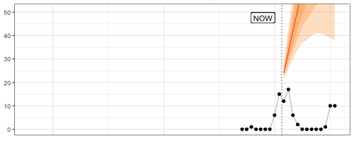
Debug Forecasts with Animated Plots
Speaking of GIFs, animated visualizations of rolling forecasts are eye-opening to the impact of individual observations, the number of observations, and default settings on a model’s forecasts. In the example below, the default forecast::auto.arima() transitions between poor model specifications until it can finally pick up the seasonality after 24 observations, only to generate a negative point forecast despite purely non-negative observations.
Fantastic way to understand forecast methods’ edge-case behavior.
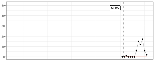
My favorite frame? After nine observations, when a model specification with trend is picked and returns an exploding forecast based on very little evidence.
The code for this GIF in this small Github repo.
2024/04/15
Reliably Forecasting Time-Series in Real Time
∞
Straight from my YouTube recommendations, a PyData London 2018 (!) presentation by Charles Masson of Datadog. To predict whether server metrics cross a threshold, he builds a method model that focuses on being robust to all the usual issues of anomalies and structural breaks. He keeps it simple, interpretable, and–for the sake of real-time forecasting–fast. Good stuff all around. The GIFs are the cherry on top.
2024/03/27
Chronos: Learning the Language of Time Series
∞
Ansari et al. (2024) introduce their Chronos model family on Github:
Chronos is a family of pretrained time series forecasting models based on language model architectures. A time series is transformed into a sequence of tokens via scaling and quantization, and a language model is trained on these tokens using the cross-entropy loss. Once trained, probabilistic forecasts are obtained by sampling multiple future trajectories given the historical context.
The whole thing is very neat. The repository can be pip-installed as package wrapping the pre-trained models on HuggingFace so that the installation and “Hello, world” example just work, and the paper is extensive at 40 pages overall. I commend the authors for using that space to include section 5.7 “Qualitative Analysis and Limitations” discussing and visualizing plenty of examples. The limitation arising from the quantization approach (Figure 16) would not have been as clear otherwise.
Speaking of quantization, the approach used to tokenize time series onto a fixed vocabulary reminds me of the 2020 paper “The Effectiveness of Discretization in Forecasting” by Rabanser et al., a related group of (former) Amazon researchers.
The large set of authors of Chronos also points to the NeurIPS 2023 paper “Large Language Models Are Zero-Shot Time Series Forecasters”, though the approach of letting GPT-3 or LLaMA-2 predict a sequence of numeric values directly is very different.
2024/03/25
Average Temperatures by Month Instead of Year
∞
This tweet is a prime example for why it’s hard to analyze one signal in a time series (here, its trend) without simultaneously adjusting for its other signal components (here, its seasonality).
If the tweet gets taken down, perhaps this screenshot on Mastodon remains.
2024/03/24
AI Act Article 17 - Quality Management System
Article 17 of the AI Act adopted by the EU Parliament is the ideal jump-off point into other parts of the legislation. While article 16 lists the “Obligations of providers of high-risk AI systems”, Article 17 describes the main measure by which providers can ensure compliance: the quality management system.
That system shall be documented in a systematic and orderly manner in the form of written policies, procedures and instructions, and shall include at least the following aspects […]
Note that providers write the policies themselves. The policies have to cover aspects summarizing critical points found elsewhere in the document, as for example the development, quality control, and validation of the AI system. But also…
- a description of the applied harmonized standards or other means to comply with the requirements for high-risk AI systems as set out in Section 2,
- procedures for data management such as analysis, labeling, storage, aggregation, and retention,
- procedures for post-marketing monitoring as in Article 72, incident notification as in Article 73, and record-keeping as in Article 12, and
- procedures for communication with competent authorities, notified bodies, and customers.
This doesn’t necessarily sound all that exciting and might be glossed over on first reading, but search for Article 17 in the AI Act and you’ll find the quality management system listed as the criterion alongside technical documentation in the conformity assessment of high-risk AI systems that providers perform themselves (Annex VI) or that notified bodies perform for them (Annex VII).
Quality management systems are the means by which providers can self-assess their high-risk AI systems against official standards and comply with the regulation and thus central to the reading of the AI Act.
2024/03/16
Demystifying the Draft EU AI Act
∞
Speaking of AI Act details, the paper “Demystifying the Draft EU AI Act” (Veale and Borgesius, 2021) has been a real eye-opener and fundamental to my understanding of the regulation.1
Different than most coverage of the regulation, the two law researchers highlight the path by which EU law eventually impacts practice: Via standards and company-internal self-assessments. This explains why you will be left wondering what human oversight and technical robustness mean after reading the AI Act. The AI Act purposely does not provide specifications practitioners could follow to stay within the law when developing AI systems. Instead, specifics are outsourced to the private European standardization agencies CEN and CENELEC. The EU Commission will task them with definition of standards (think ISO or DIN) that companies can then follow during implementation of their systems and subsequently self-assess. This is nothing unusual in EU law making (for example, it’s used for medical devices and kids' chemistry sets). But, as the authors argue, it implies that “standardisation is arguably where the real rule-making in the Draft AI Act will occur”.
Chapter III, section 4 “Conformity Assessment and Presumption” for high-risk AI systems, as well as chapters V and VI provide context not found anywhere else, leading up to strong concluding remarks:
The high-risk regime looks impressive at first glance. But scratching the surface finds arcane electrical standardisation bodies with no fundamental rights experience expected to write the real rules, which providers will quietly self-assess against.
-
As the paper’s title suggests, it has been written in 2021 as a dissection of the EU Commission’s initial proposal of the AI Act. Not all descriptions might apply to the current version adopted by the EU Parliament on Tuesday. Consequently the new regulation of foundation models, for example, is not covered. ↩︎
2024/03/14
AI Act Approved by EU Parliament
The EU AI Act has finally come to pass, and pass it did with 523 of 618 votes of the EU Parliament in favor. The adopted text (available as of writing as PDF or Word document—the latter is much easier to work with!) has seen a number of changes since the original proposal by the EU Commission in 2021.
For example, the current text reduces the set of systems considered high-risk somewhat by excluding those that are “not materially influencing the outcome of decision making” (Chapter III, Section 1, Article 6, Paragraph 3) except for those already covered by EU regulation such as medical devices and elevators. It also requires providers of any AI systems to mark generated audio, image, video or text content as such in a “machine-readable format and detectable as artificially generated” while also being “interoperable” (Chapter IV, Article 50, Paragraph 2).
And then there is the “right to an explanation” (Article 86). While data scientists and machine learning engineers hear “Explainable AI” and start submitting abstracts to CHI, the provision does not appear to ask for an explanation of the AI system’s recommendation, but only for a description of the overall process in which the system was deployed:
Any affected person subject to a decision which is taken by the deployer on the basis of the output from a high-risk AI system listed in Annex III, with the exception of systems listed under point 2 thereof, and which produces legal effects or similarly significantly affects that person in a way that they consider to have an adverse impact on their health, safety or fundamental rights shall have the right to obtain from the deployer clear and meaningful explanations of the role of the AI system in the decision-making procedure and the main elements of the decision taken.
This reading1 is confirmed by the references to the “deployer” and not the “provider” of the AI system. The latter would be the one who can provide an interpretable algorithm or at least explanations.
Additionally, this only refers to high-risk systems listed in Annex III such as those used for, for example, hiring and workers management or credit scoring. Therefore, however, it also excludes high-risk systems falling under existing EU regulations listed in Annex I, such as medical devices and elevators.
The devil is in the details.
-
Which is not based on any legal expertise whatsoever, by the way. ↩︎
2023/12/12
Stop Using Dynamic Time Warping for Business Time Series
Dynamic Time Warping (DTW) is designed to reveal inherent similarity between two time series of similar scale that was obscured because the time series were shifted in time or sampled at different speeds. This makes DTW useful for time series of natural phenomena like electrocardiogram measurements or recordings of human movements, but less so for business time series such as product sales.
To see why that is, let’s first refresh our intuition of DTW, to then check why DTW is not the right tool for business time series.
What Dynamic Time Warping Does
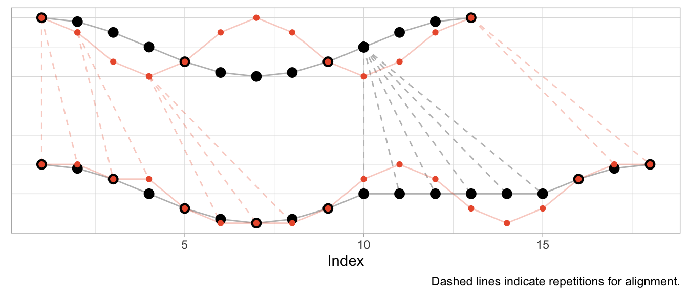
Given two time series, DTW computes aligned versions of the time series to minimize the cumulative distance between the aligned observations. The alignment procedure repeats some of the observations to reduce the resulting distance. The aligned time series end up with more observations than in the original versions, but the aligned versions still have to have the same start and end, no observation may be dropped, and the order of observations must be unchanged.
But the best way to understand the alignment is to visualize it.
Aligning a Shift
To start, I’ll use an example where DTW can compute a near perfect alignment: That of a cosine curve and a shifted cosine curve—which is just a sine curve.1 For each of the curves, we observe 12 observations per period, and 13 observations in total.
series_sine <- sinpi((0:12) / 6)
series_cosine <- cospi((0:12) / 6)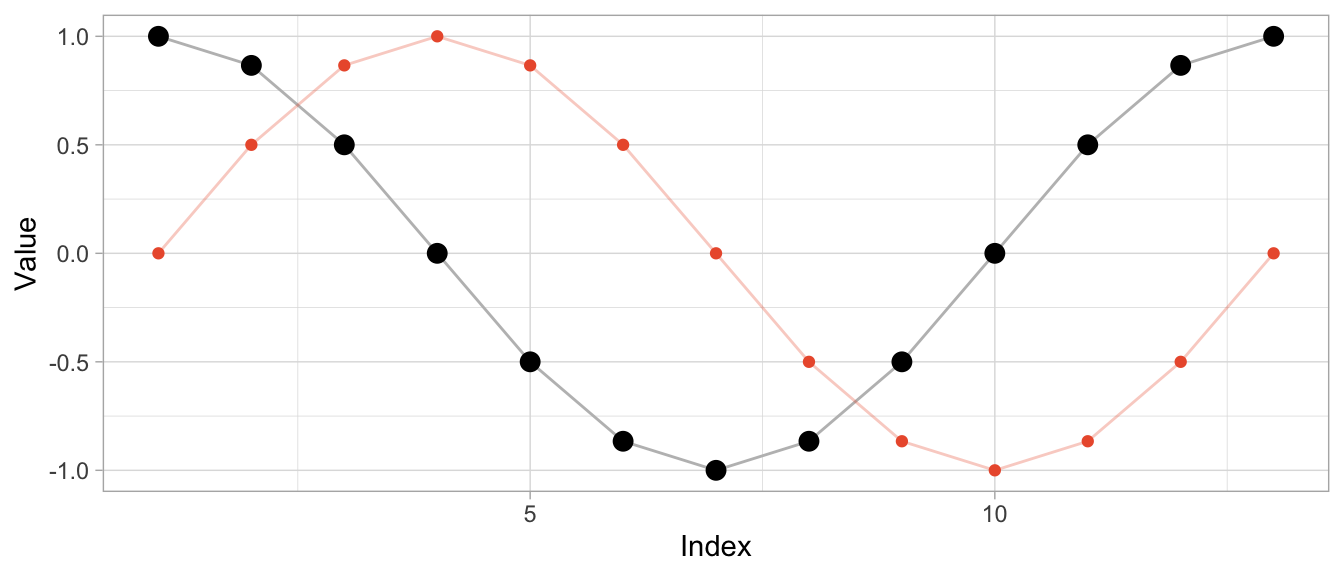
To compute the aligned versions, I use the DTW implementation of the dtw package (also available for Python as dtw-python) with default parameters.
library(dtw)
dtw_shift <- dtw::dtw(x = series_sine, y = series_cosine)
Besides returning the distance of the aligned series, DTW produces a mapping of original series to aligned series in the form of alignment vectors dtw_shift$index1 and dtw_shift$index2. Using those, I can visualize both the original time series and the aligned time series along with the repetitions used for alignment.
# DTW returns a vector of indices of the original observations
# where some indices are repeated to create aligned time series
dtw_shift$index2
## [1] 1 1 1 1 2 3 4 5 6 7 8 9 10 11 12 13# In this case, the first index is repeated thrice so that the first
# observation appears four times in the aligned time series
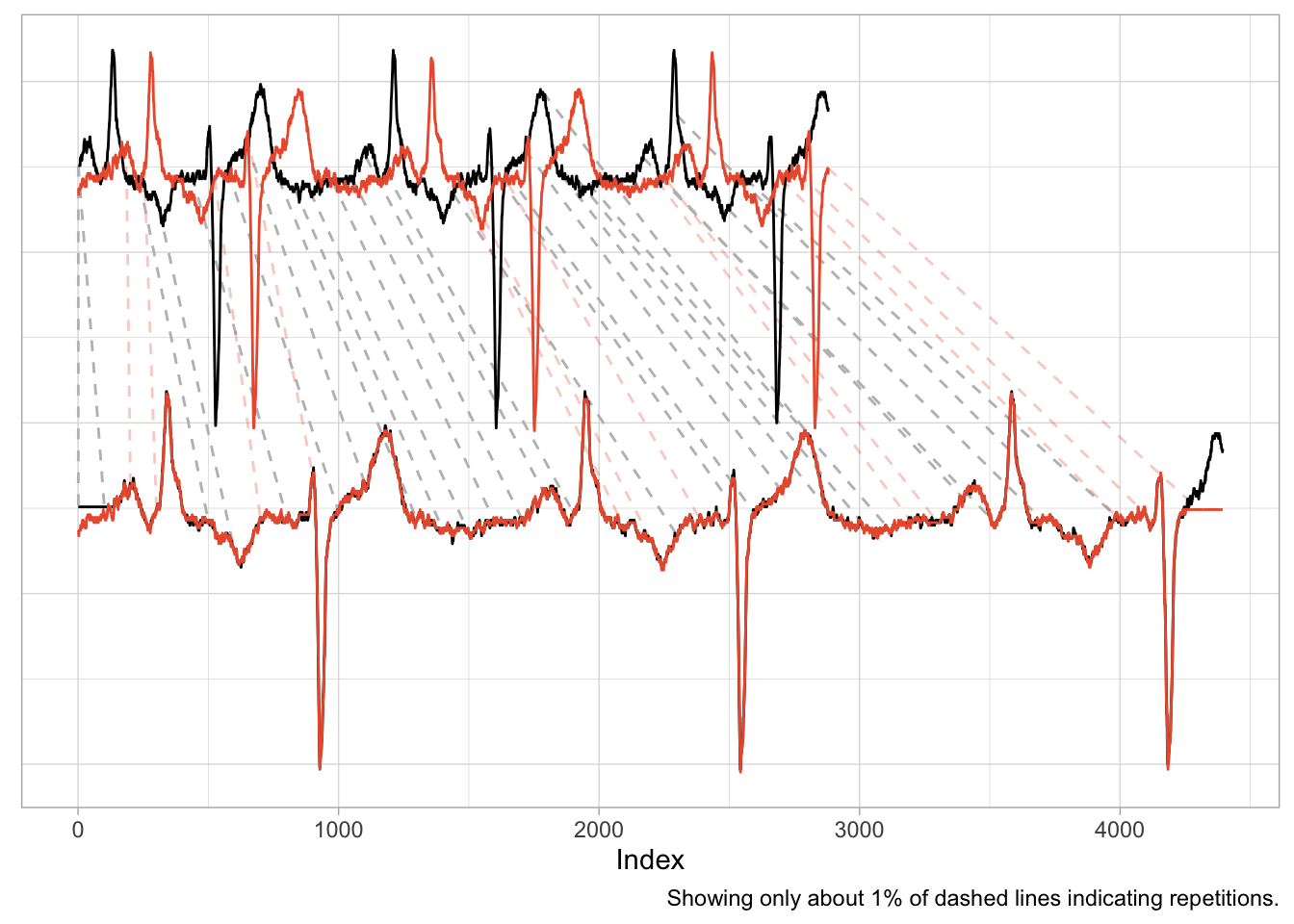
series_cosine[dtw_shift$index2] |> head(8) |> round(2)## [1] 1.00 1.00 1.00 1.00 0.87 0.50 0.00 -0.50The plot below shows the original time series in the upper half and the aligned time series in the lower half, with the sine in orange and the cosine in black. Dashed lines indicate where observations were repeated to achieve the alignment.
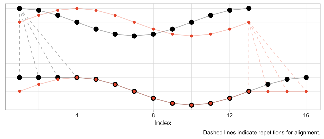
Given that the sine is a perfect shifted copy of the cosine, three-quarters of the observed period can be aligned perfectly. The first quarter of the sine and the last quarter of the cosine’s period, however, can’t be aligned and stand on their own. Their indices are mapped to the repeated observations from the other time series, respectively.
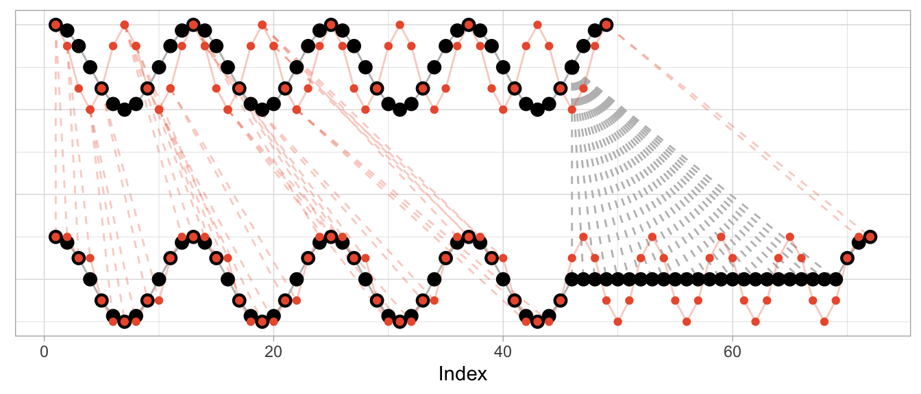
Aligning Speed
Instead of shifting the cosine, I can sample it at a different speed (or, equivalently, observe a cosine of different frequency) to construct a different time series that can be aligned well by DTW. In that case, the required alignment is not so much a shift as it is a squeezing and stretching of the observed series.
Let’s create a version of the original cosine that is twice as “fast”: In the time that we observe one period of the original cosine, we observe two periods of the fast cosine.
series_cosine_fast <- cospi((0:12) / 3)
dtw_fast <- dtw::dtw(x = series_cosine_fast, y = series_cosine)
The resulting alignment mapping looks quite different than in the first example. Under a shift, most observations still have a one-to-one mapping after alignment. Under varying frequencies, most observations of the faster time series have to be repeated to align. Note how the first half of the fast cosine’s first period can be neatly aligned with the first half of the slow cosine’s period by repeating observations (in an ideal world exactly twice).
The kind of alignment reveals itself better when the time series are observed for more than just one or two periods. Below, for longer versions of the same series, half of the fast time series can be matched neatly with the slow cosine as we observe twice the number of periods for the fast cosine.
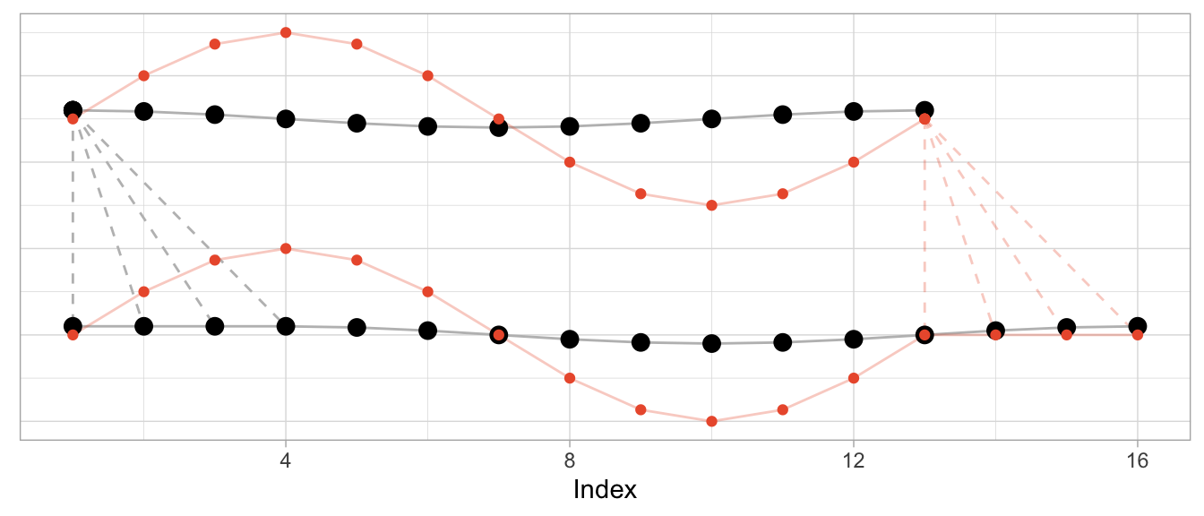
Aligning Different Scales
What’s perhaps unexpected, though, is that the alignment works only on the time dimension. Dynamic time warping will not scale the time series’ amplitude. But at the same time DTW is not scale independent. This can make the alignment fairly awkward when time series have varying scales as DTW exploits the time dimension to reduce the cumulative distance of observations in the value dimension.
To illustrate this, let’s take the sine and cosine from the first example but scale the sine’s amplitude by 5 and check the resulting alignment.
series_sine_scaled <- series_sine * 10
dtw_scaled <- dtw::dtw(x = series_sine_scaled, y = series_cosine)
We might expect DTW to align the two series as it did in the first example above with unscaled series. After all, the series have the same frequencies as before and the same period shift as before.
This is what the alignment would look like using the alignment vectors from the first example above based on un-scaled observations. While it’s a bit hard to see due to the different scales, the observations at peak amplitude are aligned (e.g., indices 4, 10, 16) as are those at the minimum amplitude (indices 7 and 13).
But Dynamic Time Warping’s optimization procedure doesn’t actually try to identify characteristics of time series such as their period length to align them. It warps time series purely to minimize the cumulative distance between aligned observations. This may lead to a result in which also the periodicity is aligned as in the first and second examples above. But that’s more by accident than by design.
This is how DTW actually aligns the scaled sine and the unscaled cosine:
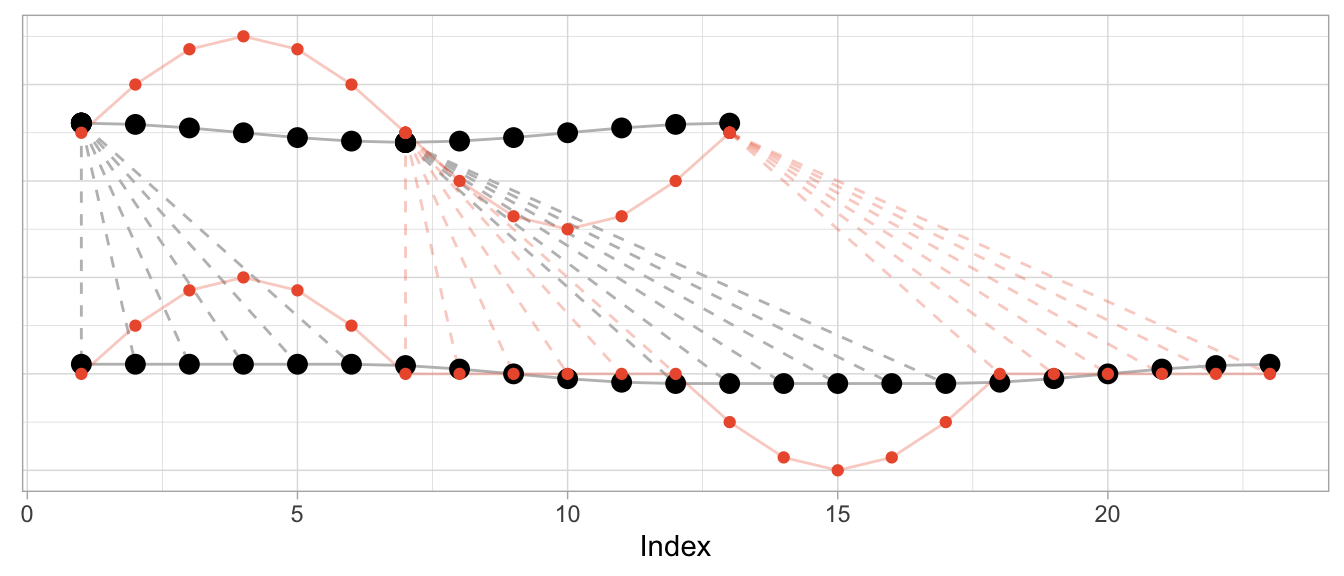
The change in the series’ amplitude leads to a more complicated alignment: Observations at the peak amplitude of the cosine (which has the small amplitude) are repeated many times to reduce the Euclidean distance to the already high amplitude observations of the sine. Reversely, the minimum-amplitude of the sine is repeated many times to reduce the Euclidean distance to the already low amplitude observations of the cosine.
DTW Is Good at Many Things…
Dynamic time warping is great when you’re observing physical phenomena that are naturally shifted in time or at different speeds.
Consider, for example, measurements taken in a medical context such as those of an electrocardiogram (ECG) that measures the electrical signals in a patient’s heart. In this context, it is helpful to align time series to identify similar heart rhythms across patients. The rhythms’ periods could be aligned to check whether one patient has the same issues as another. Even for the same person a DTW can be useful to align measurements taken on different days at different heart rates.
data("aami3a") # ECG data included in `dtw` package
dtw_ecg <- dtw::dtw(
  x = as.numeric(aami3a)[1:2880],
  y = as.numeric(aami3a)[40001:42880]
)
An application such as this one is nearly identical to the first example of the shifted cosine. And as the scale of the time series is naturally the same across the two series, the alignment works well, mapping peaks and valleys with minimal repetitions.
There is also a natural interpretation to the alignment, namely that we are aligning the heart rhythm across measurements. A large distance after alignment would indicate differences in rhythms.
…But Comparing Sales Ain’t One of Them
It is enticing to use Dynamic Time Warping in a business context, too. Not only does it promise a better distance metric to identify time series that are “similar” and to separate them from those that are “different”, but it also has a cool name. Who doesn’t want to warp stuff?
We can, for example, warp time series that count the number of times products are used for patients at a hospital per month. Not exactly product sales but sharing the same characteristics. The data comes with the expsmooth package.
set.seed(47772)
sampled_series <- sample(x = ncol(expsmooth::hospital), size = 2)
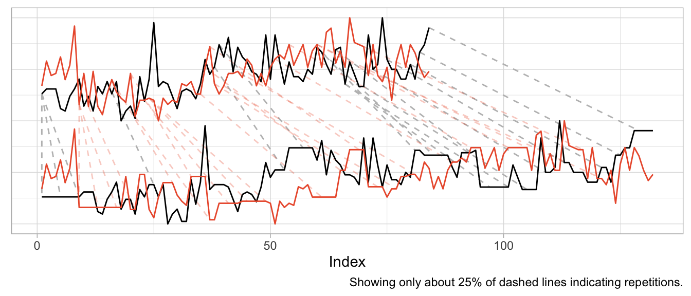
product_a <- as.numeric(expsmooth::hospital[,sampled_series[1]])
product_b <- as.numeric(expsmooth::hospital[,sampled_series[2]])While product_b is used about twice as often as product_a, both products exhibit an increase in their level at around index 40 which is perhaps one characteristic that makes them similar or at least more similar compared to a series that doesn’t share this increase.
However, the warped versions exhibit a lot of unwanted repetitions of observations. Given the different level of the products, this should not come as a surprise.
dtw_products_ab <- dtw::dtw(x = product_b, y = product_a)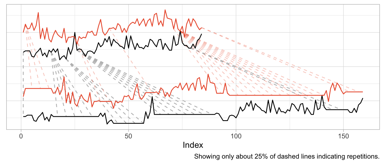
We can mostly fix this by min-max scaling the series, forcing their observations onto the same range of values.
dtw_products_ab_standardized <- dtw::dtw(
  x = (product_b - min(product_b)) / (max(product_b) - min(product_b)),
  y = (product_a - min(product_a)) / (max(product_a) - min(product_a))
)
While we got rid of the unwanted warping artifacts in the form of extremely long repetitions of the same observation, the previous plot should raise some questions:
- How can we interpret the modifications for “improved” alignment?
- Are we aligning just noise?
- What does the warping offer us that we didn’t already have before?
If you ask me, there is no useful interpretation to the alignment modifications, because the time series already were aligned. Business time series are naturally aligned by the point in time at which they are observed.2
We also are not taking measurement of a continuous physical phenomenon that goes up and down like the electric signals in a heart. While you can double the amount of ECG measurements per second, it does not make sense to “double the amount of sales measurements per month”. And while a product can “sell faster” than another, this results in an increased amplitude not an increased frequency (or shortened period lengths).
So if you apply Dynamic Time Warping to business time series, you will mostly be warping random fluctuations with the goal of reducing the cumulative distance just that tiny bit more.
This holds when you use Dynamic Time Warping to derive distances for clustering of business time series, too. You might as well calculate the Euclidean distance3 on the raw time series without warping first. At least then the distance between time series will tell you that they were similar (or different) at the same point in time.
In fact, if you want to cluster business time series (or train any kind of model on them), put your focus on aligning them well in the value dimension by thinking carefully about how you standardize them. That makes all the difference.
Before using Dynamic Time Warping, ask yourself: What kind of similarity are you looking for when comparing time series? Will there be meaning to the alignment that Dynamic Time Warping induces in your time series? And what is it that you can do after warping that you weren’t able to do before?
A similar example is also used by the
dtwpackage in its documentation.↩︎Two exceptions come to mind: First, you may want to align time series of products by the first point in time at which the product was sold. But that’s straightforward without DTW. Second, you may want to align products that actually exhibit a shift in their seasonality—such as when a product is heavily affected by the seasons and sold in both the northern and southern hemisphere. DTW might be useful for this, but there might also be easier ways to accomplish it.↩︎
Or Manhattan distance, or any other distance.↩︎
2023/12/03
Comes with Anomaly Detection Included
A powerful pattern in forecasting is that of model-based anomaly detection during model training. It exploits the inherently iterative nature of forecasting models and goes something like this:
- Train your model up to time step
tbased on data[1,t-1] - Predict the forecast distibution at time step
t - Compare the observed value against the predicted distribution at step
t; flag the observation as anomaly if it is in the very tail of the distribution - Don’t update the model’s state based on the anomalous observation
For another description of this idea, see, for example, Alexandrov et al. (2019).
Importantly, you use your model to detect anomalies during training and not after training, thereby ensuring its state and forecast distribution are not corrupted by the anomalies.
The beauty of this approach is that
- the forecast distribution can properly reflect the impact of anomalies, and
- you don’t require a separate anomaly detection method with failure modes different from your model’s.
In contrast, standalone anomaly detection approaches would first have to solve the handling of trends and seasonalities themselves, too, before they could begin to detect any anomalous observation. So why not use the model you already trust with predicting your data to identify observations that don’t make sense to it?
This approach can be expensive if your model doesn’t train iteratively over observations in the first place. Many forecasting models1 do, however, making this a fairly negligiable addition.
But enough introduction, let’s see it in action. First, I construct a simple time series y of monthly observations with yearly seasonality.
set.seed(472)
x <- 1:80
y <- pmax(0, sinpi(x / 6) * 25 + sqrt(x) * 10 + rnorm(n = 80, sd = 10))

# Insert anomalous observations that need to be detected
y[c(55, 56, 70)] <- 3 * y[c(55, 56, 70)]
To illustrate the method, I’m going to use a simple probabilistic variant of the Seasonal Naive method where the forecast distribution is assumed to be Normal with zero mean. Only the \(\sigma\) parameter needs to be fitted, which I do using the standard deviation of the forecast residuals.
The estimation of the \(\sigma\) parameter occurs in lockstep with the detection of anomalies. Let’s first define a data frame that holds the observations and will store a cleaned version of the observations, the fitted \(\sigma\) and detected anomalies…
df <- data.frame(
  y = y,
  y_cleaned = y,
  forecast = NA_real_,
  residual = NA_real_,
  sigma = NA_real_,
  is_anomaly = FALSE
)
… and then let’s loop over the observations.
At each iteration, I first predict the current observation given the past and update the forecast distribution by calculating the standard deviation over all residuals that are available so far, before calculating the latest residual.
If the latest residual is in the tails of the current forecast distribution (i.e., larger than multiples of the standard deviation), the observation is flagged as anomalous.
For time steps with anomalous observations, I update the cleaned time series with the forecasted value (which informs a later forecast at step t+12) and set the residual to missing to keep the anomalous observation from distorting the forecast distribution.
# Loop starts when first prediction from Seasonal Naive is possible
for (t in 13:nrow(df)) {
  df$forecast[t] <- df$y_cleaned[t - 12]
  df$sigma[t] <- sd(df$residual, na.rm = TRUE)
  df$residual[t] <- df$y[t] - df$forecast[t]

  if (t > 25) {
    # Collect 12 residuals before starting anomaly detection
    df$is_anomaly[t] <- abs(df$residual[t]) > 3 * df$sigma[t]
  }

  if (df$is_anomaly[t]) {
    df$y_cleaned[t] <- df$forecast[t]
    df$residual[t] <- NA_real_
  }
}
Note that I decide to start the anomaly detection not before there are 12 residuals for one full seasonal period, as the \(\sigma\) estimate based on less than a handful of observations can be flaky.
In a plot of the results, the combination of 1-step-ahead prediction and forecast distribution is used to distinguish between expected and anomalous observations, with the decision boundary indicated by the orange ribbon. At time steps where the observed value falls outside the ribbon, the orange line indicates the model prediction that is used to inform the model’s state going forward in place of the anomaly.
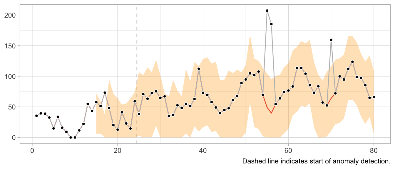
Note how the prediction at time t is not affected by the anomaly at time step t-12. Neither is the forecast distribution estimate.
This would look very different when one gets the update behavior slightly wrong. For example, the following implementation of the loop detects the first anomaly in the same way, but uses it to update the model’s state, leading to subsequently poor predictions and false positives, and fails to detect later anomalies.
# Loop starts when first prediction from Seasonal Naive is possible
for (t in 13:nrow(df)) {
  df$forecast[t] <- df$y[t - 12]
  df$sigma[t] <- sd(df$residual, na.rm = TRUE)
  df$residual[t] <- df$y[t] - df$forecast[t]

  if (t > 25) {
    # Collect 12 residuals before starting anomaly detection
    df$is_anomaly[t] <- abs(df$residual[t]) > 3 * df$sigma[t]
  }

  if (df$is_anomaly[t]) {
    df$y_cleaned[t] <- df$forecast[t]
  }
}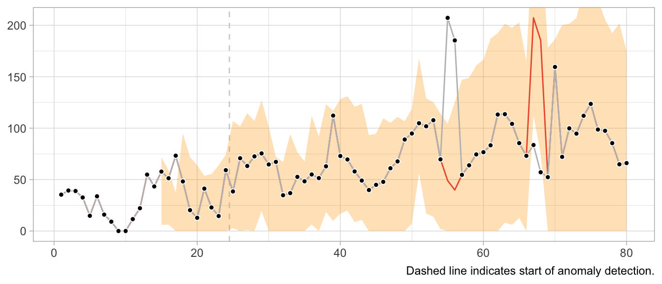
What about structural breaks?
While anomaly detection during training can work well, it may fail spectacularly if an anomaly is not an anomaly but the start of a structural break. Since structural breaks make the time series look different than it did before, chances are the first observation after the structural break will be flagged as anomaly. Then so will be the second. And then the third. And so on, until all observations after the structural break are treated as anomalies because the model never starts to adapt to the new state.
This is particularly frustrating because the Seasonal Naive method is robust against certain structural breaks that occur in the training period. Adding anomaly detection makes it vulnerable.
What values to use for the final forecast distribution?
Let’s get philosophical for a second. What are anomalies?
Ideally, they reflect a weird measurement that will never occur again. Or if it does, it’s another wrong measurement—but not the true state of the measured phenomenon. In that case, let’s drop the anomalies and ignore them in the forecast distribution.
But what if the anomalies are weird states that the measured phenomenon can end up in? For example, demand for subway rides after a popular concert. While perhaps an irregular and rare event, a similar event may occur again in the future. Do we want to exclude that possibility from our predictions about the future? What if the mention of a book on TikTok let’s sales spike? Drop the observation and assume it will not repeat? Perhaps unrealistic.
It depends on your context. In a business context, where measurement errors might be less of an issue, anomalies might need to be modeled, not excluded.
Notably models from the state-space model family.↩︎
2023/11/12
Code Responsibly
There exists this comparison of software before and software after machine learning.
Before machine learning, code was deterministic: Software engineers wrote code, the code included conditions with fixed thresholds, and at least in theory the program was entirely understandable.
After machine learning, code is no longer deterministic. Instead of software engineers instantiating it, the program’s logic is determined by a model and its parameters. Those parameters are not artisinally chosen by a software engineer but learned from data. The program becomes a function of data, and in some cases incomprehensible to the engineer due to the sheer number of parameters.
Given the current urge to regulate AI and making its use responsible and trustworthy, humans appear to expect machine learning models to introduce an obscene number of bugs into software. Perhaps humans underestimate the ways in which human programmers can mess up.
For example, when I hear Regulate AI, all I can think is Have you seen this stuff? By Pierluigi Bizzini for Algorithm Watch1 (emphasis mine):
The algorithm evaluates teachers' CVs and cross-references their preferences for location and class with schools' vacancies. If there is a match, a provisional assignment is triggered, but the algorithm continues to assess other candidates. If it finds another matching candidate with a higher score, that second candidate moves into the lead. The process continues until the algorithm has assessed all potential matches and selected the best possible candidate for the role.
[…] [E]rrors have caused much confusion, leaving many teachers unemployed and therefore without a salary. Why did such errors occur?
When the algorithm finds an ideal candidate for a position, it does not reset the list of remaining candidates before commencing the search to fill the next vacancy. Thus, those candidates who missed out on the first role that matched their preferences are definitively discarded from the pool of available teachers, with no possibility of employment. The algorithm classes those discarded teachers as “drop-outs”, ignoring the possibility of matching them with new vacancies.
This is not AI gone rogue. This is just a flawed human-written algorithm. At least Algorithm Watch is aptly named Algorithm Watch.
Algorithms existed before AI.2 But there was no outcry, no regulation of algorithms before AI, no “Proposal for a Regulation laying down harmonised rules on artificial intelligence”. Except there actually is regulation in aviation and medical devices and such.3 Perhaps because of the extent to which these fields are entangled with hardware, posing unmediated danger to human lives.
Machine learning and an increased prowess in data processing have not introduced more bugs into software compared to software written by humans previously. What they have done is to enable applications for software that were previously infeasible by way of processing and generating data.
Some of these applications are… not great. They should never be done. Regulate those applications. By all means, prohibit them. If a use case poses unacceptable risks, when we can’t tolerate any bugs but bugs are always a possibility, then let’s just not do it.
Other applications are high-risk, high-reward. Given large amounts of testing imposed by regulation, we probably want software to enable these applications. The aforementioned aviation and medical devices come to mind.4 Living with regulated software is nothing new!
Then there is the rest that doesn’t really harm anyone where people can do whatever.
Regulating software in the context of specific use cases is feasible and has precedents.
Regulating AI is awkward. Where does the if-else end and AI start? Instead, consider it part of software as a whole and ask in which cases software might have flaws we are unwilling to accept.
We need responsible software, not just responsible AI.
-
I tried to find sources for the description of the bug provided in the article, but couldn’t find any. I don’t know where the author takes them from, so take this example with the necessary grain of salt. ↩︎
-
Also, much of what were algorithms or statistics a few years ago are now labeled as AI. And large parts of AI systems are just if statements and for loops and databases and networking. ↩︎
-
Regulation that the EU regulation of artificial intelligence very much builds upon. See “Demystifying the Draft EU Artificial Intelligence Act” (https://arxiv.org/abs/2107.03721) for more on the connection to the “New Legislative Framework”. ↩︎
-
Perhaps this is the category for autonomous driving? ↩︎
2023/10/19
A Flexible Model Family of Simple Forecast Methods
Introducing a flexible model family that interpolates between simple forecast methods to produce interpretable probabilistic forecasts of seasonal data by weighting past observations. In business forecasting applications for operational decisions, simple approaches are hard-to-beat and provide robust expectations that can be relied upon for short- to medium-term decisions. They’re often better at recovering from structural breaks or modeling seasonal peaks than more complicated models, and they don’t overfit unrealistic trends.
2023/10/05
Video: Tim Januschowski, ISF 2023 Practitioner Speaker
∞
We don’t have enough presentations of industry practitioners discussing the detailed business problems they’re addressing and what solutions and trade-offs they were able to implement. Tim Januschoswki did just that, though, in his presentation at the International Symposium on Forecasting 2023. He discusses demand forecasting for optimal pricing at Zalando.
Presentations such as this one are rare opportunites to peak at the design of real world solutions. My favorite quote:
What we’re not using that might be also interesting is weather data. My business counterparts, they always, you know, make me aware of that fact. But we’re not using it.
2023/09/11
‘ECB Must Accept Forecasting Limitations to Restore Trust’
∞
Christine Lagarde, president of the European Central Bank, declared her intent to communicate the shortcomings of the ECB’s forecasts better—and in doing so, provides applied data science lessons for the rest of us. As quoted by the Financial Times:
“Even if these [forecast] errors were to deplete trust, we can mitigate this if we talk about forecasts in a way that is both more contingent and more accessible, and if we provide better explanations for those errors,” Lagarde said.
2023/05/31
In Search of Verifiability: Explanations Rarely Enable Complementary Performance in AI-Advised Decision Making
∞
Raymond Fok and Daniel S. Weld in a recent Arxiv preprint:
We argue explanations are only useful to the extent that they allow a human decision maker to verify the correctness of an AI’s prediction, in contrast to other desiderata, e.g., interpretability or spelling out the AI’s reasoning process.
This does ring true to me: Put yourself into the position of an employee of Big Company Inc. whose task it is to allocate marketing budgets, to purchase product inventory, or to perform any other monetary decision as part of a business process. Her dashboard, powered by a data pipeline and machine learning model, suggests to increase TV ad spend in channel XYZ, or to order thousands of units of a seasonal product to cover the summer.
In her shoes, if you had to sign the check, what let’s you sleep at night: Knowing the model’s feature importances, or having verified the prediction’s correctness?
I’d prefer the latter, and the former only so much as it helps in the pursuit of verification. Feature importance alone, it is argued however, can’t determine correctness:
Here, we refer to verification of an answer as the process of determining its correctness. It follows that many AI explanations fundamentally cannot satisfy this desideratum […] While feature importance explanations may provide some indication of how much each feature influenced the AI’s decision, they typically do not allow a decision maker to verify the AI’s recommendation.
We want verifiability, but we cannot have it for most relevant supervised learning problems. The number of viewers of the TV ad are inherently unknown at prediction time, as is the demand for the seasonal product. These applications are in stark contrast to the maze example the authors provide, in which the explanation method draws the proposed path through the maze.
If verifiability is needed to complement human decision making, then this might be why one can get the impression of explanation washing of machine learning systems: While current explanation methods are the best we can do, they fall short of what is really needed to trust a system’s recommendation.
What can we do instead? We could start by showing the actual data alongside the recommendation. Making the data explorable. The observation in question can be put into the context of observations from the training data for which labels exist, essentially providing case-based explanations.
Ideally, any context provided to the model’s recommendation is not based on another model that adds another layer to be verified, but on hard actuals.
In the case of forecasting, simply visualizing the forecast alongside the historical observations can be extremely effective at establishing trust. When the time series is stable and shows clear patterns, a human actually can verify the the forecast’s correctness up to a point. And a human easily spots likely incorrect forecasts given historical data.
The need for verifiability makes me believe in building data products, not just a model.
2023/05/29
Explainability Washing
∞
Upol Ehsan ponders on Mastodon:
Explainable AI suffers from an epidemic. I call it Explainability Washing. Think of it as window dressing–techniques, tools, or processes created to provide the illusion of explainability but not delivering it.
Ah yes, slapping feature importance values onto a prediction and asking your users “Are you not entertained?”.
This thread pairs well with Rick Saporta’s presentation. Both urge you to focus solely on your user’s decision when deciding what to build.
2023/05/29
A Framework for Data Product Management for Increasing Adoption & User Love
∞
You might have heard this one before: To build successful data products, focus on the decisions your customers make. But when was the last time you considered “how your work get[s] converted into action”?
At Data Council 2023, Rick Saporta lays out a framework of what data products to build and how to make them successful with customers. He goes beyond the platitudes, his advice sounds hard-earned.
Slides are good, talk is great.
2023/05/20
The 2-by-2 of Forecasting
False Positives and False Negatives are traditionally a topic in classification problems only. Which makes sense: There is no such thing as a binary target in forecasting, only a continuous range. There is no true and false, only a continuous scale of wrong. But there lives an MBA student in me who really likes 2-by-2 charts, so let’s come up with one for forecasting.
The {True,False}x{Positive,Negative} confusion matrix is the one opportunity for university professors to discuss the stakeholders of machine learning systems. The fact that a stakeholder might care more about reducing the number of False Positives and thus accepting a higher rate of False Negatives. Certain errors are more critical than others. That’s just as much the case in forecasting.
To construct the 2-by-2 of forecasting, the obvious place to start is the sense of “big errors are worse”. Let’s put that on the y-axis.

This gives us the False and “True” equivalents of forecasting. The “True” is in quotes because any deviation from the observed value is some error. But for the sake of the 2-by-2, let’s call small errors “True”.
Next, we need the Positive and Negative equivalents. When talking about stakeholder priorities, Positive and Negative differentiate the errors that are Critical from those that are Acceptable. Let’s put that on the x-axis.

While there might be other ways to define criticality1, human perception of time series forecastability comes up as soon as users of your product inspect your forecasts. The human eye will detect apparent trends and seasonal patterns and project them into the future. If your model does not, and wrongly so, it raises confusion instead. Thus, forecasts of series predictable by humans will be critized, while forecasts of series with huge swings and more noise than signal are easily acceptable.
To utilize this notion, we require a model of human perception of time series forecastability. In a business context, where seasonality may be predominant, the seasonal naive method captures much of what is modelled by the human eye. It is also inherently conservative, as it does not overfit to recent fluctuations or potential trends. It assumes business will repeat as it did before.
Critical, then, are forecasts of series that the seasonal naive method, or any other appropriate benchmark, predicts with small error, while Acceptable are any forecasts of series that the seasonal naive method predicts poorly. This completes the x-axis.

With both axes defined, the quadrants of the 2-by-2 emerge. Small forecast model erros are naturally Acceptable True when the benchmark model fails, and large forecast model errors are Acceptable False when the benchmark model also fails. Cases of series that feel predictable and are predicted well are Critical True. Lastly, series that are predicted well by a benchmark but not by the forecast model are Critical False.
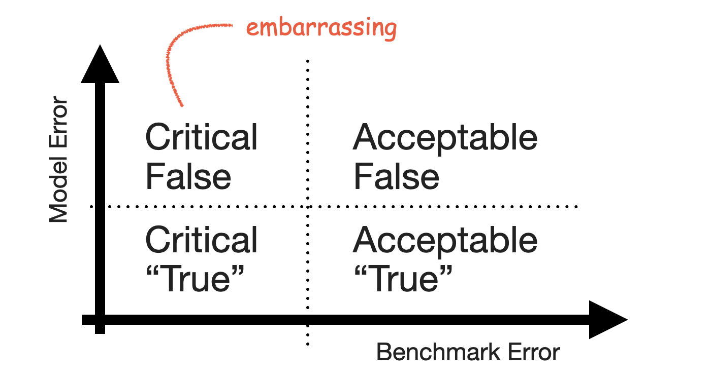
The Critical False group contains the series for which users expect a good forecast because they themselves can project the series into the future—but your model fails to deliver that forecast and does something weird instead. It’s the group of forecasts that look silly in your tool, the ones that cause you discomfort when users point them out.
Keep that group small.
-
For example, the importance of a product to the business as measured by revenue. ↩︎
2023/03/25
Bayesian Intermittent Demand Forecasting at NeurIPS 2016
∞
Oldie but a goodie: A recording of Matthias Seeger’s presentation of “Bayesian Intermittent Demand Forecasting for Large Inventories” at NeurIPS 2016. The corresponding paper is a favorite of mine, but I only now stumbled over the presentation. It sparked an entire catalogue of work on time series forecasting by Amazon, and like few others called out the usefulness of sample paths.
2023/02/26
On the Factory Floor
∞
What works at Google-scale is not the pattern most data scientists need to employ at their work. But the paper “On the Factory Floor: ML Engineering for Industrial-Scale Ads Recommendation Models” is the kind of paper that we need more of: Thrilling reports of what works in practice.
Also, the authors do provide abstract lessons anyone can use, such as considering the constraints of your problem rather than using whatever is state-of-the-art:
A major design choice is how to represent an ad-query pair x. The semantic information in the language of the query and the ad headlines is the most critical component. Usage of attention layers on top of raw text tokens may generate the most useful language embeddings in current literature [64], but we find better accuracy and efficiency trade-offs by combining variations of fully-connected DNNs with simple feature generation such as bi-grams and n-grams on sub-word units. The short nature of user queries and ad headlines is a contributing factor. Data is highly sparse for these features, with typically only a tiny fraction of non-zero feature values per example.
2023/01/08
SAP Design Guidelines for Intelligent Systems
∞
From SAP’s Design Guidelines for Intelligent Systems:
High–stakes decisions are more common in a professional software environment than in everyday consumer apps, where the consequences of an action are usually easy to anticipate and revert. While the implications of recommending unsuitable educational content to an employee are likely to be minimal, recommendations around critical business decisions can potentially cause irreversible damage (for example, recommending an unreliable supplier or business partner, leading to the failure or premature termination of a project or contract). It’s therefore vital to enable users to take an informed decision.
While sometimes overlooked, this guide presents software in internal business processes as rich opportunity to augment human capabilities, deserving just as much love and attention as “everyday consumer apps”.
The chapters on intelligent systems are not too tuned to SAP systems, but they do have the specific context of business applications in mind which differentiates them from other (great!) guides on user interfaces for machine learning systems.
Based on that context, the guide dives deep on Ranking, Recommendations, and Matching, proving that it’s based on a much more hands-on view than any text discussing Supervised, Unsupervised, and Reinforcement Learning.
When aiming to build systems that “augment human capabilities”, the importance of “gain[ing] the user’s trust and foster[ing] successful adoption” can’t be overstated, making it worthwhile to deeply consider how we present the output of our systems.
Related: Formalizing Trust in Artificial Intelligence: Prerequisites, Causes and Goals of Human Trust in AI by Alon Jacovi, Ana Marasović, Tim Miller, and Yoav Goldberg.
2023/01/02
Skillful Image Fast-Forwarding
∞
Russel Jacobs for Slate on the discontinued Dark Sky weather app, via Daring Fireball:
Indeed, Dark Sky’s big innovation wasn’t simply that its map was gorgeous and user-friendly: The radar map was the forecast. Instead of pulling information about air pressure and humidity and temperature and calculating all of the messy variables that contribute to the weather–a multi-hundred-billion-dollars-a-year international enterprise of satellites, weather stations, balloons, buoys, and an army of scientists working in tandem around the world (see Blum’s book)–Dark Sky simply monitored changes to the shape, size, speed, and direction of shapes on a radar map and fast-forwarded those images. “It wasn’t meteorology,” Blum said. “It was just graphics practice.”
Reminds me of DeepMind’s “Skilful precipitation nowcasting using deep generative models of radar”.
2022/12/09
ChatGPT and ML Product Management
Huh, look at that, OpenAI’s ChatGPT portrays absolute confidence while giving plain wrong answers. But ChatGPT also does provide helpful responses a large number of times. So one kind of does want to use it. Sounds an awful lot like every other machine learning model deployed in 2022. But really, how do we turn fallible machine learning models into products to be used by humans? Not by injecting its answers straight into StackOverflow.
2022/09/28
GluonTS Workshop at Amazon Berlin on September 29
∞
The workshop will revolve around tools that automatically transform your data, in particular time series, into high-quality predictions based on AutoML and deep learning models. The event will be hosted by the team at AWS that develops AutoGluon, Syne Tune and GluonTS, and consist of a mix of tutorial-style presentation on the tools, discussion, and contributions from external partners on their applications.
Unique opportunity to hear from industry practitioners and GluonTS developers in person or by joining online.
2022/09/14
Design a System, not an “AI”
∞
Ryxcommar on Twitter:
I think one of the bigger mistakes people make when designing AI powered systems is seeing them as an AI first and foremost, and not as a system first and foremost.
Once you have your API contracts in place, the AI parts can be seen as function calls inside the system. Maybe your first version of these functions just return an unconditional expected value. But the system is the bulk of the work, the algorithm is a small piece.
To me, this is why regulation of AI (in contrast to regulation of software generally) can feel misguided: Any kind of function within a system has the potential to be problematic. It doesn’t have to use matrix multiplication for that to be the case.
More interestingly though, this is why it’s so effective to start with a simple model. It provides the function call around which you can build the system users care about.
Some free advice for data scientists– every time I have seen people treat their systems primarily as AI and not as systems, both the AI and the system suffered for it. Don’t make that mistake; design a system, not an “AI.”
2022/09/06
Berlin Bayesians Meetup on September 27
∞
The Berlin Bayesians meetup is happening again in-person. Juan Orduz is going to present Buy ‘Til You Die models implemented in PyMC:
In this talk, we introduce a certain type of customer lifetime models for the non-contractual setting commonly known as BTYD (Buy Till You Die) models. We focus on two sub-model components: the frequency BG/NBD model and the monetary gamma-gamma model. We begin by introducing the model assumptions and parameterizations. Then we walk through the maximum-likelihood parameter estimation and describe how the models are used in practice. Next, we describe some limitations and how the Bayesian framework can help us to overcome some of them, plus allowing more flexibility. Finally, we describe some ongoing efforts in the open source community to bring these new ideas and models to the public.
Buy ‘Til You Die models for the estimation of customer lifetime value were one of the first applications I worked on in my data science career, I’m glad to see they’re still around and kicking. Now implemented in the shiny new version of PyMC!
Edit: The event was rescheduled to September 27.
2022/08/31
Legible Forecasts, and Design for Contestability
Some models are inherently interpretable because one can read their decision boundary right off them. In fact, you could call them interpreted as there is nothing left for you to interpret: The entire model is written out for you to read. For example, assume it’s July and we need to predict how many scoops of ice cream we’ll sell next month. The Seasonal Naive method tells us: AS 12 MONTHS AGO IN August, PREDICT sales = 3021.
2022/08/30
Where Is the Seasonal Naive Benchmark?
Yesterday morning, I retweeted this tweet by sklearn_inria that promotes a scikit-learn tutorial notebook on time-related feature engineering. It’s a neat notebook that shows off some fantastic ways of creating features to predict time series within a scikit-learn pipeline. There are, however, two things that irk me: All features of the dataset including the hourly weather are passed to the model. I don’t know the details of this dataset, but skimming what I believe to be its description on the OpenML repository, I suspect this might introduce data leakage as in reality we can’t know the exact hourly humidity and temperature days in advance.
2022/07/25
When Quantiles Do Not Suffice, Use Sample Paths Instead
I don’t need to convince you that you should absolutely, to one hundred percent, quantify your forecast uncertainty—right? We agree about the advantages of using probabilistic measures to answer questions and to automate decision making—correct? Great. Then let’s dive a bit deeper. So you’re forecasting not just to fill some numbers in a spreadsheet, you are trying to solve a problem, possibly aiming to make optimal decisions in a process concerned with the future.
2022/07/11
Be Skeptical of the t-SNE Bunny
∞
Matt Henderson on Twitter (click through for the animation):
Be skeptical of the clusters shown in t-SNE plots! Here we run t-SNE on a 3d shape - it quickly invents some odd clusters and structures that aren’t really present in the original bunny.
What would happen if every machine learning method would come with a built-in visualization of the spurious results that it found?
Never mind the the answer to that question. I think that this dimensionality reduction of a 3D bunny into two dimensions isn’t even all that bad—the ears are still pretty cute. And it’s not like the original data had a lot more global and local structure once you consider that the bunny is not much more than noise in the shape of a rectangle with two ears that human eyes ascribe meaning to.
I’m the first to admit that t-SNE, UMAP, and all kinds of other methods will produce clusters from whatever data you provide. But so will k-means always return k clusters. One shouldn’t trust any model without some kind of evaluation of its results.
If you don’t take them at face value, UMAP and Co. can be powerful tools to explore data quickly and interactively. Look no further than the cool workflows Vincent Warmerdam is building for annotating text.
2022/07/05
Failure Modes of State Space Models
State space models are great, but they will fail in predictable ways. Well, claiming that they “fail” is a bit unfair. They actually behave exactly as they should given the input data. But if the input data fails to adhere to the Normal assumption or lacks stationarity, then this will affect the prediction derived from the state space models in perhaps unexpected yet deterministic ways. This article ensures that none of us is surprised by these “failure modes”.
2021/12/29
Approach to Estimate Uncertainty Distributions of Walmart Sales
∞
We present our solution for the M5 Forecasting - Uncertainty competition. Our solution ranked 6th out of 909 submissions across all hierarchical levels and ranked first for prediction at the finest level of granularity (product-store sales, i.e. SKUs). The model combines a multi-stage state-space model and Monte Carlo simulations to generate the forecasting scenarios (trajectories). Observed sales are modelled with negative binomial distributions to represent discrete over-dispersed sales. Seasonal factors are hand-crafted and modelled with linear coefficients that are calculated at the store-department level.
The approach chosen by this team of prior Lokad employees hits all the sweet spots. It’s simple, yet comes 6th in a Kaggle challenge, and produces multi-horizon sample paths.
Having the write-up of a well-performing result available in this detail is great—they share some nuggets:
Considering the small search space, this optimisation is done via grid search.
Easy to do for a two-parameter model and a neat trick to get computational issues under control. Generally neat to also enforce additional prior knowledge via arbitrary constraints on the search space.
According to the M5 survey by Makridakis et al. [3], our solution had the best result at the finest level of granularity (level 12 in the competition), commonly referred to as product-store level or SKU level (Stock Keeping Unit). For store replenishment and numerous other problems, the SKU level is the most relevant level.
Good on them to point this out. Congrats!
2021/10/03
On Google Maps Directions
Google Maps and its Directions feature are the kind of data science product everyone wished they’d be building. It augments the user, enabling decision-making while driving. Directions exemplifies the difference between prediction and prescription. Google Maps doesn’t just expose data, and it doesn’t provide a raw analysis by-product like SHAP values. It processes historical and live data to predict the future and to optimize my route based on it, returning only the refined recommendations.
2021/09/01
Forecasting Uncertainty Is Never Too Large
Rob J. Hyndman gave a presentation titled “Uncertain futures: what can we forecast and when should we give up?” as part of the ACEMS public lecture series with recording available on Youtube.
He makes an often underappreciated point around minute 50 of the talk:
When the forecast uncertainty is too large to assist decision making? I don’t think that’s ever the case. Forecasting uncertainty being too large does assist decision making by telling the decision makers that the future is very uncertain and they should be planning for lots of different possible outcomes and not assuming just one outcome or another. And one of the problems we have in providing forecasts to decision makers is getting them to not focus in on the most likely outcome but to actually take into account the range of possibilities and to understand that futures are uncertain, that they need to plan for that uncertainty.
2021/08/12
What Needs to Prove True for This to Work?
Data science projects are a tricky bunch. They entice you with challenging problems and promise a huge return if successful. In contrast to more traditional software engineering projects, however, data science projects entail more upfront uncertainty: You’ll not know until you tried whether the technology is good enough to solve the problem. Consequently, a data science endeavor fails more often, or doesn’t turn out to be the smash hit you and your stakeholders expected it to be.
2021/05/02
Everything is an AI Technique
Along with their proposal for regulation of artificial intelligence, the EU published a definition of AI techniques. It includes everything, and that’s great!
From the proposal’s Annex I:
ARTIFICIAL INTELLIGENCE TECHNIQUES AND APPROACHES referred to in Article 3, point 1
- (a) Machine learning approaches, including supervised, unsupervised and reinforcement learning, using a wide variety of methods including deep learning;
- (b) Logic- and knowledge-based approaches, including knowledge representation, inductive (logic) programming, knowledge bases, inference and deductive engines, (symbolic) reasoning and expert systems;
- (c) Statistical approaches, Bayesian estimation, search and optimization methods.
Unsurprisingly, this definition and the rest of the proposal made the rounds: Bob Carpenter quipped about the fact that according to this definition, he has been doing AI for 30 years now (and that the EU feels the need to differentiate between statistics and Bayesian inference). In his newsletter, Thomas Vladeck takes the proposal apart to point out potential ramifications for applications. And Yoav Goldberg was tweeting about it ever since a draft of the document leaked.
From a data scientist’s point of view, this definition is fantastic: First, it highlights that AI is a marketing term used to sell whatever method does the job. Not including optimization as AI technique would have given everyone who called their optimizer “AI” a way to wiggle out of the regulation otherwise. This implicit acknowledgement is welcome.
Second, and more importantly, as practitioner it’s practical to have this “official” set of AI techniques in your backpocket for when someone asks what exactly AI is. The fact that one doesn’t have to use deep learning to wear the AI bumper sticker means that we can be comfortable in choosing the right tool for the job. At this point, AI refers less to a set of techniques or artificial intelligence, and more to a family of problems that are solved by one of the tools listed above.
2021/01/01
Resilience, Chaos Engineering and Anti-Fragile Machine Learning
In his interview with The Observer Effect, Tobi Lütke, CEO of Shopify, describes how Shopify benefits from resilient systems:
Most interesting things come from non-deterministic behaviors. People have a love for the predictable, but there is value in being able to build systems that can absorb whatever is being thrown at them and still have good outcomes.
So, I love Antifragile, and I make everyone read it. It finally put a name to an important concept that we practiced. Before this, I would just log in and shut down various servers to teach the team what’s now called chaos engineering.
But we’ve done this for a long, long time. We’ve designed Shopify very well because resilience and uptime are so important for building trust. These lessons were there in the building of our architecture. And then I had to take over as CEO.
It sticks out that Lütke uses “resilient” and “antifragile” interchangeably even though Taleb would point out that they are not the same thing: Whereas a resilient system doesn’t fail due to randomly turned off servers, an antifragile system benefits. (Are Shopify’s systems robust or have they become somehow better beyond robust due to their exposure to “chaos”?)
But this doesn’t diminish Lütke’s notion of resilience and uptime being “so important for building trust” (with users, presumably): Users’ trust in applications is fragile. Earning users’ trust in a tool that augments or automates decisions is difficult, and the trust is withdrawn quickly when the tool makes a stupid mistake. Making your tool robust against failure modes is how you make it trustworthy—and used.
Which makes it interesting to reason about what an equivalent to shutting off random servers is to machine learning applications (beyond shutting off the server running the model). Label noise? Shuffling features? Adding Covid-19-style disruptions to your time series? The latter might be more related to the idea of experimenting with a software system in production.
And—to return to the topic of discerning anti-fragile and robust—what would it mean for machine learning algorithms “to gain from disorder”? Dropout comes to mind. What about causal inference through natural experiments?
2020/06/14
Embedding Many Time Series via Recurrence Plots
We demonstrate how recurrence plots can be used to embed a large set of time series via UMAP and HDBSCAN to quickly identify groups of series with unique characteristics such as seasonality or outliers. The approach supports exploratory analysis of time series via visualization that scales poorly when combined with large sets of related time series. We show how it works using a Walmart dataset of sales and a Citi Bike dataset of bike rides.
2020/06/07
Rediscovering Bayesian Structural Time Series
This article derives the Local-Linear Trend specification of the Bayesian Structural Time Series model family from scratch, implements it in Stan and visualizes its components via tidybayes. To provide context, links to GAMs and the prophet package are highlighted. The code is available here. I tried to come up with a simple way to detect “outliers” in time series. Nothing special, no anomaly detection via variational auto-encoders, just finding values of low probability in a univariate time series.
2020/04/26
Are You Sure This Embedding Is Good Enough?
Suppose you are given a data set of five images to train on, and then have to classify new images with your trained model. Five training samples are in general not sufficient to train a state-of-the-art image classification model, thus this problem is hard and earned it’s own name: few-shot image classification. A lot has been written on few-shot image classification and complex approaches have been suggested.1 Tian et al.
2020/01/18
The Causal Effect of New Year’s Resolutions
We treat the turn of the year as an intervention to infer the causal effect of New Year’s resolutions on McFit’s Google Trend index. By comparing the observed values from the treatment period against predicted values from a counterfactual model, we are able to derive the overall lift induced by the intervention. Throughout the year, people’s interest in a McFit gym membership appears quite stable.1 The following graph shows the Google Trend for the search term “McFit” in Germany for April 2017 to until the week of December 17, 2017.
2019/06/16
satRday Berlin Presentation
My satRday Berlin slides on “Modeling Short Time Series” are available here. This saturday, June 15, Berlin had its first satRday conference. I eagerly followed the hashtags of satRday Amsterdam last year and satRday Capetown the year before that on Twitter. Thanks to Noa Tamir, Jakob Graff, Steve Cunningham, and many others, we got a conference in Berlin as well. When I saw the call for papers, I jumped at the opportunity to present, trying what it feels like to be on the other side of the microphone; being in the hashtag instead of following it.
2019/04/16
Modeling Short Time Series with Prior Knowledge
I just published a longer case study, Modeling Short Time Series with Prior Knowledge: What ‘Including Prior Information’ really looks like. It is generally difficult to model time series when there is insuffient data to model a (suspected) long seasonality. We show how this difficulty can be overcome by learning a seasonality on a different, long related time series and transferring the posterior as a prior distribution to the model of the short time series.
2019/03/23
The Probabilistic Programming Workflow
Last week, I gave a presentation about the concept of and intuition behind probabilistic programming and model-based machine learning in front of a general audience. You can read my extended notes here. Drawing on ideas from Winn and Bishop’s “Model-Based Machine Learning” and van de Meent et al.’s “An Introduction to Probabilistic Programming”, I try to show why the combination of a data-generating process with an abstracted inference is a powerful concept by walking through the example of a simple survival model.
2019/02/24
Problem Representations and Model-Based Machine Learning
Back in 2003, Paul Graham, of Viaweb and Y Combinator fame, published an article entitled “Better Bayesian Filtering”. I was scrolling chronologically through his essays archive the other day when this article stuck out to me (well, the “Bayesian” keyword). After reading the first few paragraphs, I was a little disappointed to realize the topic was Naive Bayes rather than Bayesian methods. But it turned out to be a tale of implementing a machine learning solution for a real world application before anyone dared to mention AI in the same sentence.
2018/11/11
Videos from PROBPROG 2018 Conference
Videos of the talks given at the International Conference on Probabilistic Programming (PROBPROG 2018) back in October were published a few days ago and are now available on Youtube. I have not watched all presentations yet, but a lot of big names attended the conference so there should be something for everyone. In particular the talks by Brooks Paige (“Semi-Interpretable Probabilistic Models”) and Michael Tingley (“Probabilistic Programming at Facebook”) made me curious to explore their topics more.
2018/09/30
Videos from Exploration in RL Workshop at ICML
One of the many fantastic workshops at ICML this year was the Exploration in Reinforcement Learning workshop. All talks were recorded and are now available on Youtube. Highlights include presentations by Ian Osband, Emma Brunskill, and Csaba Szepesvari, among others. You can find the workshop’s homepage here with more information and the accepted papers.
2018/07/25
SVD for a Low-Dimensional Embedding of Instacart Products
Building on the Instacart product recommendations based on Pointwise Mutual Information (PMI) in the previous article, we use Singular Value Decomposition to factorize the PMI matrix into a matrix of lower dimension (“embedding”). This allows us to identify groups of related products easily. We finished the previous article with a long table where every row measured how surprisingly often two products were bought together according to the Instacart Online Grocery Shopping dataset.
2018/06/17
Pointwise Mutual Information for Instacart Product Recommendations
Using pointwise mutual information, we create highly efficient “customers who bought this item also bought” style product recommendations for more than 8000 Instacart products. The method can be implemented in a few lines of SQL yet produces high quality product suggestions. Check them out in this Shiny app. Back in school, I was a big fan of the Detective Conan anime. For whatever reason, one of the episodes stuck with me.
2017/07/01
Pokémon Recommendation Engine
Using t-SNE, I wrote a Shiny app that recommends similar Pokémon. Try it out here. Needless to say, I was and still am a big fan of the Pokémon games. So I was very excited to see that a lot of the meta data used in Pokémon games is available on Github due to the Pokémon API project. Data on Pokémon’s names, types, moves, special abilities, strengths and weaknesses is all cleanly organized in a few dozen csv files.
2017/01/25
Look At All These Links
By now, some time has passed since NIPS 2016. Consequently, several recaps can be found on blogs. One of them is this one by Eric Jang. If you want to make your first steps in putting some of the theory presented at NIPS into practice, why not take a look at this slide deck about reinforcement learning in R? The RStudio Conference also took place, and apparently has been a blast.
2016/12/14
Multi-Armed Bandits at Tinder
In a post on Tinder’s tech blog, Mike Hall presents a new application for multi-armed bandits. At Tinder, they started to use multi-armed bandits to optimize the photo of users that is shown first: While a user can have multiple photos in his profile, only one of them is shown first when another user swipes through the deck of user profiles. By employing an adapted epsilon-greedy algorithm, Tinder optimizes this photo for the “Swipe-Right-Rate”. Mike Hall about the project:
It seems to fit our problem perfectly. Let’s discover which profile photo results in the most right swipes, without wasting views on the low performing ones. …
We were off to a solid start with just a little tweaking and tuning. Now, we are able to leverage Tinder’s massive volume of swipes in order to get very good results in a relatively small amount of time, and we are convinced that Smart Photos will give our users a significant upswing in the number of right swipes they are receiving with more complex and fine-tuned algorithms as we move forward.
2016/11/06
Look At All These Links
At Airbnb, the data science team has written their own R packages to scale with the company’s growth. The most basic achievement of the packages is the standardization of the work (ggplot and RMarkdown templates) and reduction of duplicate effort (importing data). New employees are introduced to the infrastructure with extensive workshops. This reminded me of a presentation by Hilary Parker in April at the New York R Conference on Scaling Analysis Responsibly.
2016/06/14
Three Types of Cluster Reproducibility
Christian Hennig provides a function called clusterboot() in his R package fpc which I mentioned before when talking about assessing the quality of a clustering. The function runs the same cluster algorithm on several bootstrapped samples of the data to make sure that clusters are reproduced in different samples; it validates the cluster stability. In a similar vein, the reproducibility of clusterings with subsequent use for marketing segmentation is discussed in this paper by Dolnicar and Leisch.
2016/05/30
Assessing the Quality of a Clustering Solution
During one of the talks at PyData Berlin, a presenter quickly mentioned a k-means clustering used to group similar clothing brands. She commented that it wasn’t perfect, but good enough and the result you would expect from a k-means clustering. There remains the question, however, how one can assess whether a clustering is “good enough”. In above case, the number of brands is rather small, and simply by looking at the groups one is able to assess whether the combination of Tommy Hilfiger and Marc O’Polo is sensible.
2015/09/21
Taxi Pulse of New York City
I don’t know about you, but I think taxi data is fascinating. There is a lot you can do with the data sets as they usually contain observations on geolocation as well as time stamps besides other information, which makes them unique. Geolocation and timestamps alone, as well as the large number of observations in cities like New York enable you to create stunning visualizations that aren’t possible with any other set of data.
2015/08/26
Analyzing Taxi Data to Create a Map of New York City
Yet another day was spent working on the taxi data provided by the NYC Taxi and Limousine Commission (TLC). My goal in working with the data was to create a plot that maps the streets of New York using the geolocation data that is provided for the taxis’ pickup and dropoff locations as longitude and latitude values. So far, I had only used the dataset for January of 2015 to plot the locations; also, I hadn’t used the more than 12 million observations in January alone but a smaller sample (100000 to 500000 observations).