Embedding Many Time Series via Recurrence Plots
We demonstrate how recurrence plots can be used to embed a large set of time series via UMAP and HDBSCAN to quickly identify groups of series with unique characteristics such as seasonality or outliers. The approach supports exploratory analysis of time series via visualization that scales poorly when combined with large sets of related time series. We show how it works using a Walmart dataset of sales and a Citi Bike dataset of bike rides.
Traditional time series courses act as if we had plenty of time to take care of time series individually, one after another. In reality, though, we’re often faced with a large set of time series—too large to look at each time series yet alone to check them repeatedly. This conflicts with the value that comes from visualizing time series to understand how they might need to be modeled. Randomly picking time series from the larger set is one way to deal with this issue. But I’ve also come to appreciate the following combination of tricks to quickly become aware of broader patterns and issues in a given set of data.
Recurrence Plots
Recurrence plots are not a new idea but I only became aware of them through the recent paper by Lia et al. (2020) who build on top of the original description by Eckmann et al. (1987). Given a time series with observations \(y_1, ..., y_T\), the authors check for each combination of two observations \(i\) and \(j\) with \(i < j\) whether \(|y_j - y_i| < \epsilon\) with \(\epsilon > 0\). If this holds, then the observation has recurred.
Given that many important patterns in time series can be described by how similar two points in the time series are to each other, plotting this recurrence information can be helpful to spot said patterns.
I suppose that the binary measure was used in 1987 as it was easier to print a graph in black-and-white rather than shades of color. Nowadays though, we can look at the continuous version of the (absolute) difference between two points. Using all combinations of \(i\) and \(j\), we get following square recurrence plots:
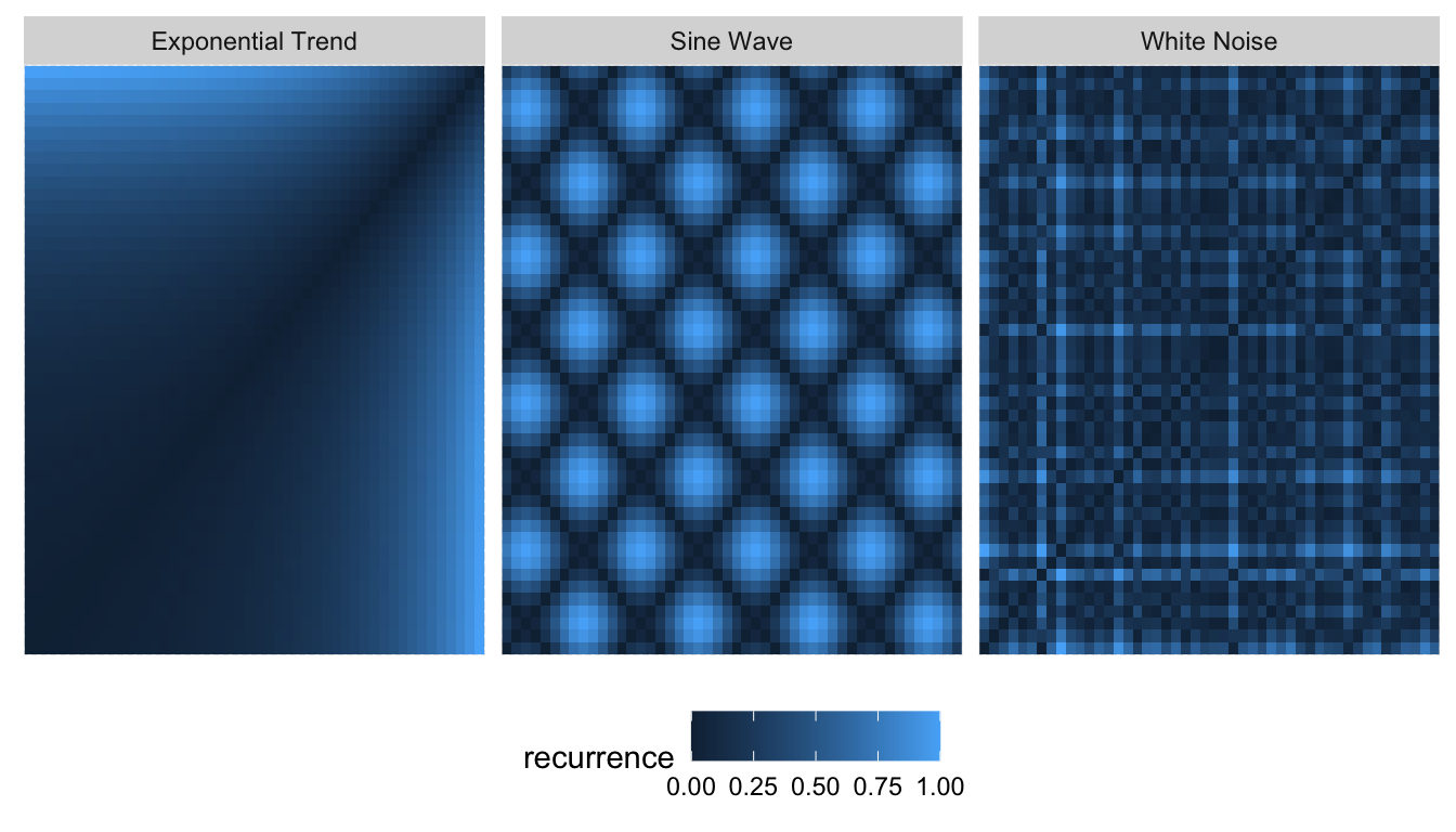
Real time series, of course, do not have patterns this clean. This makes it difficult to draw conclusions from these graphs when they resemble the one on the right rather than the two on the left. Lia et al. (2020) thus took to Convolutional Neural Networks to analyze a large set of time series via recurrence plots.
Lia et al. (2020) had a specific task that needed solving. However, when it comes to exploration of the data set only, UMAP is a favorite of mine. Similarly to how UMAP can embed the MNIST dataset, we can run UMAP on recurrence plots of many time series to project each time series onto a two-dimensional space. In this representation, time series with similar recurrence plots should be clustered and spotting commonalities among them becomes easier.
UMAP on Recurrence Plots
To explore the usefulness of recurrence plots combined with UMAP, we consider two freely available data sets of many time series: 1) Daily number of rides starting from Citi Bike stations in New York, and 2) daily sales of products at 10 different Walmart locations in the US.
Both datasets consist of daily observations. Here, however, we load them aggregated to monthly values (date is formatted as YYYY-MM-01). The reason for this is mostly that the recurrence plots create large datasets: What previously was a time series of \(N\) observations turns into at least \(N^2/2\) observations. This is a major drawback to consider—especially when going beyond a single series.
glimpse(citibike)## Observations: 46,170
## Variables: 3
## $ id <dbl> 72, 72, 72, 72, 72, 72, 72, 72, 72, 72, 72, 72, 72, 72, 72…
## $ date <date> 2013-07-01, 2013-08-01, 2013-09-01, 2013-10-01, 2013-11-0…
## $ value <dbl> 3575, 3675, 3153, 3325, 2122, 1213, 924, 676, 1433, 2380, …glimpse(walmart)## Observations: 320,000
## Variables: 3
## $ id <chr> "FOODS_1_012_CA_1_validation", "FOODS_1_012_CA_1_validatio…
## $ date <date> 2011-01-01, 2011-02-01, 2011-03-01, 2011-04-01, 2011-05-0…
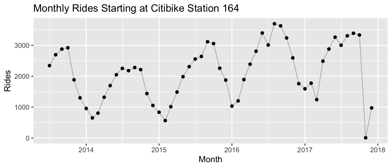
## $ value <dbl> 0, 0, 0, 0, 0, 0, 4, 3, 0, 0, 0, 0, 0, 0, 0, 0, 15, 89, 13…Note that for both datasets the observations are non-negative counts. This is what a randomly picked time series from the citibike dataset looks like:
And this is what sales for a randomly picked product at Walmart look like:
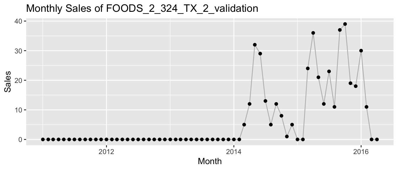
The latter time series of Walmart highlight another detail that needs to be considered when using recurrence plots the way I do: Since we want to feed every pixel of the recurrence plot as a feature to UMAP, we need the same number of pixels for each time series. To achieve this when new Citi Bike stations are added over time and products are launched or discontinued at Walmart, I pad each time series with zeros as needed. At least in the case of count time series the zero is a natural choice. However, we will see in the following that even in this case the padding does have a strong impact on the results.
To run the analysis, we first need to compute the recurrence plots for each time series of the dataset. We start by analyzing the Walmart dataset.
UMAP and Recurrence Plots for Walmart Sales
In the following, I use a few convenience functions shared as tiny R package recur on Github. They wrap in part functions from the umap and hdbscan package which do the actual work.
We take the dataset and compute the recurrence plot for each product. The recur::measure() function does exactly this. Here, we return the recurrence pixels in a long table after having computed the full \(N \times N\) matrix. Before computing the recurrence values, it min-max standardizes all values for each time series to values between 0 and 1.
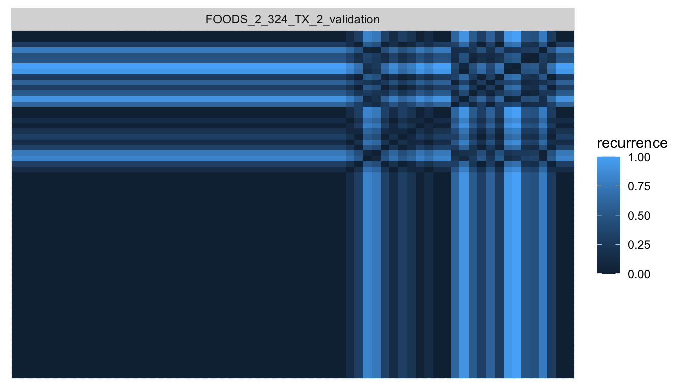
walmart_recur <- recur::measure(walmart, shape = "long", size = "square")The recurrence plot of the product shown above looks as follows, with a large area reserved for the initial zero padding. The area with recurrence of points after the product started selling appears without obvious pattern and is limited to less than a quarter of the pixels.
With the recurrence pixels for each time series in hand, we can pass them to UMAP to get a two-dimensional embedding of the time series. recur::embed() is a convenience function that first calls recur::measure() and then umap::umap() to do this.
walmart_embed <- recur::embed(data = walmart)Even before visualizing the embedding, we continue and cluster the products in the embedding space via HDBSCAN where the recur::cluster() function calls dbscan::hdbscan() to do so.
walmart_cluster <- recur::cluster(walmart_embed)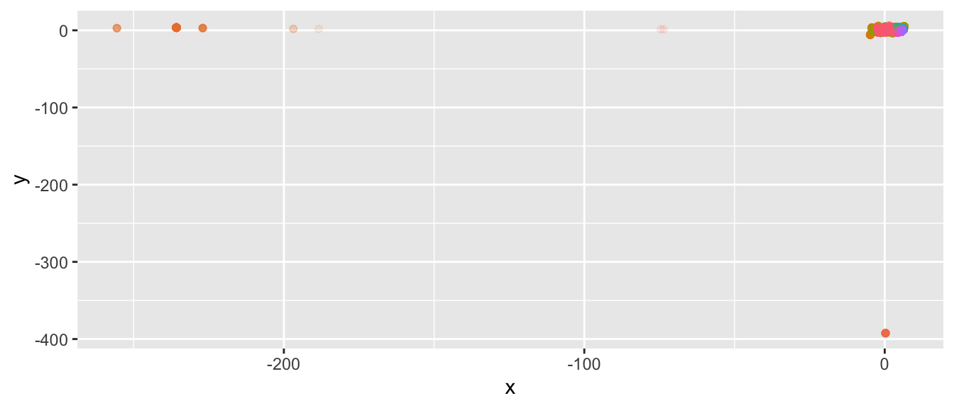
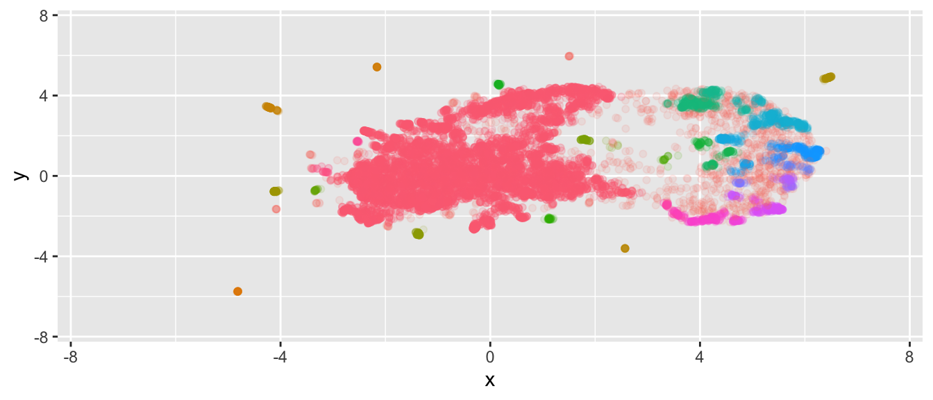
There appear to exist groups of time series that are very different from the rest. If we focus on the central, largest set of time series, we see that they are mostly densely clustered.
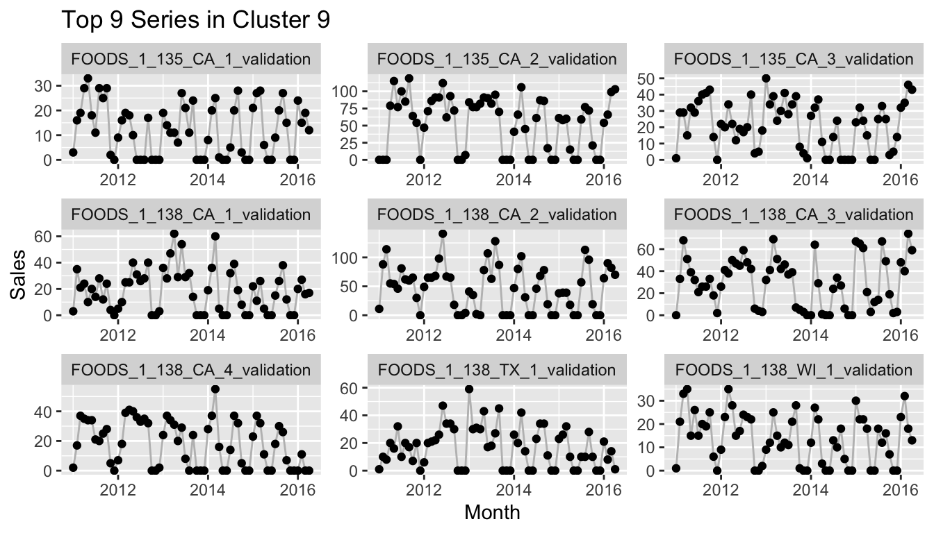
Since this by itself might not be overly useful, we can instead look at the \(n\) time series in cluster \(k\) with the largest HDBSCAN cluster membership probability using the following function:
plot_top_n_from_cluster_k <- function(clustered, data, n = 9, k = 1) {
  filtered <- clustered$embedding[clustered$embedding$cluster == k,]
  ordered <- filtered[order(filtered$membership_prob, decreasing = TRUE),]
  n <- min(nrow(ordered), n)


  pp <- data[data$id %in% ordered$id[1:n],] %>%
    ggplot(aes(x = date, y = value)) +
    geom_line(color = "grey") +
    geom_point() +
    facet_wrap(~id, scales = "free") +
    labs(x = "Month", y = "Sales",
         title = paste0("Top ", n, " Series in Cluster ", k))

  return(pp)
}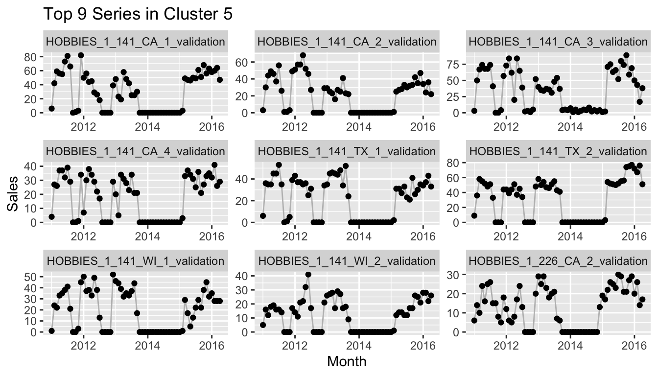
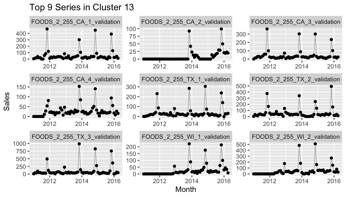
If you would reproduce this at home and check more of the clusters, you would notice that many of the clusters consist of a set of time series that starts after the earliest possible start date and thus has 0 sales for the first months. This can mean, of course, that a quarter or half or more of the values of the series are exactly equal to other series with the same start date, while at the same time the importance of the differences between the actual observations is lessened by the min-max scaling. One example of this is the following cluster.
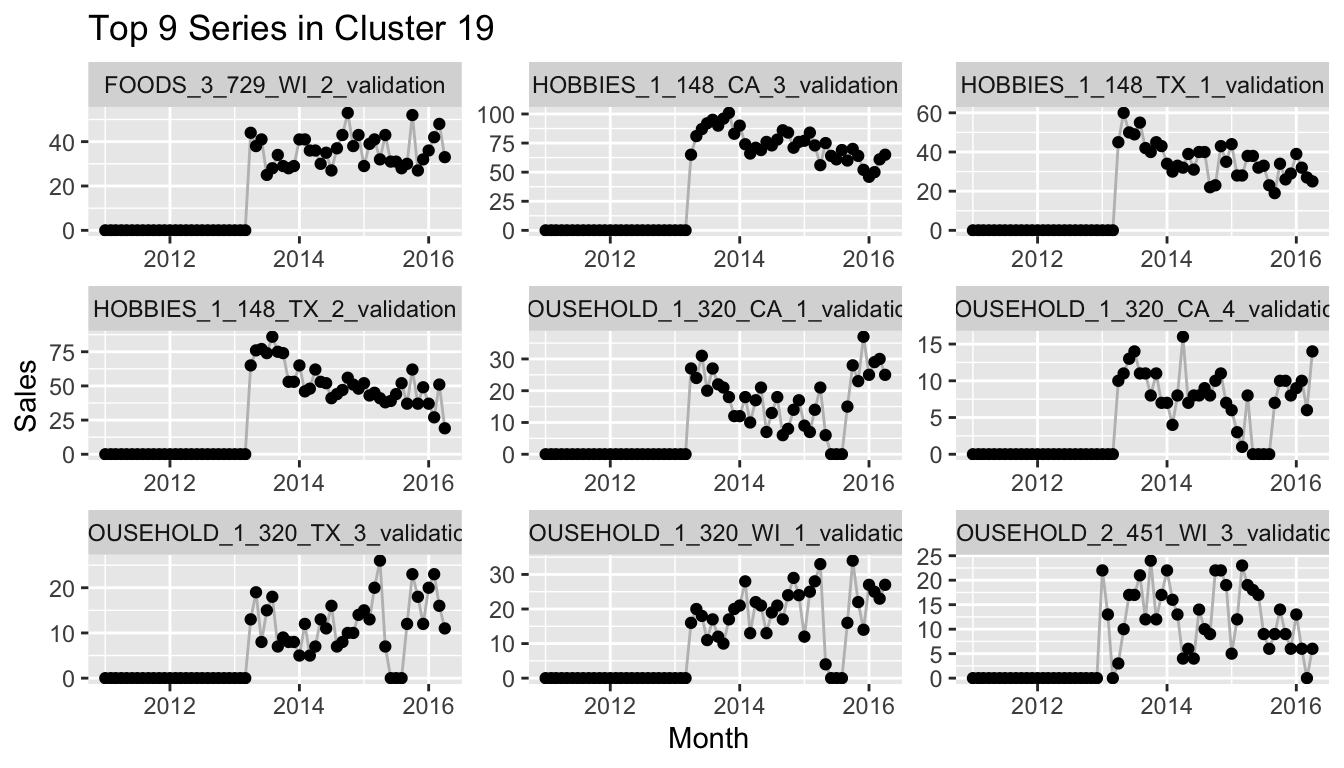
So the method is certainly not perfect. But this drawback can also help to check your assumptions on whether the data is clean or not. It can also identify groups of time series that need a different modeling approach than others.
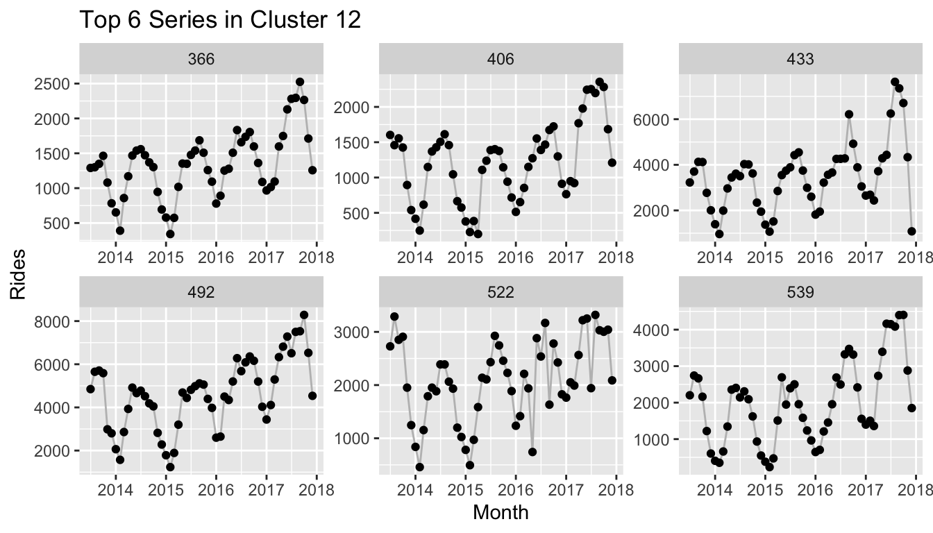
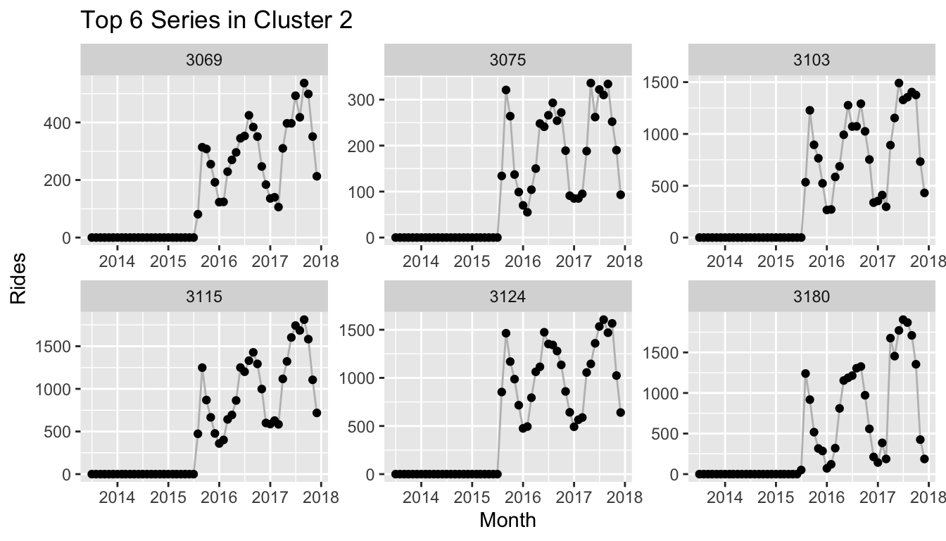
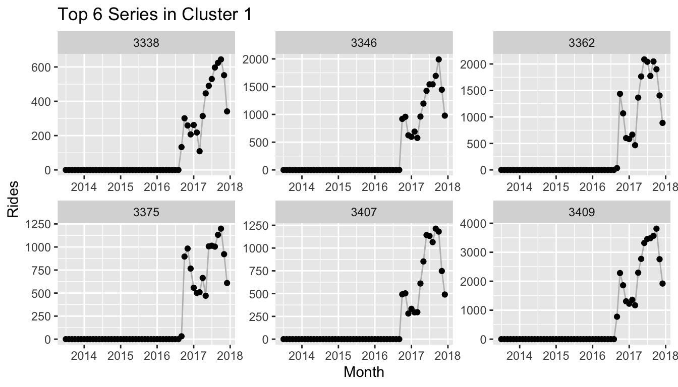
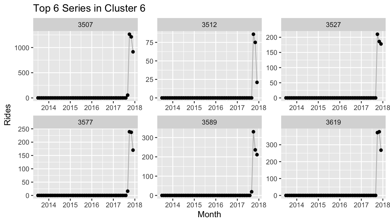
UMAP and Recurrence Plots for Citi Bike Rides
We can now apply the same methods to the Citi Bike data. An interesting differentiation to the Walmart data is that most time series here have a strong yearly seasonality. This, for example, is what the recurrence plot of Citi Bike station 360 looks like:
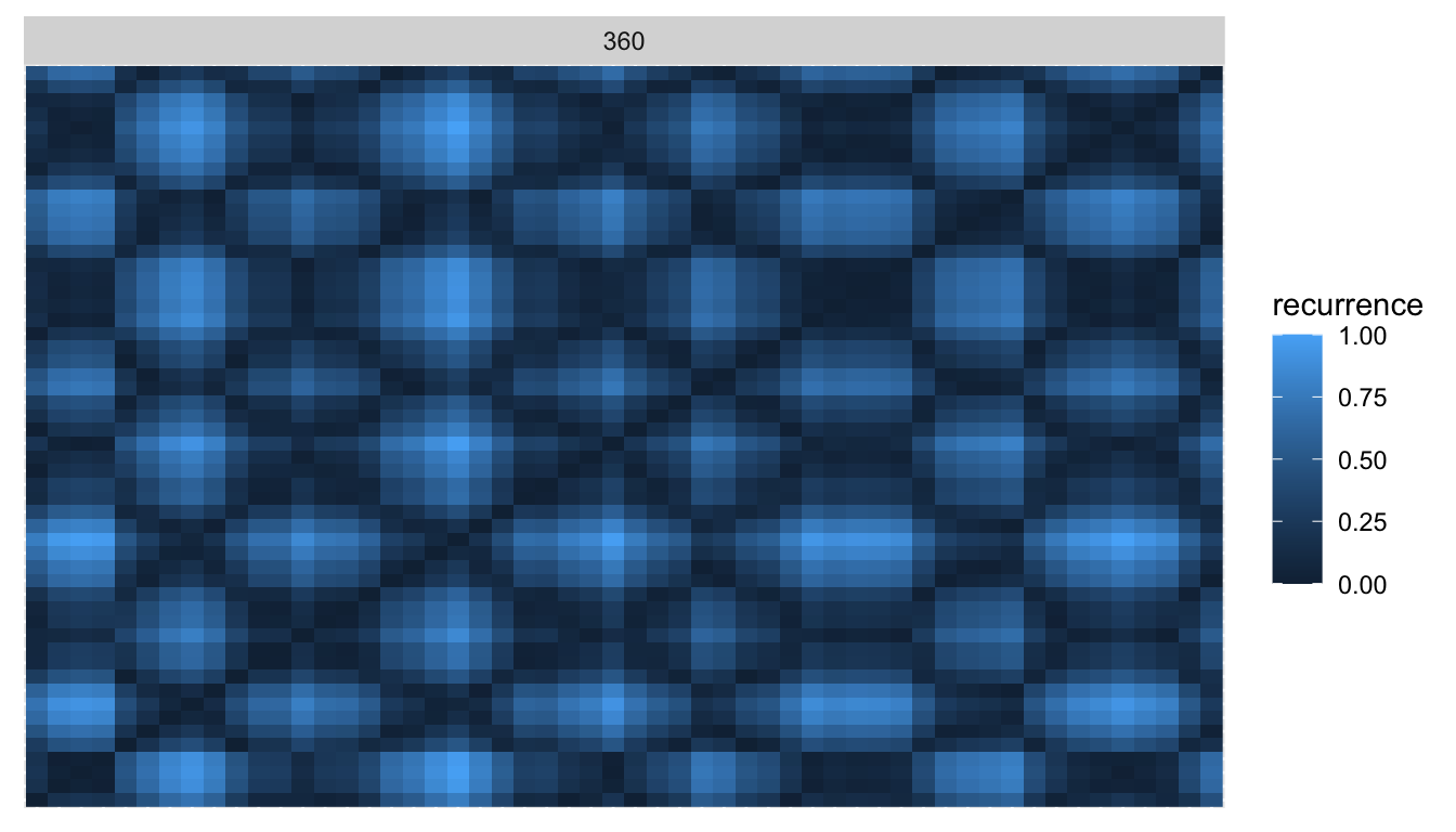
Compared to the plot of the Walmart product above, this is much closer to the idealized sine curve recurrence pattern!
To analyze the entire dataset, we take the monthly observations of Citi Bike rides, compute the recurrence plots and pass them to UMAP and HDBSCAN, just as before.
citibike_embed <- recur::embed(data = citibike)
citibike_cluster <- recur::cluster(citibike_embed)
This time, the global dispersion in the UMAP embedding is not quite as extreme as for Walmart, and HDBSCAN is able to cluster the time series nicely.
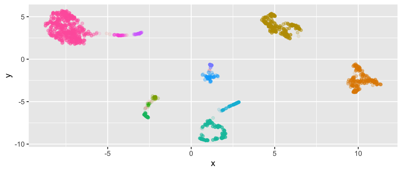
We peak into the clusters to reveal that yet again the clusters depend heavily on the dates at which the respective stations within the cluster were used for the first/last time, as this provides UMAP with the largest global variation.
Citi Bike Recurrence Plots and Location Data
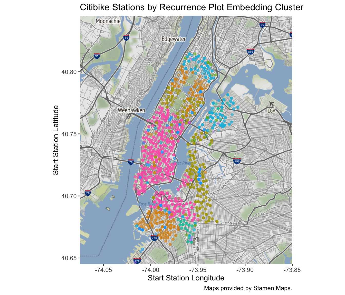
A unique feature of the Citi Bike data is that each time series corresponds to a location in New York since the rides are counted for each station at which a ride starts. The coordinates of Citi Bike stations are also available with the ride data which let’s us make use of this information.
We can take the cluster information that we used in the plot of the embedding above and project the stations with the cluster information onto their respective coordinate. The resulting plot reveals that Citi Bike rolled out its stations by distinct areas in New York. The largest cluster (pink) corresponds to the stations available from the start, which are located in Manhattan south of Central Park, as well as the parts of Brooklyn that connect to Manhattan via the Williamsburg Bridge, Brooklyn Bridge and Manhattan Bridge.
References
Citi Bike data available at https://s3.amazonaws.com/tripdata/index.html. See also https://www.citibikenyc.com/system-data.
The Walmart data set is part of the M5 competition hosted on Kaggle, see https://www.kaggle.com/c/m5-forecasting-accuracy.
Xixi Lia, Yanfei Kanga, Feng Li (2020). Forecasting with Time Series Imaging, ArXiv e-prints 1802.03426.
J.-P. Eckmann, S. Oliffson Kamphorst, D. Ruelle (1987). Recurrence Plots of Dynamical Systems, EPL (Europhysics Letters), Vol. 4, 9.
L. McInnes, J. Healy, J. Melville (2018). UMAP: Uniform Manifold Approximation and Projection for Dimension Reduction, ArXiv e-prints 1802.03426.
L. McInnes, J. Healy, S. Astels. The hdbscan Clustering Library.
R. J.G.B. Campello, D. Moulavi, J. Sander (2013). Density-Based Clustering Based on Hierarchical Density Estimates, PAKDD 2013, Part II, LNAI 7819, pp. 160-172.