When Quantiles Do Not Suffice, Use Sample Paths Instead
I don’t need to convince you that you should absolutely, to one hundred percent, quantify your forecast uncertainty—right? We agree about the advantages of using probabilistic measures to answer questions and to automate decision making—correct? Great. Then let’s dive a bit deeper.
So you’re forecasting not just to fill some numbers in a spreadsheet, you are trying to solve a problem, possibly aiming to make optimal decisions in a process concerned with the future. Then please, before you start to forecast, ask yourself the following: “Does my problem concern a single time period, or does it span multiple periods?”
This is a crucial question. Depending on your answer, you’ll either be fine with marginal forecast distributions, or you’ll have to take it a step further and estimate useful forecast joint forecast distributions.
Marginal Forecast Distributions
Marginal forecast distributions, summarized to a handful of quantiles, look like this:
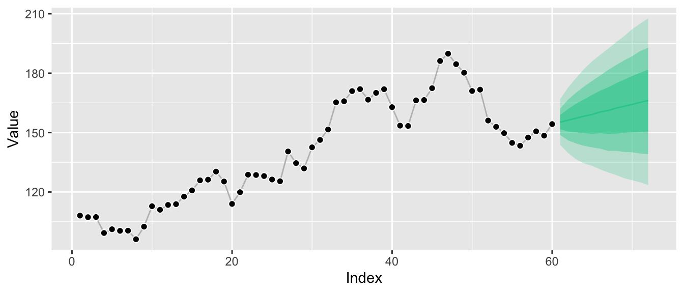
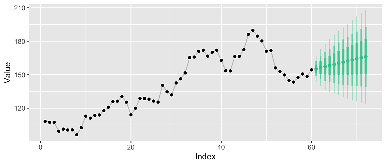
While this kind of visualization is extremely common, it hides the fact that we only know the distributions at the individual points in time, not how they relate to each other. A more honest visualization might be something along these lines:
Marginal forecast distributions describe the probability of outcomes at a single point in time. If you sample observations at a monthly frequency, a marginal forecast distribution describes possible outcomes for a single month. If you sample observations for your time series every hour, a marginal forecast distribution describes possible outcomes for a given hour. Of course you can have marginal forecast distributions for several months or hours. But they don’t tell you how January relates to February.
Marginal forecasts can answer questions such as:
- “How likely is it that the wind turbine can cover the electricity load in the next hour without us activating the coal plant?”
- “Do I need to buy additional beach chairs to be able to offer one to 95% of my hotel guests that ask for one today?”
It’s easy to believe that marginal forecast distributions are the only forecast distributions there are. After all, in many cases forecast quantiles are the default output of forecast libraries1 and all you need in forecasting competitions (if at all). And as in electricity load forecasting, sometimes marginal forecast distributions really are all that’s needed to solve a problem.
But there are common problems in which one needs to quantify uncertainty across multiple time periods, flexibly. Problems in which the question is inter-temporal. To answer questions as simple as “How likely is it that the weather is going to be hot both tomorrow and the day after tomorrow?” we need joint forecast distributions.
Joint Forecast Distributions
Whereas marginal forecast distributions quantify the uncertainty of an outcome \(Y_{t_i}\) at a single time period \(t_i\), joint forecast distributions do so for the outcomes \(Y_{t_i}\), \(Y_{t_j}\), … at multiple future time periods \(t_i\), \(t_j\), … The graphs above have visualized the marginal distributions \(P(Y_{T+1} | Y_{T}, Y_{T-1}, ...)\), \(P(Y_{T+2} | Y_{T}, Y_{T-1}, ...)\), and so on. Since these are separate distributions, it was illustrative to turn the ribbon graph into separate vertical lines, each representing one of the marginal distributions.
Now, however, we turn our attention to one big joint distribution over all future time periods of interest: \(P(Y_{T+1}, Y_{T+2}, ... | Y_{T}, Y_{T-1}, ...)\). The main selling point of joint distributions is that they not only tell us how future periods relate to the past, but also describe how future periods relate to each other. Given their inherent high dimensionality (were often interested in more than 2 forecast horizons), however, it’s difficult to visualize the relationships implied by the joint distribution.
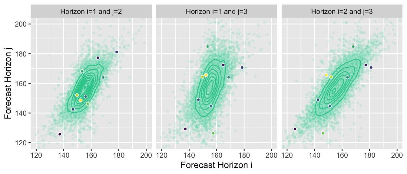
You could, of course, summarize them as marginal forecasts and visualize them in the same way. But this hides most of the information contained in the joint distribution forecast. Instead we can, for example, visualize the two-dimensional joint distributions for forecast horizons 1 and 2, 2 and 3, and 1 and 3, respectively:
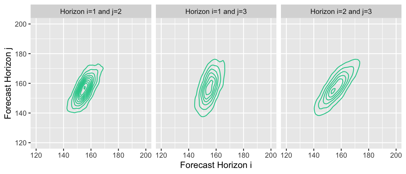
This reveals the correlation between outcomes at subsequent points in time. Given that our example time series exhibits strong autocorrelation, proper forecasts will project that autocorrelation into the future, and the estimated joint forecast distribution will represent it.
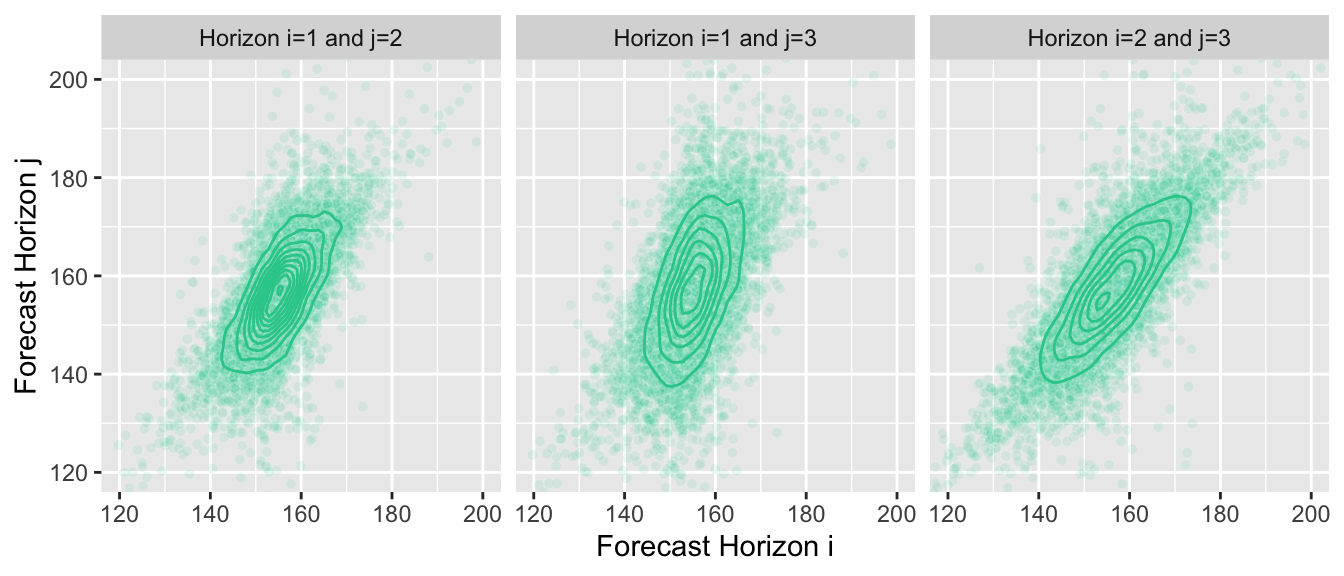
Unsurprisingly, when forecasting, we usually aren’t able to derive a closed form definition of the joint distribution. A great way to represent the distribution is by drawing many samples from it instead. If we choose our forecast model wisely, it can generate these samples for us. We can then use the samples to answer questions for which we usually needed to compute integrals with the density function.
Here is the same plot of the joint distributions, but now with the samples that I’m using in the background to generate the graphs—I don’t know the joint distribution, the contour lines are an approximation of the true density computed from samples:
Joint Forecasts as Sample Paths
While the plots above are nice, the best way to think about and work with joint forecasts are sample paths. Sample paths are samples from the joint forecast distribution.2 They represent possible paths that the time series is expected to take into the future. Not every model can provide them, but often a model can generate a sample path iteratively starting at the last observation and then simulating an outcome over several forecast horizons. By drawing many sample paths from the model, we can infer which ranges of outcomes are likely.
So let’s pick 10 sample paths from all the available ones, …
… and then render them as possible continuations of the original time series.
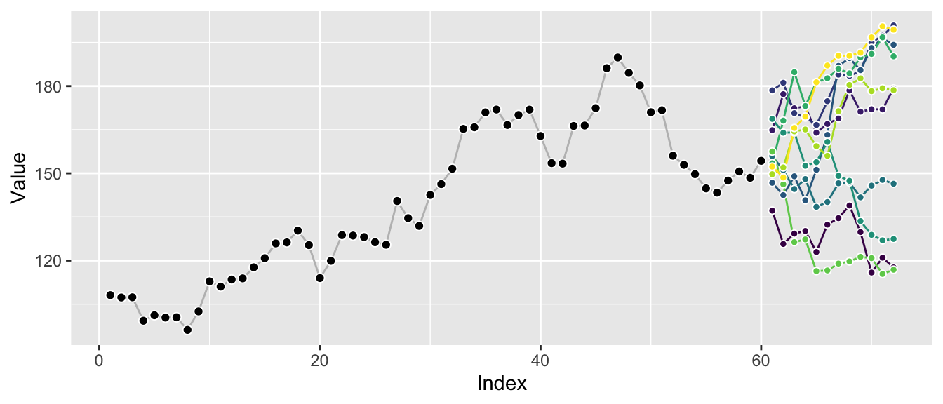
Plotting a few sample paths is great to get a quick sense of possible outcomes and how well the forecast model represents the characteristics of the original series. The correlation between the different horizons becomes apparent, in contrast to the graphs of marginal distributions above.
Plotting many sample paths on top of each other makes it harder to spot these correlations, but we get a sense of the overall possible ranges that can be achieved.
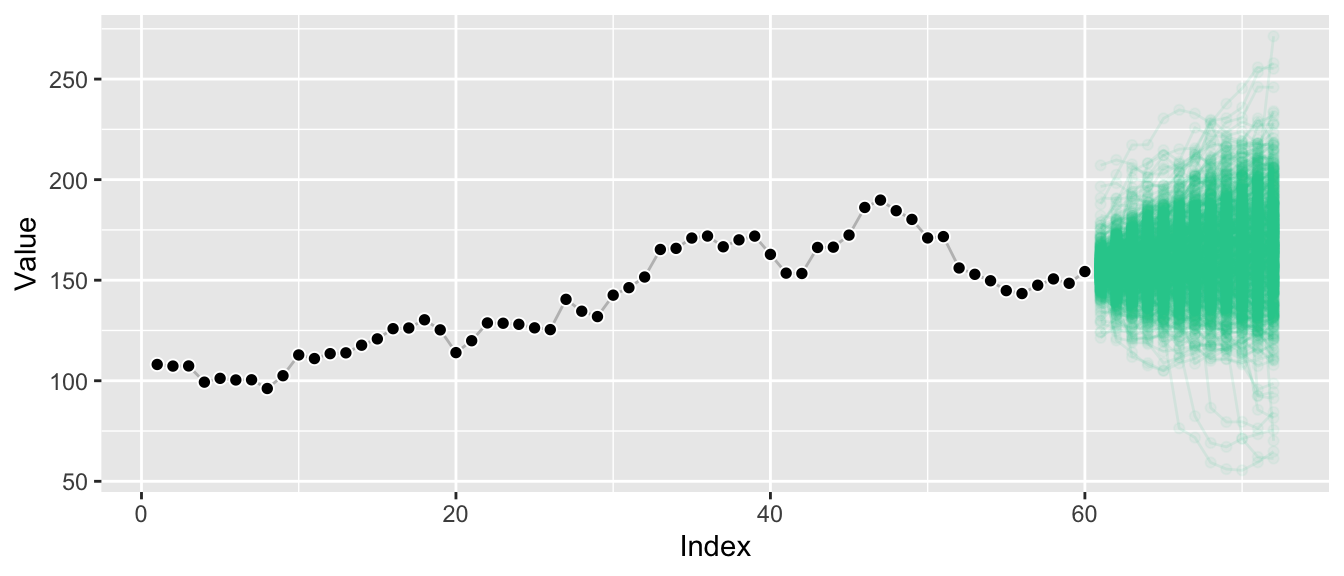
And we see that the extremal quantiles at the last horizon are usually only reached if the sample paths trended toward them at earlier points as well—in contrast to what the marginal distributions might suggest.
In fact, given sufficient samples, we can take this a step further and derive conditional sample paths: Demanding that we reach a point higher than at the last observation at forecast horizon 6 (this level is indicated by the horizontal line), let’s plot all sample paths that lead us there.
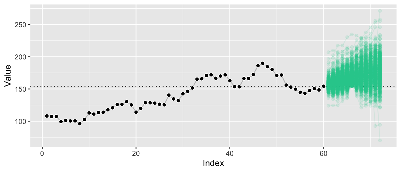
By conditioning on paths that reach a certain value at horizon 6, we filter out a large chunk of outcomes that were deemed likely before. The remaining sample paths illustrate the forecast distribution conditioned on a certain outcome at also a future point, whereas usually forecast distributions are only ever presented conditioned on the past.
This illustrates that we can answer hard questions in simple ways when we have access to sample paths.
Answering Hard Questions by Summing and Counting
When you have quantiles of the marginal forecast distribution, then all you have are quantiles from the marginal forecast distribution. Samples from the marginal forecast distribution are a bit better, as they let you compute quantiles of arbitrary functions of your outcome at a single point in time. Samples from the joint distribution though are where it’s at: With them we can answer questions across arbitrary combinations of forecast horizons, arbitrary functions of those forecasts, at arbitrary quantiles. And since we’re working with samples, we don’t even have to compute integrals: All we need to do is to sum and to count, following the Monte-Carlo method.3
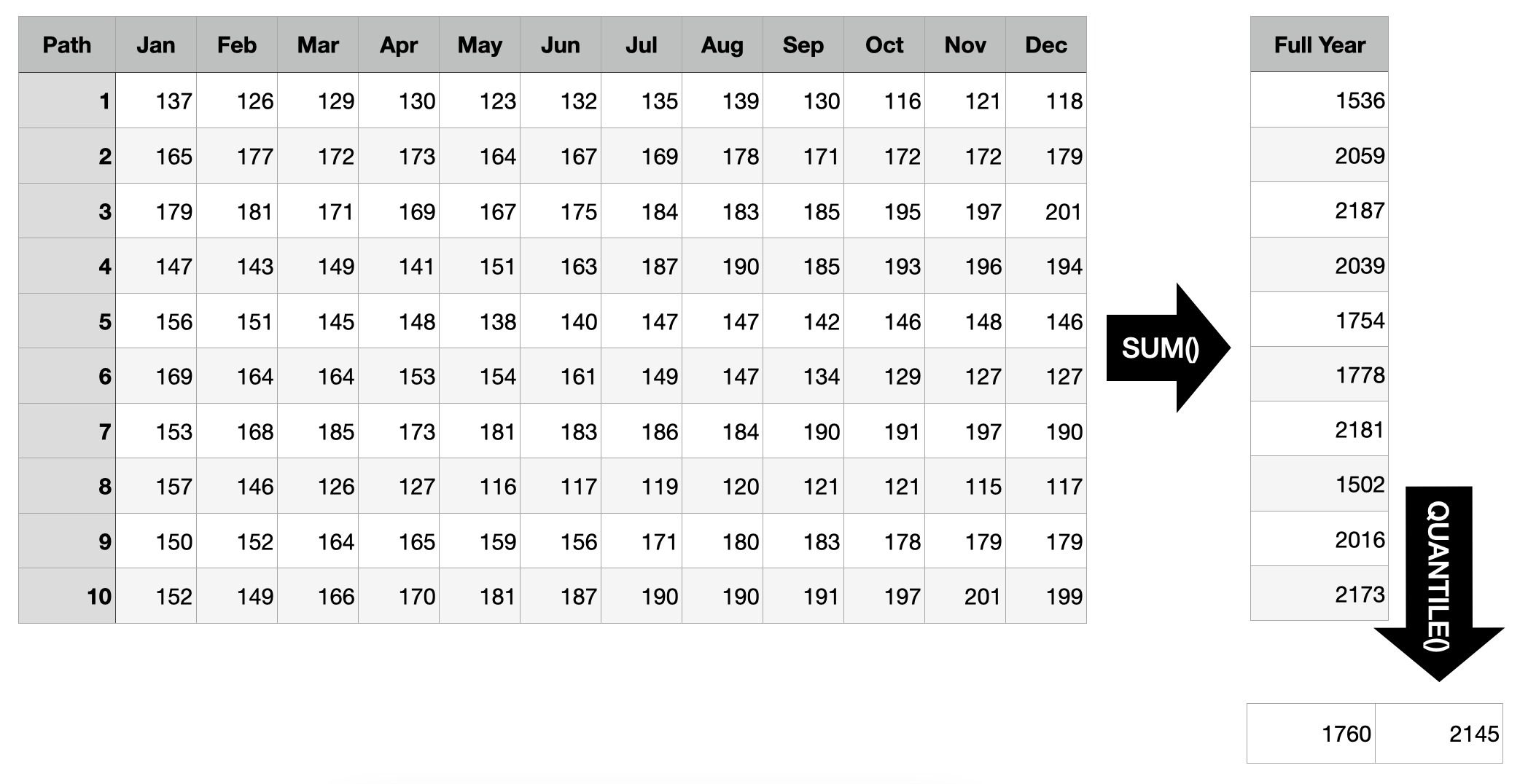
Scenario 1: Forecast of Costs for the Full Year
Suppose the time series above represents the costs of a business division of the company you work for as data scientist. Your stakeholders asked for forecasts for the upcoming year and you provided them with the marginal quantile forecasts from the first graph above. They like those, but follow up with: “So what’s the 50% prediction interval for the costs we will generate in the entire year?”
Oops! If all you had were marginal quantiles, you’d be hard pressed to provide an answer. Sure, you can sum up the mean predictions to get a mean prediction for the full year, but you can’t expect to sum up every month’s 25% quantile to get the 25% quantile for the full year—quantiles aren’t additive.
Luckily, you generated joint forecast distributions and saved them as sample paths. So all you need to do to find the answer is to sum up each sample path’s realizations before computing the quantiles of those sums. Based on the example below, there is a 50% probability that the total costs generated in the coming year will range from 1760 to 2145.
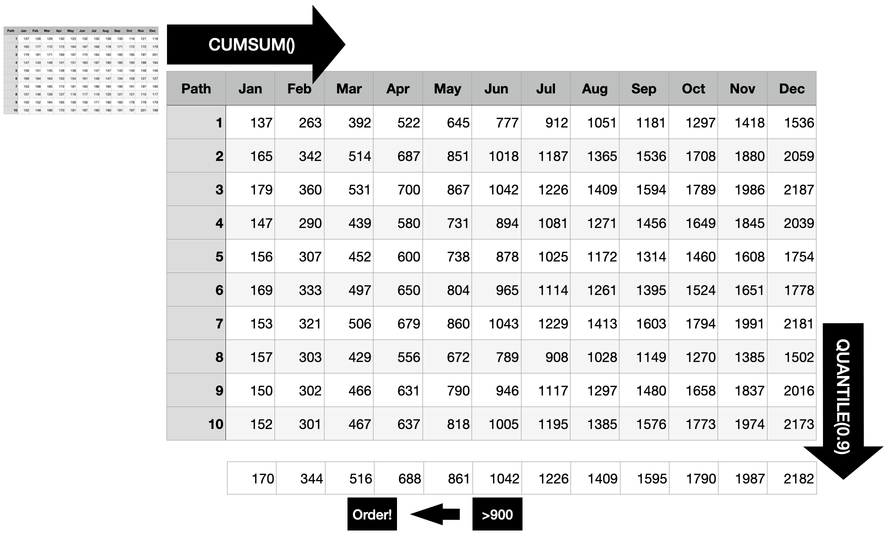
Scenario 2: Out-of-Stock Forecast
Prolific data scientist that you are, you provided other stakeholders with monthly demand forecasts. “When do we need to create the next replenishment order for this product given that it takes two months for the order to arrive, a current inventory level of 900 units, and a service level of 90% (in one of 10 cases a stock-out is acceptable)?”, they ask you.
Different from the first scenario where you always had to sum all 12 months, here you need to predict the optimal point in time to trigger the order. To do so, first compute the cumulative sum for each sample path. This way, you get the distribution of the “total sum until each point in time”, at each point in time.
For each point in time, you want to know whether the 90% quantile is larger than the current stock, because as soon as this is the case, there is a larger than 90% probability that the current inventory will not suffice until the end of that month. Consequently, the order should be triggered 2 months before that point to ensure you don’t run out of stock with 90% probability.
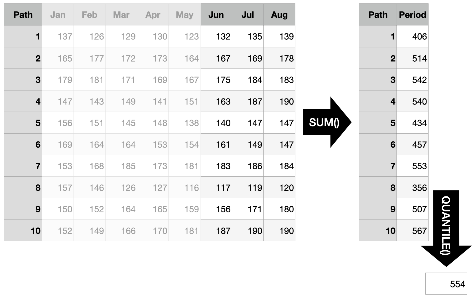
Scenario 3: Order Size
“Assuming that we indeed trigger the order in April and that the entire inventory is used up when the delivery arrives: How much should we order to cover at least 3 months with 90% probability?”
Since we are using sample paths to generate our answers, it is straightforward to answer questions which are concerned with an arbitrary time interval in the future. Instead of starting the sum at the first forecast horizon, take the sum over the three months in question (forecast horizons 6 through 8) and determine the quantile in question. To cover the demand of the three months in question with a probability of 90%, you need to order at least 554 units based on the sample paths shown below.
The Sum of Quantiles Is not the Quantile of the Sums
The reason all of this is even relevant is that the sum of quantiles is not the quantile of the sums. In scenario 1 above we solved the problem by computing the quantile of the sum. But we can’t answer the question by taking the sum of the quantiles. In contrast to the expected value, quantile functions are not additive.
This implies that marginal forecast distributions in the form of quantiles will only ever be able to answer a limited set of questions. In contrast, joint distributions can be summarized to the marginal distributions and thus offer the full flexibility to answer any question concerning the future.
There are important problems for which marginal forecasts suffice. Electricity load forecasting, for example. But to provide actionable recommendations in problems such as inventory management, one needs access to the joint forecast distribution.
When reading papers and blog posts describing models designed for forecasting, the difference between marginal forecast distributions and joint forecast distributions is often swept under the carpet (by those that only offer marginal distributions). A showcase of this is the Multi-Horizon Quantile Recurrent Forecaster paper by Wen et al. at Amazon. While they evaluate their model on an internal Amazon demand forecasting data set, they noticeably don’t use the same evaluation metric that a different Amazon team around Salinas et al. used in the DeepAR paper. Salinas et al.’s \(\rho\)-risk metric evaluates the demand forecasts over a span of time points, very similar to the three scenarios described above. Thus unsurprisingly, they make a point of using sample paths to do so:
To obtain such a quantile prediction from a set of sample paths, each realization is first summed in the given span. The samples of these sums then represent the estimated distribution for \(Z_i(L, S)\) and we can take the \(\rho\)-quantile from the empirical distribution.
To their credit, while Wen et al. don’t discuss this shortcoming in their MQ-RNN paper, they did publish a follow-up paper, Sample Path Generation for Probabilistic Demand Forecasting by Madeka et al., that tries to turn their neural network’s quantiles into sample paths. As part of this, they also describe in detail why their quantiles do not suffice for inter-temporal decision making:
However, since quantiles aren’t additive, in order to predict the total demand for any wider future interval all required intervals are usually appended to the target vector during model training. The separate optimization of these overlapping intervals can lead to inconsistent forecasts, i.e. forecasts which imply an invalid joint distribution between different horizons. As a result, inter-temporal decision making algorithms that depend on the joint or step-wise conditional distribution of future demand cannot utilize these forecasts.
Choose your model based on the questions you want to answer.
References
Michael Betancourt (2021). Sampling. Retrieved from https://github.com/betanalpha/knitr_case_studies/tree/master/sampling, commit eb27fbdb5063220f3d335024d2ae5e2bfdf70955.
Dhruv Madeka, Lucas Swiniarski, Dean Foster, Leo Razoumov, Kari Torkkola, Ruofeng Wen (2018). Sample Path Generation for Probabilistic Demand Forecasting. Link to PDF from 4th Workshop on Mining and Learning from Time Series.
David Salinas, Valentin Flunkert, Jan Gasthaus (2017). DeepAR: Probabilistic Forecasting with Autoregressive Recurrent Networks. https://arxiv.org/abs/1704.04110.
Syama Sundar Rangapuram, Matthias W. Seeger, Jan Gasthaus, Lorenzo Stella, Yuyang Wang, Tim Januschowski (2018). Deep State Space Models for Time Series Forecasting. Advances in Neural Information Processing Systems 31 (NeurIPS 2018). (Section 4.2 and the subsequent remarks are especially relevant).
Ruofeng Wen, Kari Torkkola, Balakrishnan Narayanaswamy, Dhruv Madeka (2017). A Multi-Horizon Quantile Recurrent Forecaster. https://arxiv.org/abs/1711.11053.
Appendix: Drawing Sample Paths
Generating high-quality sample paths from a model is not always easy. For the examples above, instead of fitting a model, I used the function by which I generated the observed time series to also generate the “forecasted” sample paths as possible continuations of the observed series. This is as if I had chosen the correct model class and recovered the exact parameter of the data generating process. Also called cheating.
It also shows, though, why it helps to be able to write down a data generating process when you want to generate sample paths. The one I used above is a random walk with drift and Student’s t-distributed noise with 4 degrees of freedom:
\[ y_t = y_{t-1} + \mu + \sigma \cdot \epsilon_t \]
\[ \epsilon_t \sim Student(4) \]
The following function implements this model. \(\mu\) / mu regulates the drift of the series, whereas \(\sigma\) / sigma determines the size of the noise. We use a Student’s t-distributed noise to not have just a Normal distribution. The initial_value is used to provide an overall level when generating the initial series, and to condition the forecasts on the input series.
random_student_walk <- function(n, mu, sigma, initial_value) {
  y <- rep(NA, times = n)

  y[1] <- initial_value + mu + sigma * rt(n = 1, df = 4)
  for (i in 2:n) {
    y[i] <- y[i-1] + mu + sigma * rt(n = 1, df = 4)
  }

  return(y)
}
The observed series can then be generated using an intial value of 100:
set.seed(572)
n_obs <- 60

y <- random_student_walk(
  n = n_obs, mu = 1, sigma = 5, initial_value = 100
)
tail(y)
## [1] 145 143 147 151 148 154We can generate one forecasted sample path by conditioning on the last observation (assuming really well estimated parameters and choice of model):
random_student_walk(n = 12, mu = 1, sigma = 5, initial_value = y[n_obs])## [1] 166 162 158 175 177 178 179 179 183 181 190 184And another one:
random_student_walk(n = 12, mu = 1, sigma = 5, initial_value = y[n_obs])## [1] 145 145 146 147 141 139 135 135 162 166 164 161Third time’s a charm:
random_student_walk(n = 12, mu = 1, sigma = 5, initial_value = y[n_obs])## [1] 162 153 155 157 152 152 149 158 160 173 182 184Try
forecast::forecast(AirPassengers)to see what I mean.↩︎Since the joint distribution is multidimensional across forecast horizons, a single sample is not a scalar but a vector. Many samples form a matrix. If we considered multiple time series, sample paths would form a tensor.↩︎
Obviously we’re still computing integrals—just instead of doing the math we approximate them by counting samples.↩︎