Analyzing Taxi Data to Create a Map of New York City
Yet another day was spent working on the taxi data provided by the NYC Taxi and Limousine Commission (TLC).
My goal in working with the data was to create a plot that maps the streets of New York using the geolocation data that is provided for the taxis’ pickup and dropoff locations as longitude and latitude values. So far, I had only used the dataset for January of 2015 to plot the locations; also, I hadn’t used the more than 12 million observations in January alone but a smaller sample (100000 to 500000 observations). The problem then however was that the sample included not enough observations for most streets outside of Manhattan Island such that their structure did not become visible. At the same time, the overplotting on Manhattan Island made it impossible to observe any structure for that part of the city.
In order to change this, I had to move away from the csv file I was using so far. To get better results, I needed to include every observation in my analysis. Thereby, I were able to filter for every unique location registered during 2015. I would then plot every unique location once, instead of plotting every observation. This means, that I were able to include the rare observations for the outer parts of New York in the plot without having too many observations that would make plotting infeasible.
Exactly this is the approach that Daniel Forsyth took for his plot.
However, sticking with the monthly csv files, each 2GB in size, was infeasible. It wouldn’t be effective to import them all, to sort through them, and to extract the unique observations. Instead, I followed Forsyth’s lead and utilized the fact that the TLC provides their data through Google BigQuery as well. Yet, while he had used Python to access and plot the data, I wanted to use R.
To be clear, neither had I used Google BigQuery before, nor had I accessed it through R’s interface by using the API. Unsurprisingly though, I do have a Google account, so it was a breeze to log into Google BigQuery and to create my first project. Having a project in BigQuery is necessary to later access the data through R with the project ID as identifier. If you’re like me and using BigQuery for the first time, you might want to check whether the corresponding BigQuery API is turned on. To do so, click “API’s & Auth” on the left of your Google Developers Console, choose “BigQuery API” and click the button to switch it from “OFF” to “ON”.
Afterwards, you’re set to continue in R. The currently easiest way to access BigQuery seems to be the package bigrquery to be installed with install.packages("bigrquery"). Since you already have a project with project ID, the next step is as easy as the example given in the package’s documentation:
library(bigrquery)
project <- "fantastic-voyage-389" # put your project ID here
sql <- "SELECT year, month, day, weight_pounds FROM
        [publicdata:samples.natality] LIMIT 5"
query_exec(sql, project = project)
As you can see, one uses SQL queries to access data on BigQuery. You could also try to use the query stored in sql above directly through Google BigQuery and it’s “Compose Query” window. This provides an easy way to check your SQL query before using it in R.
In order to access not data on body weights but the taxi locations, you can leave the first two lines of code unchanged. Though you have to change the query itself, of course. Consequently, I was glad that I’m not unfamiliar with SQL. On the other hand, Forsyth had used an SQL query, too, to access the data; for my purposes, I didn’t have to change his query at all.
taxiQuery <- "SELECT ROUND(pickup_latitude, 4) as lat,
                ROUND(pickup_longitude, 4) as long, COUNT(*) as
                num_pickups FROM [nyc-tlc:yellow.trips_2015] WHERE
                (pickup_latitude BETWEEN 40.61 AND 40.91) AND
                (pickup_longitude BETWEEN -74.06 AND -73.77 ) GROUP
                BY lat, long"
taxi_df <- query_exec(taxiQuery, project = project, max_pages = Inf)
As I’m not only requesting 5 values of body weights but 740879 locations, I had to set the max_pages argument in query_exec to Inf so that the page limit of 10 with 10000 rows each (100000 observations overall) is lifted.
The query above rounds both latitude and longitude to four decimal PLACES and stores how often each combination appears in num_pickups. In order to zoom into downtown New York, the range of both latitude and longitude is limited to certain values which will be represented later in the plot. Due to the argument GROUP BY lat, long not all observations are stored in the data frame taxi_df but each pickup location only once. Instead of assigning a row to each of the millions and millions of taxi rides, the necessary information can be stored in less than 750000 rows. Also, if I do decide to incorporate the density of rides into my plot, I can use num_pickups to do so.
> dim(taxi_df)
[1] 740879      3
The final data frame contains three variables with 740879 observations each.
To create the map after the example of eck and Forsyth, I eventually chose to use the ggplot2 package, as it allows me to adjust certain settings as for example background color and transparency levels more easily or depending on num_pickups.
Some experimenting later, I ended up with the following code to plot the pickup locations.
require(ggplot2)
taxi_plot <- ggplot(data=taxi_df, aes(x = long, y = lat))
taxi_plot + geom_point(aes(alpha = as.factor(num_pickups)),
                       size=0.4, color="white") +
scale_alpha_discrete(range = c(0.1,1), guide = FALSE) +
theme(panel.background = element_rect(fill="black", color="black"),
      panel.grid.major = element_blank(), panel.grid.minor = element_blank(),
      axis.text = element_blank(), axis.line = element_blank(),
      axis.title = element_blank(), axis.ticks = element_blank(),
      panel.border = element_blank(),
      plot.background = element_rect(fill="black", color="black"))
I created the first layer of the plot using the longitude and latitude; after all, I would like to create a map. Since the map covers exclusively New York, the distortion due to cartesian coordinates should be minimal. As a second layer I added the scatter plot layer of pickup locations. The size of 0.4 is small enough to preserve a clear representation of streets. Furthermore, the transparency of points that are added to the plot is adjusted by the alpha argument. Here, I did not set a fixed transparency for all locations. Instead, the transparency of each coordinate pair depends on how often a taxi picked up a customer on that location. Consequently, the airports and the streets of Manhattan ended up glowing. If it weren’t for the different alpha values, one wouldn’t be able to recognize any street in Manhattan as there were too many observations.
Lastly, I adjusted the theme of the plot such that there are neither axes nor legends in the final plot. Also, I set the background color to black.
I’m pleased with the resulting image of New York.

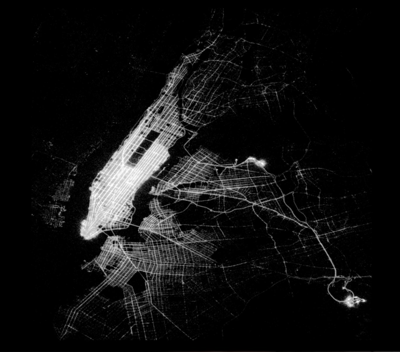
Different from my first tries is that not only Manhattan is recognizable, but also the streets in other boroughs, especially Queens and Brooklyn. Likewise, Manhattan is no longer a large glowing spot: the famous grid structure has become visible. I therefore managed to address the most critical features of the map.
In the process, I realized that there is at least one big difference between eck’s image (and mine), and Forsyth’s. In eck’s and my case, a brigther white color represents points that were visited frequently by taxi drivers. That’s why on eck’s map, the streets in Manhattan as well as the airports are glowing. The airports in the case of Forsyth are glowing, too. But the streets in Manhattan are black with everything around them white. I’m wondering how he managed to plot them in black color and why he chose to do so. The effect looks nice.
As an extension one could use the additionally provided dropoff dates and times to create an animated version of the plot. This would require one to use every observation, though, instead of only unique locations as this adds a third dimension to the plot.
At this point, I have to thank to Hadley Wickham. Not only did he work on the ggmap package that I used last time. He extended the grammar of graphics to the layered grammar of graphics and is the author of the ggplot2 package. He has also written a book to accompany the package. He is the Chief Scientist at RStudio, which I use to write my code and to create my plots. Finally, Hadley Wickham is also the author of the bigrquery package. I’m standing on the shoulders of giants, and today Hadley Wickham has been one of them.