Debug Forecasts with Animated Plots
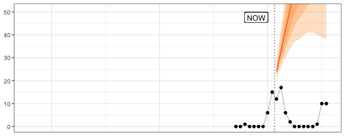
Speaking of GIFs, animated visualizations of rolling forecasts are eye-opening to the impact of individual observations, the number of observations, and default settings on a model’s forecasts. In the example below, the default forecast::auto.arima() transitions between poor model specifications until it can finally pick up the seasonality after 24 observations, only to generate a negative point forecast despite purely non-negative observations.
Fantastic way to understand forecast methods’ edge-case behavior.
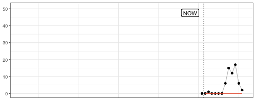
My favorite frame? After nine observations, when a model specification with trend is picked and returns an exploding forecast based on very little evidence.
The code for this GIF in this small Github repo.