Where Is the Seasonal Naive Benchmark?
Yesterday morning, I retweeted this tweet by sklearn_inria that promotes a scikit-learn tutorial notebook on time-related feature engineering. It’s a neat notebook that shows off some fantastic ways of creating features to predict time series within a scikit-learn pipeline.
There are, however, two things that irk me:
- All features of the dataset including the hourly weather are passed to the model. I don’t know the details of this dataset, but skimming what I believe to be its description on the OpenML repository, I suspect this might introduce data leakage as in reality we can’t know the exact hourly humidity and temperature days in advance.
- There is no comparison against the simplest benchmark method, the one predicting the value from a week ago (the seasonal naive method). Given the daily and weekly seasonality, it should be possible to capture a ton of signal by predicting the same number of bike rentals that were observed a week ago.
To be clear, I don’t think it’s the responsibility of a scikit-learn tutorial to be all encompassing. It’s created to show off scikit-learn features. That’s what it does, and that’s fine. But here we can have some fun, so let’s see how far we can get when we drop the weather-related columns, and by using the simplest of benchmarks only.
To start off, let’s do a bit of a speed run through the pipeline setup used in the original notebook.
First Look at the Bike Sharing Data
The data used in the notebook are bike sharing demand observed as hourly time series for a period of about two years in 2011 and 2012. In contrast to other datasets of its kind, this dataset consists of a single series. The tutorial loads it from the OpenML repository:
from sklearn.datasets import fetch_openml

bike_sharing = fetch_openml("Bike_Sharing_Demand", version=2, as_frame=True)
df = bike_sharing.frame
To take a sneak peek at what the time series looks like, the tutorial computes the average hourly demand over observed across the entire dataset:
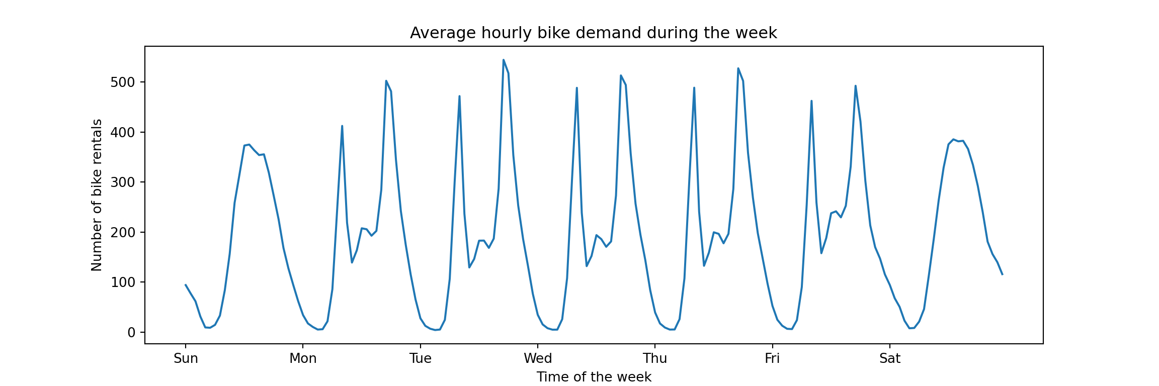
Unsurprisingly, the bike sharing demand is highly seasonal. There is a within-day pattern that repeats on weekdays corresponding to demand from commuters. Also, weekends are clearly distinct from weekdays but likely similar across weekends (in theory this is not visible from this plot, but…). Absent any drastic trends, and ignoring the slower yearly seasonality given that we will focus on short-term forecasts, most of the signal from one week to the next will come from the daily and weekly seasonality. Any model we use should be designed to capture it. And that’s what the tutorial does, it demonstrates different ways to capture the seasonal patterns via feature engineering.
While most of the feature engineering is done to reduce the error of linear regression-based models, the best model of the tutorial turns out to be the gradient boosting model that is evaluated first and uses none of the fancy transformations. That’s the model we focus on now.
Setup of the Original Gradient Boosting Pipeline
First, the target column count is standardized by dividing by the largest observation. Thus we don’t predict the count of bike rentals directly, but the share of the largest possible hourly demand. This means that a mean absolute error of 0.01 corresponds to 1pp difference from the actually observed percent of maximum demand. The transformed column is assigned to y, then dropped from the dataframe to create the feature matrix X.
y = df["count"] / df["count"].max()
X = df.drop("count", axis="columns")
The initial model matrix consists of the following features (the range shown here is a bit misleading for the categorical columns). Note the weather-related columns such as temp, humidity, and windspeed. These are the problematic features mentioned in the introduction.
for col in X.columns:
    print(f"'{col}' with values in [{min(X[col])}, {max(X[col])}]")
## 'season' with values in [fall, winter]
## 'year' with values in [0.0, 1.0]
## 'month' with values in [1.0, 12.0]
## 'hour' with values in [0.0, 23.0]
## 'holiday' with values in [False, True]
## 'weekday' with values in [0.0, 6.0]
## 'workingday' with values in [False, True]
## 'weather' with values in [clear, rain]
## 'temp' with values in [0.8200000000000001, 41.0]
## 'feel_temp' with values in [0.0, 50.0]
## 'humidity' with values in [0.0, 1.0]
## 'windspeed' with values in [0.0, 56.996900000000004]As heavy_rain was a rare occurence, it’s grouped together with rain.
X["weather"].replace(to_replace="heavy_rain", value="rain", inplace=True)The tutorial uses a time series cross validation with five splits and a gap between train and validation of 48 hours. This gap of 48 hours is what we’ll use as the definition of the necessary lag between the moment of creating the prediction, and the moment that we predict. For example, if we need to schedule 48 hours in advance the number of bikes brought into circulation from repairs, then we can’t wait to observe the demand at 3pm today to plan for tomorrow’s demand. Instead, the latest information we can take into account is the demand observed yesterday, 48 hours in advance.
Thus, we won’t consider a daily seasonal naive model that projects the observation from 24 hours ago into the future. And because of this lag, the weather columns are somewhat unrealistic. But more on this in a moment.
We define the splits, each of which evaluates on a test set of about 42 days.
from sklearn.model_selection import TimeSeriesSplit

ts_cv = TimeSeriesSplit(
    n_splits=5,
    gap=48,
    max_train_size=10000,
    test_size=1000,
)

all_splits = list(ts_cv.split(X, y))

# this split is used to plot predictions from the models below
train_0, test_0 = all_splits[0]
The splits will be used to evaluate the model pipelines. For that, an evaluation helper is defined that uses both MAE and RMSE as metrics.
def print_metrics(mae, rmse):
  print(
        f"Mean Absolute Error:     {mae.mean():.3f} +/- {mae.std():.3f}\n"
        f"Root Mean Squared Error: {rmse.mean():.3f} +/- {rmse.std():.3f}"
    )

def evaluate(model, X, y, cv):
    cv_results = cross_validate(
        model,
        X,
        y,
        cv=cv,
        scoring=["neg_mean_absolute_error", "neg_root_mean_squared_error"],
    )
    mae = -cv_results["test_neg_mean_absolute_error"]
    rmse = -cv_results["test_neg_root_mean_squared_error"]
    print_metrics(mae, rmse)
Next, the tutorial defines the pipeline object (note the inclusion of the weather column).
import numpy as np
import matplotlib.pyplot as plt
from sklearn.pipeline import make_pipeline
from sklearn.preprocessing import OrdinalEncoder
from sklearn.compose import ColumnTransformer
from sklearn.ensemble import HistGradientBoostingRegressor
from sklearn.model_selection import cross_validate

categorical_columns = [
    "weather",
    "season",
    "holiday",
    "workingday",
]
categories = [
    ["clear", "misty", "rain"],
    ["spring", "summer", "fall", "winter"],
    ["False", "True"],
    ["False", "True"],
]
ordinal_encoder = OrdinalEncoder(categories=categories)

gbrt_pipeline = make_pipeline(
    ColumnTransformer(
        transformers=[
            ("categorical", ordinal_encoder, categorical_columns),
        ],
        remainder="passthrough",
    ),
    HistGradientBoostingRegressor(
        categorical_features=range(4),
    ),
)
And finally the cross validation performance is being evaluated. Note that we pass the entire model matrix X here—including columns describing the hourly temperature, humidity, and wind speed!
evaluate(gbrt_pipeline, X, y, cv=ts_cv)## Mean Absolute Error: 0.044 +/- 0.003
## Root Mean Squared Error: 0.068 +/- 0.005This reproduces the performance shown in the tutorial notebook exactly, perfect. Given the standardization that was applied on the series, the mean absolute error corresponds to an error of about 4.4% of the highest hourly demand observed across the time period. Given the maximum of 977 hourly bike rentals, that’s an error of about 42 bike rentals.
Let’s drop the weather-related features and evaluate again.
Gradient Boosting Without Weather Features
We define the pipeline as before, dropping weather from the categorical columns and then explicitly selecting columns from X to not pass through the temperature, humidity, and wind speed. We only keep the columns for which we can know the values in advance.
categorical_columns_no_weather = [
    "season",
    "holiday",
    "workingday",
]
categories_no_weather = [
    ["spring", "summer", "fall", "winter"],
    ["False", "True"],
    ["False", "True"],
]
ordinal_encoder_no_weather = OrdinalEncoder(categories=categories_no_weather)

gbrt_no_weather_pipeline = make_pipeline(
    ColumnTransformer(
        transformers=[
            ("categorical", ordinal_encoder_no_weather, categorical_columns_no_weather),
        ],
        remainder="passthrough",
    ),
    HistGradientBoostingRegressor(
        categorical_features=range(3),
    ),
)

X_no_weather = X[
  ['season', 'year', 'month', 'hour', 'holiday', 'weekday', 'workingday']
]
Evaluate the new pipeline on the same time series splits:
evaluate(gbrt_no_weather_pipeline, X_no_weather, y, cv=ts_cv)## Mean Absolute Error: 0.062 +/- 0.011
## Root Mean Squared Error: 0.094 +/- 0.015The MAE increased by 1.8pp. Note also the increase in the standard deviation across splits. The performance clearly worsened, but still isn’t too shabby given that we didn’t put much effort into building this model.
Can we get away with even less work?
Comparison with Seasonal Naive Method
Given that the data has several seasonal effects (daily, weekly, yearly), there is no one way to set up a seasonal naive prediction: We could use the value from 24 hours ago, the value from a week ago (168 hours), or even a mix of the two.1 As desribed above, we’ll focus on the weekly seasonal naive prediction due to the gap of 48 hours between train and test sets. A lag of one week is anyway more realistic for operational decisions.
Given the simplicity of the seasonal naive method, we just need to shift the label series. Since the cross validation splits use a gap of 48 hours that is smaller than our lag, we don’t need to do this for each cross validation split. We can do it once across the entire data set and still don’t introduce target leakage.2
snaive = y.shift(168)
print(snaive[165:172])
## 165 NaN
## 166 NaN
## 167 NaN
## 168 0.016377
## 169 0.040942
## 170 0.032753
## 171 0.013306
## Name: count, dtype: float64A custom cross validation loop gives us the performance of the seasonal naive method (i.e., of the new column) compared to the target, on the same splits that we used for the gradient boosting models.
mae = np.empty(5)
rmse = np.empty(5)

for i in range(5):
    _, test_idx = all_splits[i]
    mae[i] = np.mean(np.abs(
      y.iloc[test_idx].values - snaive.iloc[test_idx].values
    ))
    rmse[i] = np.sqrt(np.mean(np.square(
      y.iloc[test_idx].values - snaive.iloc[test_idx].values
    )))

print_metrics(mae, rmse)
## Mean Absolute Error: 0.073 +/- 0.022
## Root Mean Squared Error: 0.123 +/- 0.036How is that for a one-liner: 7.3% mean absolute error compared to the 6.2% of the gradient boosted trees model without weather features. Given that the seasonal naive method requires neither code nor infrastructure, and is inherently interpretable, one has to check the details of the business case whether any other method is worth the effort. A large chunk of the time series’ signal is already captured by this method.
Then again, the gradient boosted trees pipeline we compare against is the simplest version possible and only served as baseline in the tutorial. It could likely be improved further.
But the dataset at hand is also quite simple. Real use cases would likely have multiple series and require uncertainty quantification, thus increasing the effort going into building a model. This makes it even more important to compare against the simplest of benchmarks.
We can round this analysis off by plotting the predictions and errors of the models, similar to what was done in the scikit-learn notebook.
Graph of Predictions Over Time
We generate predictions for the first test set as defined by the cross validation split.
gbrt_pipeline.fit(X.iloc[train_0], y.iloc[train_0])
gbrt_predictions = gbrt_pipeline.predict(X.iloc[test_0])

gbrt_no_weather_pipeline.fit(X_no_weather.iloc[train_0], y.iloc[train_0])
gbrt_no_weather_predictions = gbrt_no_weather_pipeline.predict(
  X_no_weather.iloc[test_0]
)

snaive_predictions = snaive.iloc[test_0].values
Those we can then use to visualize the last week of the test set:3
last_hours = slice(-168, None)
fig, ax = plt.subplots(figsize=(12, 4))
fig.suptitle("Predictions by models and naive method")
ax.plot(
    gbrt_predictions[last_hours],
    "x-",
    label="Gradient Boosted Trees",
)
ax.plot(
    gbrt_no_weather_predictions[last_hours],
    "x-",
    label="Gradient Boosted Trees without Weather",
)
ax.plot(
    snaive_predictions[last_hours],
    "x-",
    label="Weekly Seasonal Naive",
)
ax.plot(
    y.iloc[test_0].values[last_hours],
    "x-",
    alpha=0.5,
    label="Actual demand",
    color="black",
)
_ = ax.legend()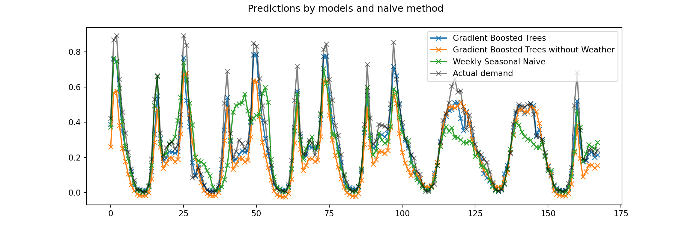
While the graph is a bit busy, the seasonal patterns are clear. While the gradient bossted trees model without the weather information underestimates the demand on most of the weekdays and isn’t able to predict the rush-hour peaks, the seasonal naive does a bit better in these respects. But it also makes larger errors on this weekend in particular, presumably due to a very different previous weekend.
To compare more than just a week of predictions against actuals, we can use a scatterplot.
Graph of Predictions Against Actuals
The graph of predictions over time is great to see the actual behavior of the time series. But consistent problems can become apparent in a scatterplot of all predictions against realized values for the current test set. The predictions from a perfect model would fall on the diagonal line, any deviation from it is the error of the prediction.
fig, axes = plt.subplots(ncols=3, figsize=(12, 4), sharey=True)
predictions = [
    gbrt_predictions,
    gbrt_no_weather_predictions,
    snaive_predictions,
]
labels = [
    "GBT",
    "GBT without Weather",
    "Seasonal Naive",
]
for ax, pred, label in zip(axes, predictions, labels):
    ax.scatter(y.iloc[test_0].values, pred, alpha=0.3, label=label)
    ax.plot([0, 1], [0, 1], "--", label="Perfect model")
    ax.set(
        xlim=(0, 1),
        ylim=(0, 1),
        xlabel="True demand",
        ylabel="Predicted demand",
    )
    ax.legend()

plt.show()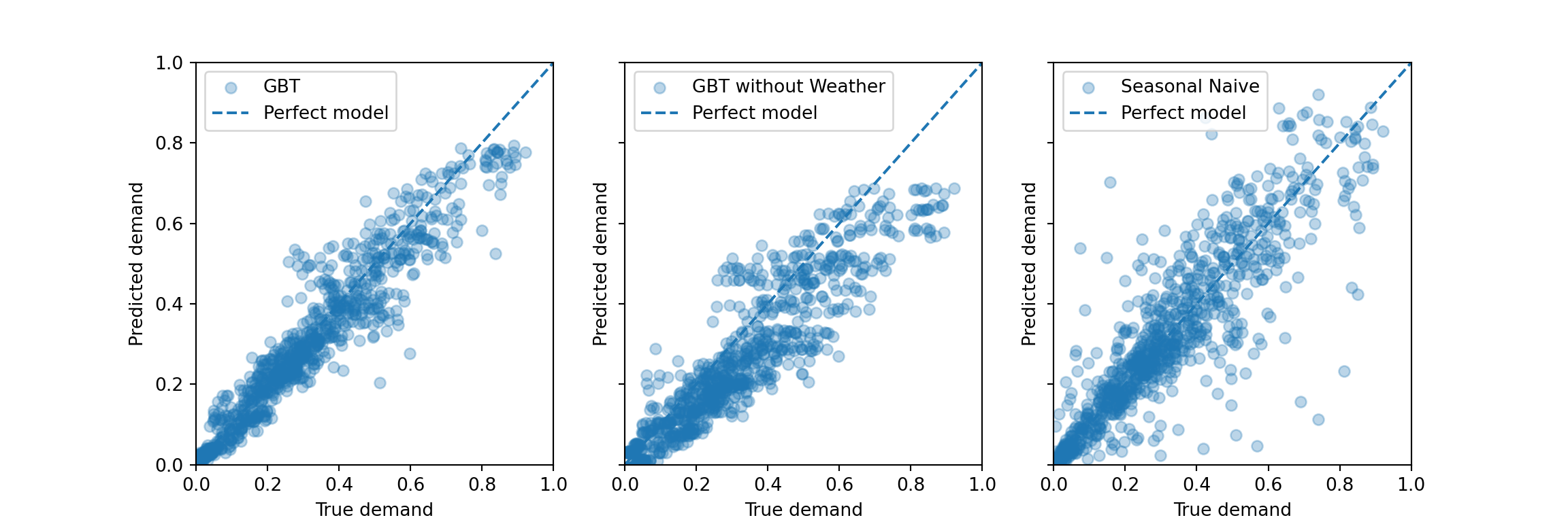
As discussed in the tutorial notebook, the gradient boosted trees models systematically underestimate the peak demand. For the model without weather information, this also appears to hold for the range of lower demand—similar to what is visible in the graph of demand over time above.
In comparison, the seasonal naive method appears to make some errors that are larger in absolute size, but it doesn’t systematically under- or overestimate. This makes sense as its predictions adjust entirely from week to week: A too large prediction in one week tends to imply a too low prediction the week thereafter if the data is noisy around some average level. Then the seasonal naive method is low bias, high variance. A bias would easily be introduced by a strong trend that persisted over time in the series, though.
For example, using observations from a week ago for weekends, but observations from a day ago for weekdays—to represent the difference between them. Mondays would have to count as weekends.↩︎
The original cross validation setup predicts 42 days into the future. While the gradient boosting models don’t see the target test period, we need to assume for the current seasonal naive implementation that we only have to forecast at most 5 days into the future: We use the last week of the training period to predict the first week of the test period, and then use the first week of the test period to predict the next week of the test period. Maybe a future blog post can evaluate how well a seasonal naive model would perform if we used the last week of the train period to forecast the entire test period.↩︎
The scikit-learn notebook showed the last four days, but I prefer to show a bit more data from an entire week period. It makes the plot more busy though.↩︎