2025/03/16
Inherently Coherent Forecasts
Suppose you offer a single API endpoint that takes historical observations of one time series at a time (not unlike Nixtla’s TimeGPT). Suppose further that everyone at your company uses this endpoint to generate any business forecast they need. What behaviors should the API’s forecast exhibit?
An obvious one would be forecast coherence across aggregation levels. Say your company sells three products. You have the historical revenue for the three products, \(Y_1\), \(Y_2\), \(Y_3\), as well as the historical revenue for the company as a whole, \(Y\), where \(Y=Y_1+Y_2+Y_3\). When you feed \(Y_1\) into the API, the API returns forecast \(\text{API}(Y_1)=\hat{Y}_1\). It returns \(\hat{Y}_2\) given \(Y_2\), \(\hat{Y}_3\) given \(Y_3\), and given \(Y\) it returns \(\hat{Y}\). If we want to see a forecast at company-level that “makes sense” given product-level forecasts, we want the forecasts to be coherent: \(\hat{Y}=\hat{Y}_1 + \hat{Y}_2 + \hat{Y}_3\). But given that the API only ever sees one time series at a time, what model could be used to provide coherent forecasts?
Again, keep in mind that the API doesn’t have access to more information than its current input. For example, when you feed it \(Y_2\), it doesn’t know that \(Y_1\) and \(Y_3\) exist. It also doesn’t know whether \(Y_2\) is at the hierarchy’s bottom- or top-level. The API does not have access to all possible time series that exist at the company. Consequently, the API does not have the information required to apply the methods from the vast literature on coherent forecasts. What modeling approach will return coherent forecasts nevertheless?
The seasonal naive method would. As would the naive method, of course. The mean forecast, too. And any other linear combination of the past observations with a pre-determined context length and coefficients.1 Any pre-trained—the coefficients must not change depending on the input provided to the API—linear autoregressive model of order p will do.
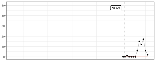
That’s a fairly flexible model family. It also includes the Non-Parametric Time Series Forecaster and threedx. Thus, the API could do an OK job for most series passed to it. It would have an obvious weakness in new or recently discontinued time series, though. The API could not, for example, override its usual forecast for a recently discontinued product and forecast zero instead. The same holds for any other kind of structural break as well as anomalies. That would make it tough to rely exclusively on such an API for operational decisions happening at the low hierarchy level ridden with discontinuities.
The above combined with recent evidence make me inclined to offer the seasonal naive method as Zero-Shot Foundation Model with Inherently Coherent Forecasts available as API.
For example, the mean forecast must not be the mean of the provided observations, but the mean of \(k\) observations resulting in coefficients \(1/k\). A time series with \(n<k\) observations needs to be padded with zeros. A time series with \(n>k\) observations is shortened to the \(k\) most recent observations.↩︎
2025/03/01
FF&P Store Report for 2025-02
In “Forecasting for Fun and Profit” I described how I would simulate the process of running the inventory replenishment decisions of a store for the remainder of a year. Every month I would publish a report on the preceding month’s results.
I just published the report summarizing the month of February.
A few quick thoughts:
- To properly reflect fixed order costs in cost-of-goods-sold, I updated the
shoprpackage I use for the simulation. The derivation of cost-of-goods-sold now attributes part of an order’s fixed cost to each unit of product sold based on how many units were ordered. - Simulating realistic data is hard. While the real world has a way of keeping only those combinations of purchase prices, delivery times, order and holding costs that fit to the demand for a product, picking these parameters at random for each product while keeping the overall business reasonably profitable is hard. To avoid a simulation that implies an unprofitable business model, I adjusted the upfront simulation of the products’ attributes.
- The previous two bullets imply that the simulation for February would be nothing like the one I had previously reported for January. In fact, I needed to re-simulate January as basis for February. So I also published a new version of the January report.
- The reports now feature additional product-level information (private-brand products, new products, discontinued products) and a revised out-of-stock impact.
- While the shop is not yet unprofitable, February shows an increase in holding costs and out-of-stock periods, and thus first signs that the (still) default forecast and replenishment optimization are not good enough and will lead the shop into an untenable downward spiral.
2025/02/01
Forecasting for Fun and Profit 🤑
For the remainder of the year, I will simulate the process of running the inventory replenishment decisions of a store. If work has taught me anything, it’s that you look differently at your forecast model when it decides day after day how money is spent—and doesn’t just fill cells in Excel. Unfortunately, that’s not often the topic of academic research. But I have a bunch of loosely connected ideas about business forecasting that I’d like to bring to paper, and the worked example of a store and its replenishment decisions will serve as the connective tissue.
To make replenishment decisions, I will first of all need to simulate a store that sells products and replenishes them to keep them on stock. With shopr, I have written a small package that models a simple world in which every day a store faces demand, sells products from inventory, and decides how many products to replenish. More on that below.
While you can run simulations with shopr as fast as your computer let’s you, I will simulate the replenishment decisions in real time: The iterations of the simulated world will be daily, from January 1 through December 31 of 2015. On the first day of every month I will publish a report that summarizes the profit and loss and cash flow achieved by the store in the previous month.1
Compared to simulating the entire year at once, proceeding in this step wise fashion will give me opportunity to make changes to the forecast method and inventory optimization and observe the changes’ impact. The step wise approach is also closer to the real-world where performance is observed over time and period-over-period changes raise questions. That should spark some discussions.
I have published the first report earlier today, summarizing the month of January.
In it you’ll find financials of a store called “FF&P Store”. It sells 1,906 different emojis (some to be released in the future). Reading tables of top sellers and out-of-stock products becomes just so much easier when it comes with product imagery.2
| Private Label | Sales Price | Purchase Price | Holding Cost | Delivery Days | |
|---|---|---|---|---|---|
| 🔞 no one under eighteen | no | $2.4 | $0.5 | $0.1 | 7 |
| 🦠 microbe | yes | $1.1 | $0.1 | $0.0 | 33 |
| 🇦🇶 flag Antarctica | no | $6.9 | $3.9 | $0.1 | 3 |
| 🙈 see-no-evil monkey | no | $2.5 | $0.7 | $0.1 | 7 |
| 🤑 money-mouth face | no | $1.7 | $0.5 | $0.0 | 9 |
The store’s financials are an aggregation of products’ observed sales, products’ prices, and the costs for purchasing products and holding them on inventory. The prices, costs, and the demand underlying the sales are the input data to the simulation and can either be generated in shopr or passed to it from existing tables.
For this simulation, I use some of the daily sales time series released in the M5 competition as historical sales and future demand, and the accompanying prices as sales prices. That’s a useful set of data to demonstrate fairly common real-world scenarios. I extend the demand and sales prices by purchase prices and holding costs. Additionally, I generate starting levels of inventory and delivery lead times for each material.
With that data as input, the simulation proceeds as follows:
For each day from January 1 through January 31:
    - Receive previously ordered shipments
    - Update inventory
    - Observe sales by comparing demand against inventory

    - User: Derive forecasts from historical sales
    - User: Optimize replenishment given forecasts and inventory

    - Open orders given replenishment decisions
A nice feature of shopr is that it stores the daily state of inventory, orders, and sales in partitioned parquet files. Using arrow in the background, it’s efficient to analyze the resulting data both during the iterations (e.g. when comparing forecasts and inventory) as well as at the end when preparing the monthly report.
While forecasts and replenishment decisions motivate this whole exercise, the key determinant of the financial results is the store’s business model: How frequently can we order products? Do we need to buy different products at once? Are there minimum order quantities? What delivery lead times do we have with suppliers? For data scientists these tend to be fixed constraints provided by others, but when simulating we need to choose each one.
The current version of shopr does take delivery lead times into account and the emoji store will replenish some products at shorter lead times and others, the private brands, at longer lead times. But shopr does not yet constrain the frequency, size, and cost of orders in any way. That’s unrealistic and I will adjust it in future iterations to make the optimization problem more interesting.
This then is also the final message: The work has only begun. Consider this a conversation starter and expect more to come soon.3
Edit (2025-03-01): Here’s a list of all reports published to-date:
- January 2025, published on 2025-02-01
- January 2025, published on 2025-03-01
- February 2025, published on 2025-03-01
Like those Mastodon accounts posting what happened on the same day during World War II.↩︎
Credit where credit is due: The unicode-emoji-json project has come in handy as tabular overview of all emojis with basic metadata.↩︎
A blogger’s famous last words.↩︎
2025/01/12
R-squared as Forecast Evaluation Metric
When Jane Street’s $120,000 “Real-Time Market Data Forecasting” Kaggle competition closes tomorrow, submitted forecasts will be evaluated using \(R^2\):
Submissions are evaluated on a scoring function defined as the sample weighted zero-mean R-squared score (\(R^2\)) of
responder_6. The formula is give by: \(R^2 = 1 - \frac{\sum w_i(y_i - \hat{y}_i)^2}{\sum w_i y_i^2}\) where \(y\) and \(\hat{y}\) are the ground-truth and predicted value vectors ofresponder_6, respectively; \(w\) is the sample weight vector.
Stats 101 courses have left \(R^2\) with a bad rep as gameable regression metric. But I’ve come to appreciate it as a metric in forecasting—when calculated on the test set with the total-sum-of-squares denominator based on the test period’s empirical mean, \(\bar{y}_{T,h} = \sum_{t = T+1}^{T+h}y_t\), where \(T\) is the training set’s last observation and \(h\) the number of observations in the test set. Then:
\[ R^2 = 1 - \frac{\sum_{t = T+1}^{T+h}(y_t - \hat{y}_t)^2}{\sum_{t = T+1}^{T+h}(y_t - \bar{y}_{T,h})^2} \]
Above definition gives the total-sum-of-squares the advantage of future knowledge included in \(\bar{y}_{T,h}\) that the predictions \(\hat{y}_t\) used for the residual-sum-of-squares do not have. In comparison to its linear regression origin, this test set-focused definition is not going to improve as parameters are added to the forecast model. But it does keep its interpretability:
- A value of 1 indicates a perfect model
- A value of 0 indicates a model as good as the test mean (the latter being a forecast that is both perfectly unbiased and perfectly predicts the total sum over the forecast horizon)
- Any negative value indicates a model that isn’t even as good as the simple test mean (but then again, the test mean uses future knowledge)
For example, when predicting the final twelve months of AirPassengers data, the obviously poor prediction given by the training set mean results in an \(R^2\) of -8.24 whereas a seasonal naive prediction achieves an \(R^2\) of 0.54.
This shouldn’t come as a suprise. Interpreting \(R^2\) as the fraction of (test) variance explained, the seasonal naive prediction can explain more than half of the variance that the test mean left unexplained. The model captures a large part of the signal hidden in the data’s variation.
Just like Jane Street replaced the test set empirical mean in their definition of \(R^2\) by zero, which in their application of predicting expected financial returns is a hard to beat expected value, one could replace the total sum of squares denominator by the squared errors of a different benchmark such as seasonal naive predictions when it is known that due to the data’s seasonality the seasonal naive prediction will consistently outperform the test set mean despite its future knowledge. Thus, \(R^2\) is not so different from the more common relative measures such as the Relative Mean Squared Error described in section 6.1.4 of Hewamalage et al. (2022), or Skill Scores employed in weather prediction described by Murphy (1988).
Then again, when a time series’ variance is not dominated by its seasonal component, \(R^2\) and its interpretation as fraction of variance explained can leave a damning picture of a model’s forecasts not actually being all that skillful. It casts doubt by asking how much signal your model has picked up to meaningfully predict future variation. Suddenly any value larger than zero will feel like an enormous success.
2024/10/05
Measurement of Discernible Differences
Wind is like pornography: I know it when I see it. I recognize wind on my face as a “Light Breeze”, I understand a “Moderate Breeze” passes by when loose paper is lifted in the air, and I know a “Moderate Gale” when it inconveniences me in my walk.
Likewise, tell me that I will have a hard time using an umbrella and I’ll think twice about leaving my apartment. But tell me that the wind’s speed is 45km/h and I’ll think twice about what that means.
The human experience of wind imparts the Beaufort wind force scale its clarity. By relating to shared observations, Beaufort made something as intangible as wind tangible. The resulting Beaufort scale classifies wind speeds into categories from 0 to 12. Each category corresponds to an observable wind condition, from 0 (wind so calm it allows smoke to rise vertically) over 6 (the aforementioned struggle with an umbrella) to 12 (the not-shared-by-everyone experience of devastation by a hurricane).
The Beaufort scale makes up in intuition, what it lacks in precision. Thus, not surprisingly, meteorologists held their anemometer up in the air to measure the exact speed at which wind provides umbrellas the strength to drag pedestrians along the sidewalk. Their measurements translated the human experience into units, and now Apple’s Weather app displays the wind speed in km/h by default. Only if you look for it will Weather offer a conversion to Beaufort’s categories.
What you’ll find is a conversion table that prioritizes order and space over comprehensiveness.1 The table does not list the categories’ observation-based definitions. Weather strips away what differentiates the Beaufort scale from common units found on a car’s speedometer. Limited by your phone screen’s horizontal width, something had to give. You’re left with a three-column table listing a number on the left, a number on the right, with 2 storms, 2 gales, and 5 breezes in the middle. Reverse the priorities and you get Wikipedia’s version of the table.

Usefully, though, Apple’s Weather app does provide an option to translate wind speeds2 from km/h to bft in most of its UI elements. Which, now that I am familiar with the categories, is the level of detail I look for when I check the weather in the morning. The Weather widget showing 1bft promises a nicer day than, say, 4bft. At 6bft I will pull up my hood and leave my umbrella at home.
A change in Beaufort category from one day’s forecast to the next foretells that the weather will feel different from the day before. A change in wind speed by 1km/h, however, I will neither feel nor see, and thus not know.
2024/04/21
Debug Forecasts with Animated Plots
Speaking of GIFs, animated visualizations of rolling forecasts are eye-opening to the impact of individual observations, the number of observations, and default settings on a model’s forecasts. In the example below, the default forecast::auto.arima() transitions between poor model specifications until it can finally pick up the seasonality after 24 observations, only to generate a negative point forecast despite purely non-negative observations.
Fantastic way to understand forecast methods’ edge-case behavior.
My favorite frame? After nine observations, when a model specification with trend is picked and returns an exploding forecast based on very little evidence.
The code for this GIF in this small Github repo.
2024/03/24
AI Act Article 17 - Quality Management System
Article 17 of the AI Act adopted by the EU Parliament is the ideal jump-off point into other parts of the legislation. While article 16 lists the “Obligations of providers of high-risk AI systems”, Article 17 describes the main measure by which providers can ensure compliance: the quality management system.
That system shall be documented in a systematic and orderly manner in the form of written policies, procedures and instructions, and shall include at least the following aspects […]
Note that providers write the policies themselves. The policies have to cover aspects summarizing critical points found elsewhere in the document, as for example the development, quality control, and validation of the AI system. But also…
- a description of the applied harmonized standards or other means to comply with the requirements for high-risk AI systems as set out in Section 2,
- procedures for data management such as analysis, labeling, storage, aggregation, and retention,
- procedures for post-marketing monitoring as in Article 72, incident notification as in Article 73, and record-keeping as in Article 12, and
- procedures for communication with competent authorities, notified bodies, and customers.
This doesn’t necessarily sound all that exciting and might be glossed over on first reading, but search for Article 17 in the AI Act and you’ll find the quality management system listed as the criterion alongside technical documentation in the conformity assessment of high-risk AI systems that providers perform themselves (Annex VI) or that notified bodies perform for them (Annex VII).
Quality management systems are the means by which providers can self-assess their high-risk AI systems against official standards and comply with the regulation and thus central to the reading of the AI Act.
2024/03/14
AI Act Approved by EU Parliament
The EU AI Act has finally come to pass, and pass it did with 523 of 618 votes of the EU Parliament in favor. The adopted text (available as of writing as PDF or Word document—the latter is much easier to work with!) has seen a number of changes since the original proposal by the EU Commission in 2021.
For example, the current text reduces the set of systems considered high-risk somewhat by excluding those that are “not materially influencing the outcome of decision making” (Chapter III, Section 1, Article 6, Paragraph 3) except for those already covered by EU regulation such as medical devices and elevators. It also requires providers of any AI systems to mark generated audio, image, video or text content as such in a “machine-readable format and detectable as artificially generated” while also being “interoperable” (Chapter IV, Article 50, Paragraph 2).
And then there is the “right to an explanation” (Article 86). While data scientists and machine learning engineers hear “Explainable AI” and start submitting abstracts to CHI, the provision does not appear to ask for an explanation of the AI system’s recommendation, but only for a description of the overall process in which the system was deployed:
Any affected person subject to a decision which is taken by the deployer on the basis of the output from a high-risk AI system listed in Annex III, with the exception of systems listed under point 2 thereof, and which produces legal effects or similarly significantly affects that person in a way that they consider to have an adverse impact on their health, safety or fundamental rights shall have the right to obtain from the deployer clear and meaningful explanations of the role of the AI system in the decision-making procedure and the main elements of the decision taken.
This reading1 is confirmed by the references to the “deployer” and not the “provider” of the AI system. The latter would be the one who can provide an interpretable algorithm or at least explanations.
Additionally, this only refers to high-risk systems listed in Annex III such as those used for, for example, hiring and workers management or credit scoring. Therefore, however, it also excludes high-risk systems falling under existing EU regulations listed in Annex I, such as medical devices and elevators.
The devil is in the details.
-
Which is not based on any legal expertise whatsoever, by the way. ↩︎
2023/12/12
Stop Using Dynamic Time Warping for Business Time Series
Dynamic Time Warping (DTW) is designed to reveal inherent similarity between two time series of similar scale that was obscured because the time series were shifted in time or sampled at different speeds. This makes DTW useful for time series of natural phenomena like electrocardiogram measurements or recordings of human movements, but less so for business time series such as product sales.
To see why that is, let’s first refresh our intuition of DTW, to then check why DTW is not the right tool for business time series.
What Dynamic Time Warping Does
Given two time series, DTW computes aligned versions of the time series to minimize the cumulative distance between the aligned observations. The alignment procedure repeats some of the observations to reduce the resulting distance. The aligned time series end up with more observations than in the original versions, but the aligned versions still have to have the same start and end, no observation may be dropped, and the order of observations must be unchanged.
But the best way to understand the alignment is to visualize it.
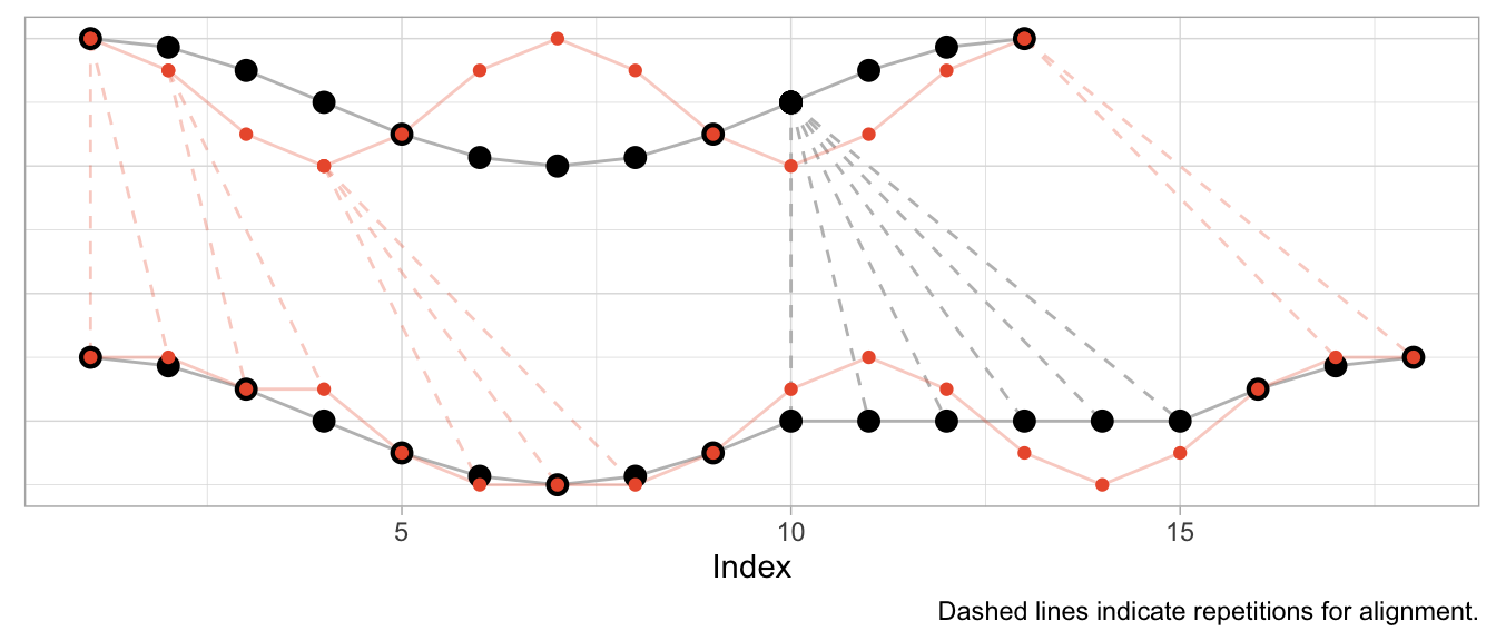
Aligning a Shift
To start, I’ll use an example where DTW can compute a near perfect alignment: That of a cosine curve and a shifted cosine curve—which is just a sine curve.1 For each of the curves, we observe 12 observations per period, and 13 observations in total.
series_sine <- sinpi((0:12) / 6)
series_cosine <- cospi((0:12) / 6)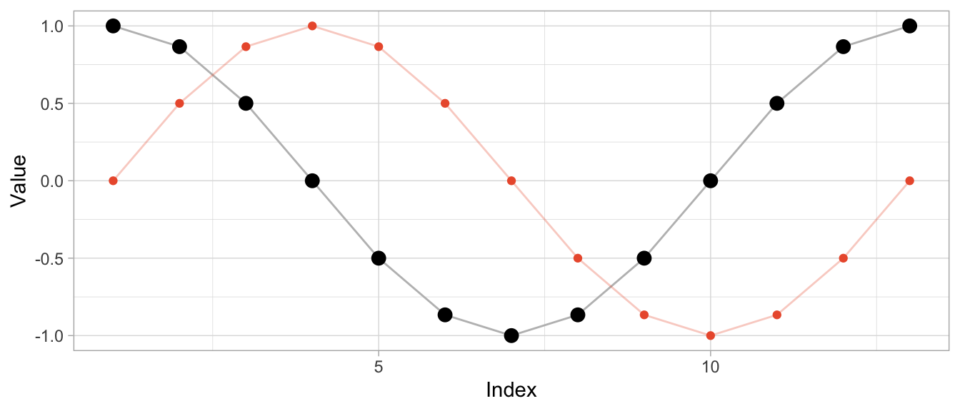
To compute the aligned versions, I use the DTW implementation of the dtw package (also available for Python as dtw-python) with default parameters.
library(dtw)
dtw_shift <- dtw::dtw(x = series_sine, y = series_cosine)
Besides returning the distance of the aligned series, DTW produces a mapping of original series to aligned series in the form of alignment vectors dtw_shift$index1 and dtw_shift$index2. Using those, I can visualize both the original time series and the aligned time series along with the repetitions used for alignment.
# DTW returns a vector of indices of the original observations
# where some indices are repeated to create aligned time series
dtw_shift$index2
## [1] 1 1 1 1 2 3 4 5 6 7 8 9 10 11 12 13# In this case, the first index is repeated thrice so that the first
# observation appears four times in the aligned time series
series_cosine[dtw_shift$index2] |> head(8) |> round(2)## [1] 1.00 1.00 1.00 1.00 0.87 0.50 0.00 -0.50The plot below shows the original time series in the upper half and the aligned time series in the lower half, with the sine in orange and the cosine in black. Dashed lines indicate where observations were repeated to achieve the alignment.
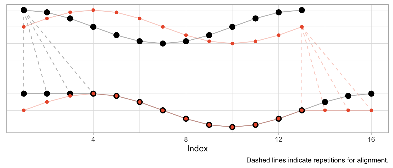
Given that the sine is a perfect shifted copy of the cosine, three-quarters of the observed period can be aligned perfectly. The first quarter of the sine and the last quarter of the cosine’s period, however, can’t be aligned and stand on their own. Their indices are mapped to the repeated observations from the other time series, respectively.
Aligning Speed
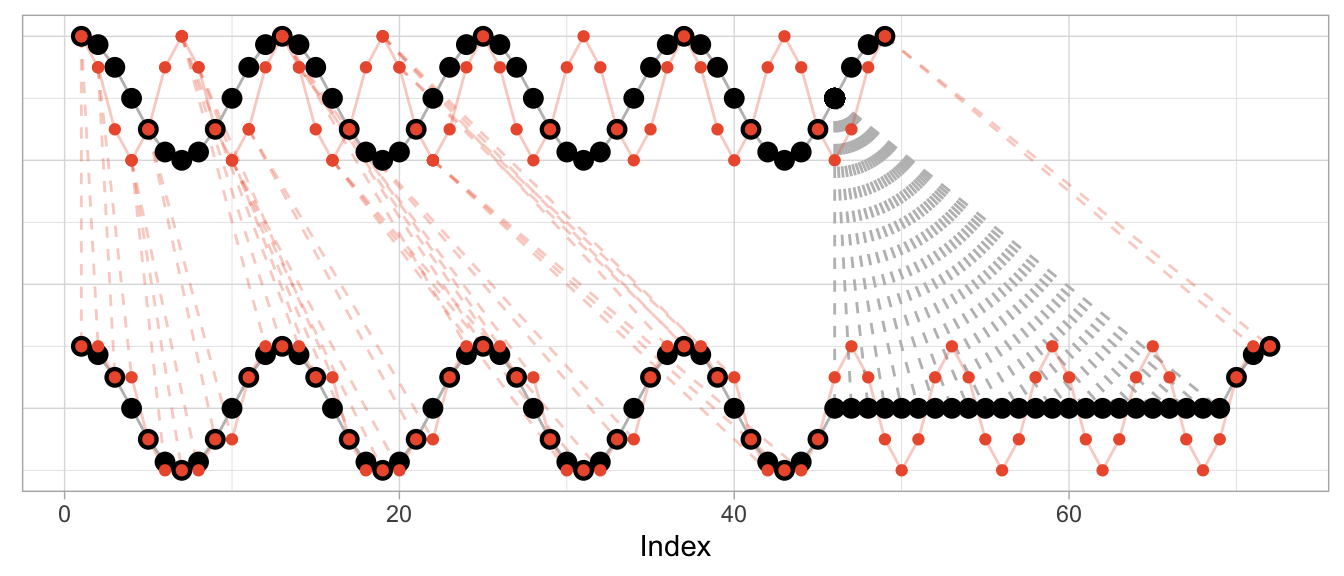
Instead of shifting the cosine, I can sample it at a different speed (or, equivalently, observe a cosine of different frequency) to construct a different time series that can be aligned well by DTW. In that case, the required alignment is not so much a shift as it is a squeezing and stretching of the observed series.
Let’s create a version of the original cosine that is twice as “fast”: In the time that we observe one period of the original cosine, we observe two periods of the fast cosine.
series_cosine_fast <- cospi((0:12) / 3)
dtw_fast <- dtw::dtw(x = series_cosine_fast, y = series_cosine)
The resulting alignment mapping looks quite different than in the first example. Under a shift, most observations still have a one-to-one mapping after alignment. Under varying frequencies, most observations of the faster time series have to be repeated to align. Note how the first half of the fast cosine’s first period can be neatly aligned with the first half of the slow cosine’s period by repeating observations (in an ideal world exactly twice).
The kind of alignment reveals itself better when the time series are observed for more than just one or two periods. Below, for longer versions of the same series, half of the fast time series can be matched neatly with the slow cosine as we observe twice the number of periods for the fast cosine.
Aligning Different Scales
What’s perhaps unexpected, though, is that the alignment works only on the time dimension. Dynamic time warping will not scale the time series’ amplitude. But at the same time DTW is not scale independent. This can make the alignment fairly awkward when time series have varying scales as DTW exploits the time dimension to reduce the cumulative distance of observations in the value dimension.
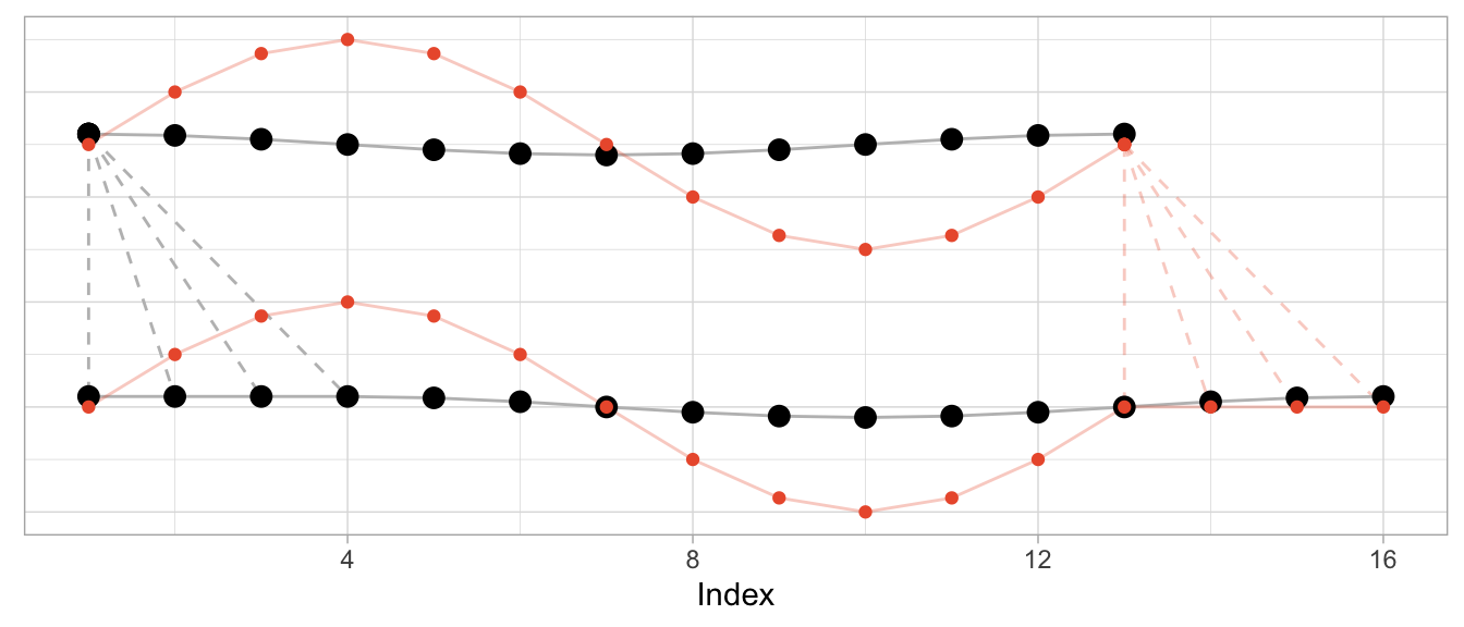
To illustrate this, let’s take the sine and cosine from the first example but scale the sine’s amplitude by 5 and check the resulting alignment.
series_sine_scaled <- series_sine * 10
dtw_scaled <- dtw::dtw(x = series_sine_scaled, y = series_cosine)
We might expect DTW to align the two series as it did in the first example above with unscaled series. After all, the series have the same frequencies as before and the same period shift as before.
This is what the alignment would look like using the alignment vectors from the first example above based on un-scaled observations. While it’s a bit hard to see due to the different scales, the observations at peak amplitude are aligned (e.g., indices 4, 10, 16) as are those at the minimum amplitude (indices 7 and 13).
But Dynamic Time Warping’s optimization procedure doesn’t actually try to identify characteristics of time series such as their period length to align them. It warps time series purely to minimize the cumulative distance between aligned observations. This may lead to a result in which also the periodicity is aligned as in the first and second examples above. But that’s more by accident than by design.
This is how DTW actually aligns the scaled sine and the unscaled cosine:
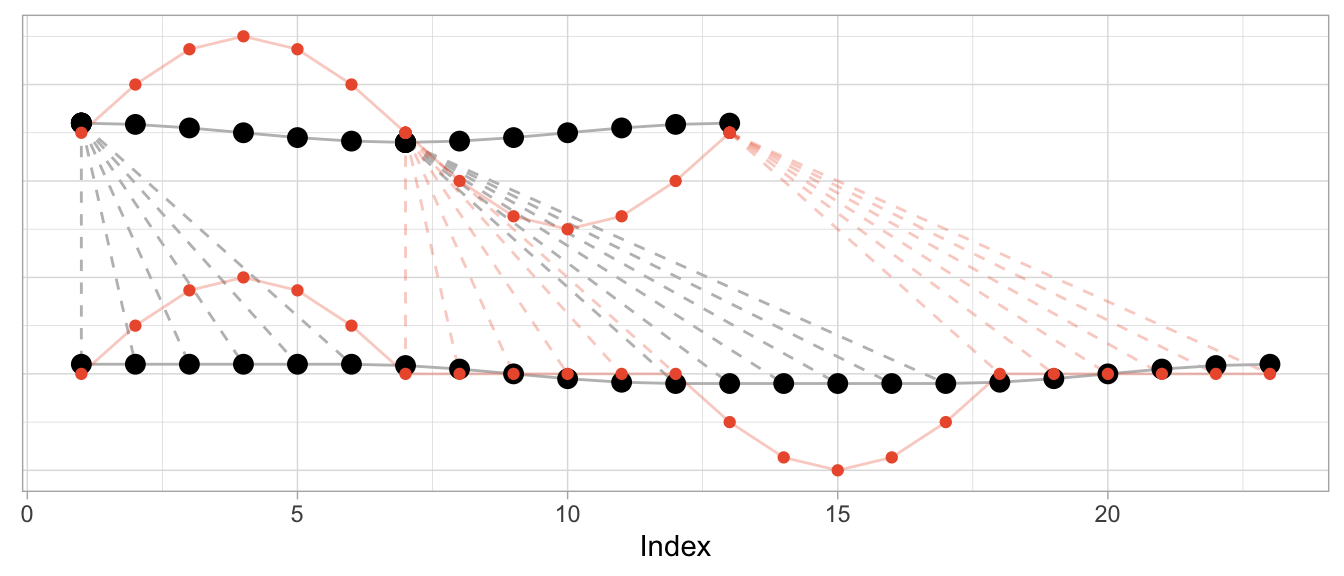
The change in the series’ amplitude leads to a more complicated alignment: Observations at the peak amplitude of the cosine (which has the small amplitude) are repeated many times to reduce the Euclidean distance to the already high amplitude observations of the sine. Reversely, the minimum-amplitude of the sine is repeated many times to reduce the Euclidean distance to the already low amplitude observations of the cosine.
DTW Is Good at Many Things…
Dynamic time warping is great when you’re observing physical phenomena that are naturally shifted in time or at different speeds.
Consider, for example, measurements taken in a medical context such as those of an electrocardiogram (ECG) that measures the electrical signals in a patient’s heart. In this context, it is helpful to align time series to identify similar heart rhythms across patients. The rhythms’ periods could be aligned to check whether one patient has the same issues as another. Even for the same person a DTW can be useful to align measurements taken on different days at different heart rates.
data("aami3a") # ECG data included in `dtw` package
dtw_ecg <- dtw::dtw(
  x = as.numeric(aami3a)[1:2880],
  y = as.numeric(aami3a)[40001:42880]
)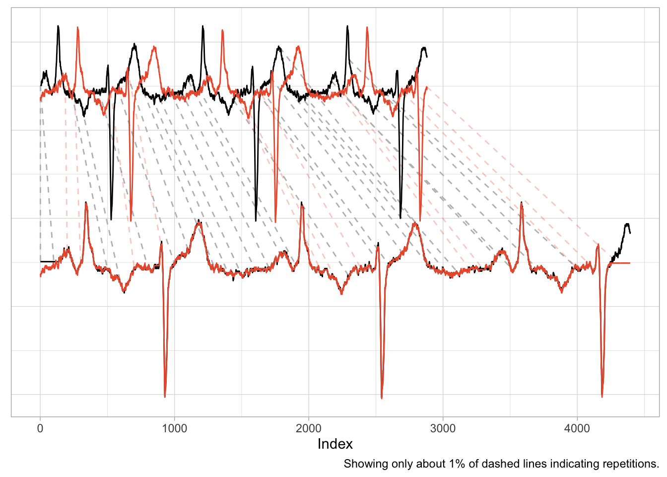
An application such as this one is nearly identical to the first example of the shifted cosine. And as the scale of the time series is naturally the same across the two series, the alignment works well, mapping peaks and valleys with minimal repetitions.
There is also a natural interpretation to the alignment, namely that we are aligning the heart rhythm across measurements. A large distance after alignment would indicate differences in rhythms.
…But Comparing Sales Ain’t One of Them
It is enticing to use Dynamic Time Warping in a business context, too. Not only does it promise a better distance metric to identify time series that are “similar” and to separate them from those that are “different”, but it also has a cool name. Who doesn’t want to warp stuff?
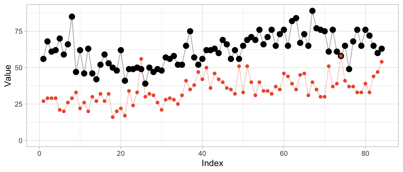
We can, for example, warp time series that count the number of times products are used for patients at a hospital per month. Not exactly product sales but sharing the same characteristics. The data comes with the expsmooth package.
set.seed(47772)
sampled_series <- sample(x = ncol(expsmooth::hospital), size = 2)
product_a <- as.numeric(expsmooth::hospital[,sampled_series[1]])
product_b <- as.numeric(expsmooth::hospital[,sampled_series[2]])
While product_b is used about twice as often as product_a, both products exhibit an increase in their level at around index 40 which is perhaps one characteristic that makes them similar or at least more similar compared to a series that doesn’t share this increase.
However, the warped versions exhibit a lot of unwanted repetitions of observations. Given the different level of the products, this should not come as a surprise.
dtw_products_ab <- dtw::dtw(x = product_b, y = product_a)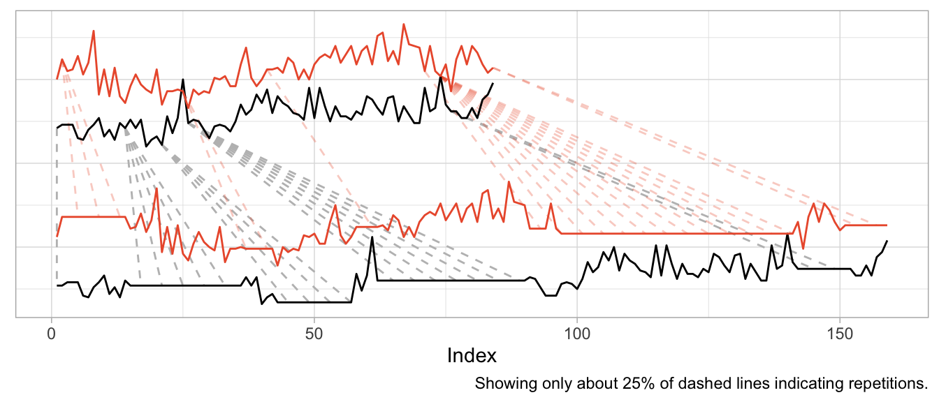
We can mostly fix this by min-max scaling the series, forcing their observations onto the same range of values.
dtw_products_ab_standardized <- dtw::dtw(
  x = (product_b - min(product_b)) / (max(product_b) - min(product_b)),
  y = (product_a - min(product_a)) / (max(product_a) - min(product_a))
)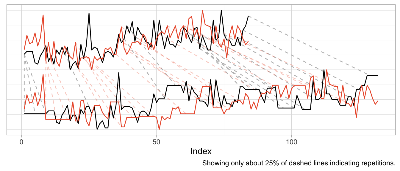
While we got rid of the unwanted warping artifacts in the form of extremely long repetitions of the same observation, the previous plot should raise some questions:
- How can we interpret the modifications for “improved” alignment?
- Are we aligning just noise?
- What does the warping offer us that we didn’t already have before?
If you ask me, there is no useful interpretation to the alignment modifications, because the time series already were aligned. Business time series are naturally aligned by the point in time at which they are observed.2
We also are not taking measurement of a continuous physical phenomenon that goes up and down like the electric signals in a heart. While you can double the amount of ECG measurements per second, it does not make sense to “double the amount of sales measurements per month”. And while a product can “sell faster” than another, this results in an increased amplitude not an increased frequency (or shortened period lengths).
So if you apply Dynamic Time Warping to business time series, you will mostly be warping random fluctuations with the goal of reducing the cumulative distance just that tiny bit more.
This holds when you use Dynamic Time Warping to derive distances for clustering of business time series, too. You might as well calculate the Euclidean distance3 on the raw time series without warping first. At least then the distance between time series will tell you that they were similar (or different) at the same point in time.
In fact, if you want to cluster business time series (or train any kind of model on them), put your focus on aligning them well in the value dimension by thinking carefully about how you standardize them. That makes all the difference.
Before using Dynamic Time Warping, ask yourself: What kind of similarity are you looking for when comparing time series? Will there be meaning to the alignment that Dynamic Time Warping induces in your time series? And what is it that you can do after warping that you weren’t able to do before?
A similar example is also used by the
dtwpackage in its documentation.↩︎Two exceptions come to mind: First, you may want to align time series of products by the first point in time at which the product was sold. But that’s straightforward without DTW. Second, you may want to align products that actually exhibit a shift in their seasonality—such as when a product is heavily affected by the seasons and sold in both the northern and southern hemisphere. DTW might be useful for this, but there might also be easier ways to accomplish it.↩︎
Or Manhattan distance, or any other distance.↩︎
2023/12/03
Comes with Anomaly Detection Included
A powerful pattern in forecasting is that of model-based anomaly detection during model training. It exploits the inherently iterative nature of forecasting models and goes something like this:
- Train your model up to time step
tbased on data[1,t-1] - Predict the forecast distibution at time step
t - Compare the observed value against the predicted distribution at step
t; flag the observation as anomaly if it is in the very tail of the distribution - Don’t update the model’s state based on the anomalous observation
For another description of this idea, see, for example, Alexandrov et al. (2019).
Importantly, you use your model to detect anomalies during training and not after training, thereby ensuring its state and forecast distribution are not corrupted by the anomalies.
The beauty of this approach is that
- the forecast distribution can properly reflect the impact of anomalies, and
- you don’t require a separate anomaly detection method with failure modes different from your model’s.
In contrast, standalone anomaly detection approaches would first have to solve the handling of trends and seasonalities themselves, too, before they could begin to detect any anomalous observation. So why not use the model you already trust with predicting your data to identify observations that don’t make sense to it?
This approach can be expensive if your model doesn’t train iteratively over observations in the first place. Many forecasting models1 do, however, making this a fairly negligiable addition.
But enough introduction, let’s see it in action. First, I construct a simple time series y of monthly observations with yearly seasonality.
set.seed(472)
x <- 1:80
y <- pmax(0, sinpi(x / 6) * 25 + sqrt(x) * 10 + rnorm(n = 80, sd = 10))

# Insert anomalous observations that need to be detected
y[c(55, 56, 70)] <- 3 * y[c(55, 56, 70)]
To illustrate the method, I’m going to use a simple probabilistic variant of the Seasonal Naive method where the forecast distribution is assumed to be Normal with zero mean. Only the \(\sigma\) parameter needs to be fitted, which I do using the standard deviation of the forecast residuals.
The estimation of the \(\sigma\) parameter occurs in lockstep with the detection of anomalies. Let’s first define a data frame that holds the observations and will store a cleaned version of the observations, the fitted \(\sigma\) and detected anomalies…
df <- data.frame(
  y = y,
  y_cleaned = y,
  forecast = NA_real_,
  residual = NA_real_,
  sigma = NA_real_,
  is_anomaly = FALSE
)
… and then let’s loop over the observations.
At each iteration, I first predict the current observation given the past and update the forecast distribution by calculating the standard deviation over all residuals that are available so far, before calculating the latest residual.
If the latest residual is in the tails of the current forecast distribution (i.e., larger than multiples of the standard deviation), the observation is flagged as anomalous.
For time steps with anomalous observations, I update the cleaned time series with the forecasted value (which informs a later forecast at step t+12) and set the residual to missing to keep the anomalous observation from distorting the forecast distribution.
# Loop starts when first prediction from Seasonal Naive is possible
for (t in 13:nrow(df)) {
  df$forecast[t] <- df$y_cleaned[t - 12]
  df$sigma[t] <- sd(df$residual, na.rm = TRUE)
  df$residual[t] <- df$y[t] - df$forecast[t]

  if (t > 25) {
    # Collect 12 residuals before starting anomaly detection
    df$is_anomaly[t] <- abs(df$residual[t]) > 3 * df$sigma[t]
  }

  if (df$is_anomaly[t]) {
    df$y_cleaned[t] <- df$forecast[t]
    df$residual[t] <- NA_real_
  }
}
Note that I decide to start the anomaly detection not before there are 12 residuals for one full seasonal period, as the \(\sigma\) estimate based on less than a handful of observations can be flaky.
In a plot of the results, the combination of 1-step-ahead prediction and forecast distribution is used to distinguish between expected and anomalous observations, with the decision boundary indicated by the orange ribbon. At time steps where the observed value falls outside the ribbon, the orange line indicates the model prediction that is used to inform the model’s state going forward in place of the anomaly.
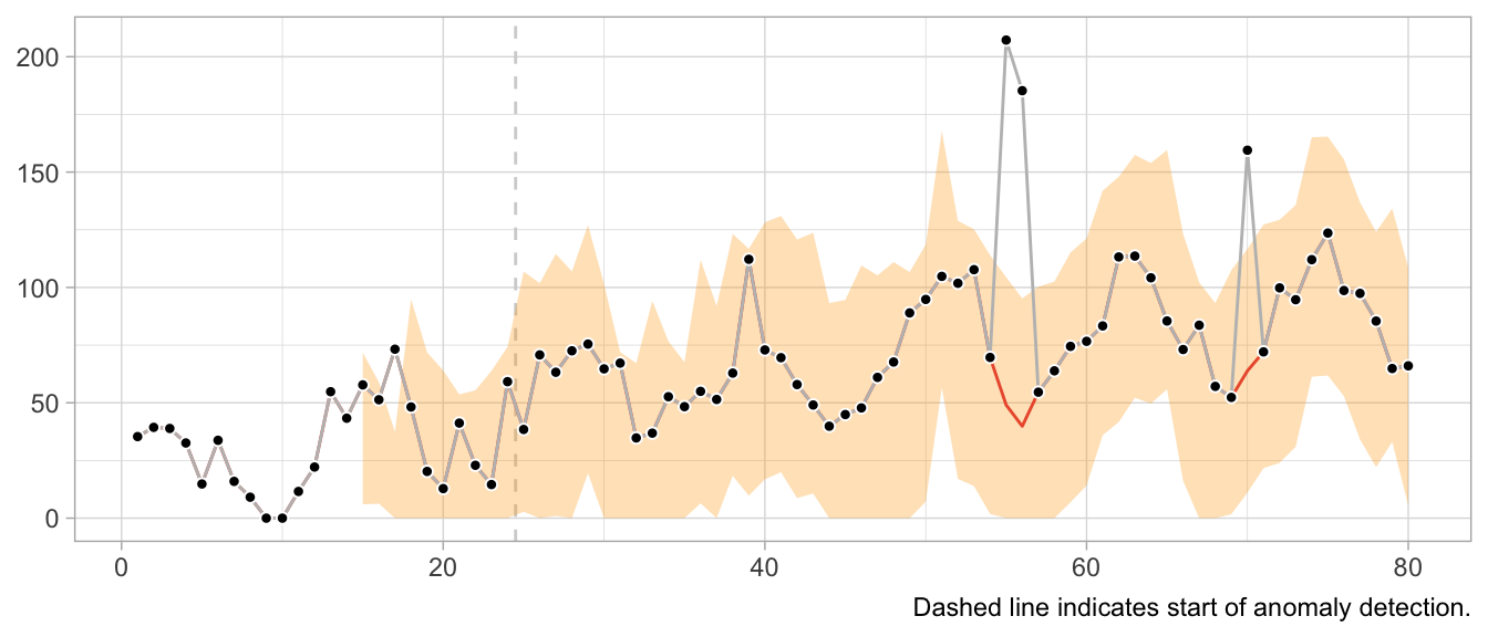
Note how the prediction at time t is not affected by the anomaly at time step t-12. Neither is the forecast distribution estimate.
This would look very different when one gets the update behavior slightly wrong. For example, the following implementation of the loop detects the first anomaly in the same way, but uses it to update the model’s state, leading to subsequently poor predictions and false positives, and fails to detect later anomalies.
# Loop starts when first prediction from Seasonal Naive is possible
for (t in 13:nrow(df)) {
  df$forecast[t] <- df$y[t - 12]
  df$sigma[t] <- sd(df$residual, na.rm = TRUE)
  df$residual[t] <- df$y[t] - df$forecast[t]

  if (t > 25) {
    # Collect 12 residuals before starting anomaly detection
    df$is_anomaly[t] <- abs(df$residual[t]) > 3 * df$sigma[t]
  }

  if (df$is_anomaly[t]) {
    df$y_cleaned[t] <- df$forecast[t]
  }
}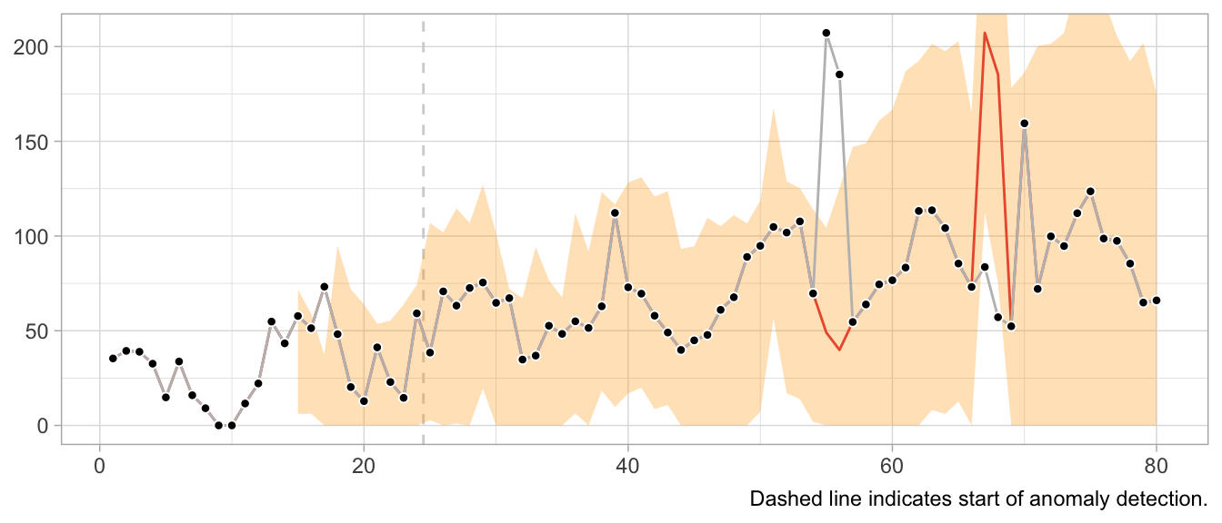
What about structural breaks?
While anomaly detection during training can work well, it may fail spectacularly if an anomaly is not an anomaly but the start of a structural break. Since structural breaks make the time series look different than it did before, chances are the first observation after the structural break will be flagged as anomaly. Then so will be the second. And then the third. And so on, until all observations after the structural break are treated as anomalies because the model never starts to adapt to the new state.
This is particularly frustrating because the Seasonal Naive method is robust against certain structural breaks that occur in the training period. Adding anomaly detection makes it vulnerable.
What values to use for the final forecast distribution?
Let’s get philosophical for a second. What are anomalies?
Ideally, they reflect a weird measurement that will never occur again. Or if it does, it’s another wrong measurement—but not the true state of the measured phenomenon. In that case, let’s drop the anomalies and ignore them in the forecast distribution.
But what if the anomalies are weird states that the measured phenomenon can end up in? For example, demand for subway rides after a popular concert. While perhaps an irregular and rare event, a similar event may occur again in the future. Do we want to exclude that possibility from our predictions about the future? What if the mention of a book on TikTok let’s sales spike? Drop the observation and assume it will not repeat? Perhaps unrealistic.
It depends on your context. In a business context, where measurement errors might be less of an issue, anomalies might need to be modeled, not excluded.
Notably models from the state-space model family.↩︎
2023/11/12
Code Responsibly
There exists this comparison of software before and software after machine learning.
Before machine learning, code was deterministic: Software engineers wrote code, the code included conditions with fixed thresholds, and at least in theory the program was entirely understandable.
After machine learning, code is no longer deterministic. Instead of software engineers instantiating it, the program’s logic is determined by a model and its parameters. Those parameters are not artisinally chosen by a software engineer but learned from data. The program becomes a function of data, and in some cases incomprehensible to the engineer due to the sheer number of parameters.
Given the current urge to regulate AI and making its use responsible and trustworthy, humans appear to expect machine learning models to introduce an obscene number of bugs into software. Perhaps humans underestimate the ways in which human programmers can mess up.
For example, when I hear Regulate AI, all I can think is Have you seen this stuff? By Pierluigi Bizzini for Algorithm Watch1 (emphasis mine):
The algorithm evaluates teachers' CVs and cross-references their preferences for location and class with schools' vacancies. If there is a match, a provisional assignment is triggered, but the algorithm continues to assess other candidates. If it finds another matching candidate with a higher score, that second candidate moves into the lead. The process continues until the algorithm has assessed all potential matches and selected the best possible candidate for the role.
[…] [E]rrors have caused much confusion, leaving many teachers unemployed and therefore without a salary. Why did such errors occur?
When the algorithm finds an ideal candidate for a position, it does not reset the list of remaining candidates before commencing the search to fill the next vacancy. Thus, those candidates who missed out on the first role that matched their preferences are definitively discarded from the pool of available teachers, with no possibility of employment. The algorithm classes those discarded teachers as “drop-outs”, ignoring the possibility of matching them with new vacancies.
This is not AI gone rogue. This is just a flawed human-written algorithm. At least Algorithm Watch is aptly named Algorithm Watch.
Algorithms existed before AI.2 But there was no outcry, no regulation of algorithms before AI, no “Proposal for a Regulation laying down harmonised rules on artificial intelligence”. Except there actually is regulation in aviation and medical devices and such.3 Perhaps because of the extent to which these fields are entangled with hardware, posing unmediated danger to human lives.
Machine learning and an increased prowess in data processing have not introduced more bugs into software compared to software written by humans previously. What they have done is to enable applications for software that were previously infeasible by way of processing and generating data.
Some of these applications are… not great. They should never be done. Regulate those applications. By all means, prohibit them. If a use case poses unacceptable risks, when we can’t tolerate any bugs but bugs are always a possibility, then let’s just not do it.
Other applications are high-risk, high-reward. Given large amounts of testing imposed by regulation, we probably want software to enable these applications. The aforementioned aviation and medical devices come to mind.4 Living with regulated software is nothing new!
Then there is the rest that doesn’t really harm anyone where people can do whatever.
Regulating software in the context of specific use cases is feasible and has precedents.
Regulating AI is awkward. Where does the if-else end and AI start? Instead, consider it part of software as a whole and ask in which cases software might have flaws we are unwilling to accept.
We need responsible software, not just responsible AI.
-
I tried to find sources for the description of the bug provided in the article, but couldn’t find any. I don’t know where the author takes them from, so take this example with the necessary grain of salt. ↩︎
-
Also, much of what were algorithms or statistics a few years ago are now labeled as AI. And large parts of AI systems are just if statements and for loops and databases and networking. ↩︎
-
Regulation that the EU regulation of artificial intelligence very much builds upon. See “Demystifying the Draft EU Artificial Intelligence Act” (https://arxiv.org/abs/2107.03721) for more on the connection to the “New Legislative Framework”. ↩︎
-
Perhaps this is the category for autonomous driving? ↩︎
2023/05/20
The 2-by-2 of Forecasting
False Positives and False Negatives are traditionally a topic in classification problems only. Which makes sense: There is no such thing as a binary target in forecasting, only a continuous range. There is no true and false, only a continuous scale of wrong. But there lives an MBA student in me who really likes 2-by-2 charts, so let’s come up with one for forecasting.
The {True,False}x{Positive,Negative} confusion matrix is the one opportunity for university professors to discuss the stakeholders of machine learning systems. The fact that a stakeholder might care more about reducing the number of False Positives and thus accepting a higher rate of False Negatives. Certain errors are more critical than others. That’s just as much the case in forecasting.
To construct the 2-by-2 of forecasting, the obvious place to start is the sense of “big errors are worse”. Let’s put that on the y-axis.

This gives us the False and “True” equivalents of forecasting. The “True” is in quotes because any deviation from the observed value is some error. But for the sake of the 2-by-2, let’s call small errors “True”.
Next, we need the Positive and Negative equivalents. When talking about stakeholder priorities, Positive and Negative differentiate the errors that are Critical from those that are Acceptable. Let’s put that on the x-axis.

While there might be other ways to define criticality1, human perception of time series forecastability comes up as soon as users of your product inspect your forecasts. The human eye will detect apparent trends and seasonal patterns and project them into the future. If your model does not, and wrongly so, it raises confusion instead. Thus, forecasts of series predictable by humans will be critized, while forecasts of series with huge swings and more noise than signal are easily acceptable.
To utilize this notion, we require a model of human perception of time series forecastability. In a business context, where seasonality may be predominant, the seasonal naive method captures much of what is modelled by the human eye. It is also inherently conservative, as it does not overfit to recent fluctuations or potential trends. It assumes business will repeat as it did before.
Critical, then, are forecasts of series that the seasonal naive method, or any other appropriate benchmark, predicts with small error, while Acceptable are any forecasts of series that the seasonal naive method predicts poorly. This completes the x-axis.

With both axes defined, the quadrants of the 2-by-2 emerge. Small forecast model erros are naturally Acceptable True when the benchmark model fails, and large forecast model errors are Acceptable False when the benchmark model also fails. Cases of series that feel predictable and are predicted well are Critical True. Lastly, series that are predicted well by a benchmark but not by the forecast model are Critical False.
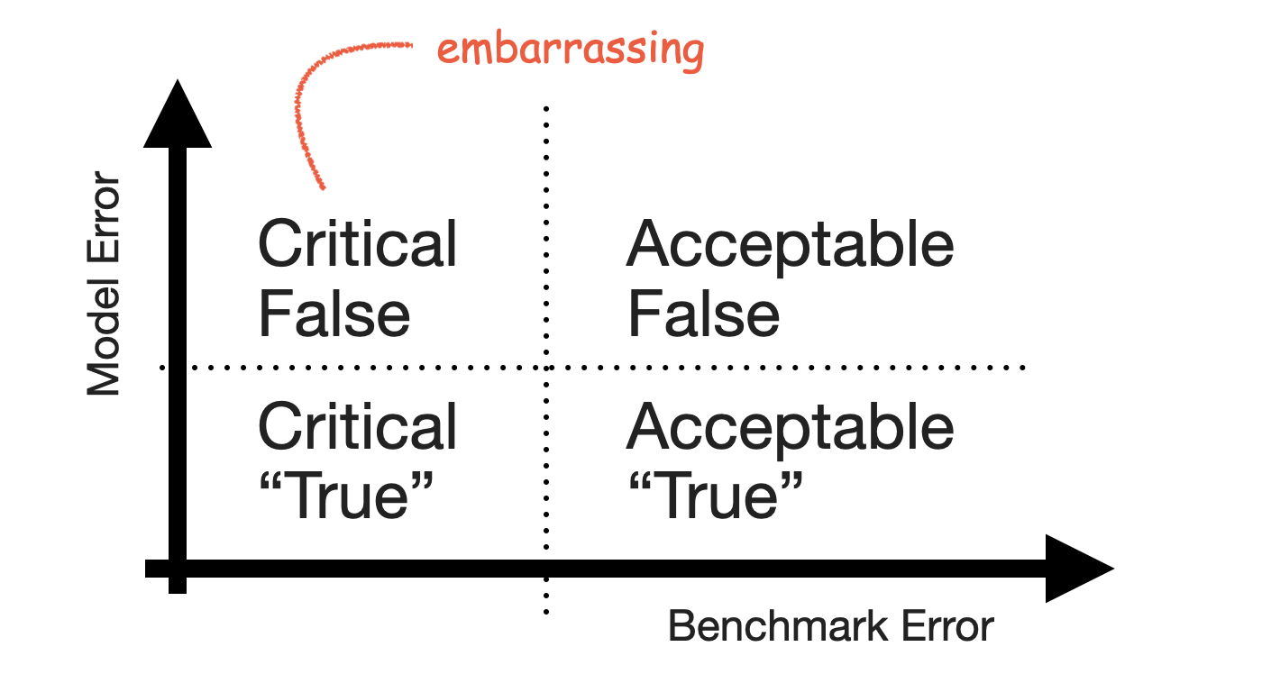
The Critical False group contains the series for which users expect a good forecast because they themselves can project the series into the future—but your model fails to deliver that forecast and does something weird instead. It’s the group of forecasts that look silly in your tool, the ones that cause you discomfort when users point them out.
Keep that group small.
-
For example, the importance of a product to the business as measured by revenue. ↩︎
2021/09/01
Forecasting Uncertainty Is Never Too Large
Rob J. Hyndman gave a presentation titled “Uncertain futures: what can we forecast and when should we give up?” as part of the ACEMS public lecture series with recording available on Youtube.
He makes an often underappreciated point around minute 50 of the talk:
When the forecast uncertainty is too large to assist decision making? I don’t think that’s ever the case. Forecasting uncertainty being too large does assist decision making by telling the decision makers that the future is very uncertain and they should be planning for lots of different possible outcomes and not assuming just one outcome or another. And one of the problems we have in providing forecasts to decision makers is getting them to not focus in on the most likely outcome but to actually take into account the range of possibilities and to understand that futures are uncertain, that they need to plan for that uncertainty.
2021/05/02
Everything is an AI Technique
Along with their proposal for regulation of artificial intelligence, the EU published a definition of AI techniques. It includes everything, and that’s great!
From the proposal’s Annex I:
ARTIFICIAL INTELLIGENCE TECHNIQUES AND APPROACHES referred to in Article 3, point 1
- (a) Machine learning approaches, including supervised, unsupervised and reinforcement learning, using a wide variety of methods including deep learning;
- (b) Logic- and knowledge-based approaches, including knowledge representation, inductive (logic) programming, knowledge bases, inference and deductive engines, (symbolic) reasoning and expert systems;
- (c) Statistical approaches, Bayesian estimation, search and optimization methods.
Unsurprisingly, this definition and the rest of the proposal made the rounds: Bob Carpenter quipped about the fact that according to this definition, he has been doing AI for 30 years now (and that the EU feels the need to differentiate between statistics and Bayesian inference). In his newsletter, Thomas Vladeck takes the proposal apart to point out potential ramifications for applications. And Yoav Goldberg was tweeting about it ever since a draft of the document leaked.
From a data scientist’s point of view, this definition is fantastic: First, it highlights that AI is a marketing term used to sell whatever method does the job. Not including optimization as AI technique would have given everyone who called their optimizer “AI” a way to wiggle out of the regulation otherwise. This implicit acknowledgement is welcome.
Second, and more importantly, as practitioner it’s practical to have this “official” set of AI techniques in your backpocket for when someone asks what exactly AI is. The fact that one doesn’t have to use deep learning to wear the AI bumper sticker means that we can be comfortable in choosing the right tool for the job. At this point, AI refers less to a set of techniques or artificial intelligence, and more to a family of problems that are solved by one of the tools listed above.
2021/01/01
Resilience, Chaos Engineering and Anti-Fragile Machine Learning
In his interview with The Observer Effect, Tobi Lütke, CEO of Shopify, describes how Shopify benefits from resilient systems:
Most interesting things come from non-deterministic behaviors. People have a love for the predictable, but there is value in being able to build systems that can absorb whatever is being thrown at them and still have good outcomes.
So, I love Antifragile, and I make everyone read it. It finally put a name to an important concept that we practiced. Before this, I would just log in and shut down various servers to teach the team what’s now called chaos engineering.
But we’ve done this for a long, long time. We’ve designed Shopify very well because resilience and uptime are so important for building trust. These lessons were there in the building of our architecture. And then I had to take over as CEO.
It sticks out that Lütke uses “resilient” and “antifragile” interchangeably even though Taleb would point out that they are not the same thing: Whereas a resilient system doesn’t fail due to randomly turned off servers, an antifragile system benefits. (Are Shopify’s systems robust or have they become somehow better beyond robust due to their exposure to “chaos”?)
But this doesn’t diminish Lütke’s notion of resilience and uptime being “so important for building trust” (with users, presumably): Users’ trust in applications is fragile. Earning users’ trust in a tool that augments or automates decisions is difficult, and the trust is withdrawn quickly when the tool makes a stupid mistake. Making your tool robust against failure modes is how you make it trustworthy—and used.
Which makes it interesting to reason about what an equivalent to shutting off random servers is to machine learning applications (beyond shutting off the server running the model). Label noise? Shuffling features? Adding Covid-19-style disruptions to your time series? The latter might be more related to the idea of experimenting with a software system in production.
And—to return to the topic of discerning anti-fragile and robust—what would it mean for machine learning algorithms “to gain from disorder”? Dropout comes to mind. What about causal inference through natural experiments?
2018/11/11
Videos from PROBPROG 2018 Conference
Videos of the talks given at the International Conference on Probabilistic Programming (PROBPROG 2018) back in October were published a few days ago and are now available on Youtube. I have not watched all presentations yet, but a lot of big names attended the conference so there should be something for everyone. In particular the talks by Brooks Paige (“Semi-Interpretable Probabilistic Models”) and Michael Tingley (“Probabilistic Programming at Facebook”) made me curious to explore their topics more.
2018/09/30
Videos from Exploration in RL Workshop at ICML
One of the many fantastic workshops at ICML this year was the Exploration in Reinforcement Learning workshop. All talks were recorded and are now available on Youtube. Highlights include presentations by Ian Osband, Emma Brunskill, and Csaba Szepesvari, among others. You can find the workshop’s homepage here with more information and the accepted papers.
2016/12/14
Multi-Armed Bandits at Tinder
In a post on Tinder’s tech blog, Mike Hall presents a new application for multi-armed bandits. At Tinder, they started to use multi-armed bandits to optimize the photo of users that is shown first: While a user can have multiple photos in his profile, only one of them is shown first when another user swipes through the deck of user profiles. By employing an adapted epsilon-greedy algorithm, Tinder optimizes this photo for the “Swipe-Right-Rate”. Mike Hall about the project:
It seems to fit our problem perfectly. Let’s discover which profile photo results in the most right swipes, without wasting views on the low performing ones. …
We were off to a solid start with just a little tweaking and tuning. Now, we are able to leverage Tinder’s massive volume of swipes in order to get very good results in a relatively small amount of time, and we are convinced that Smart Photos will give our users a significant upswing in the number of right swipes they are receiving with more complex and fine-tuned algorithms as we move forward.